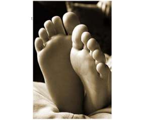
“This photo is strange and unsettling, and at the same time it is peaceful and familiar.”—Jack Howard

© Pedro Garcia. Gear: Canon EOS 50D, Canon EF 28-135mm f/3.5-5.6 IS USM lens, handheld. Exposure: 1/50 sec, f/6.3, Sepia added in post-processing.
Photographer’s statement: “This is a photograph of my seven year old daughter’s feet while she was relaxing on our living room couch. The sun was falling at the moment I took the image and since the living room has a large window, I felt the lighting was perfect for this picture.”
Our critics say…
Jack Howard: This photo is strange and unsettling, and at the same time it is peaceful and familiar. As a form study, the sepiatone effect is well used. I’m not crazy about the hot spot on the background in lower right, which sucks the eyes away from the main focus. I’d also like a little more directional light on the flat of the top foot, which is just a lot of dead space, but with a wee bit more angular light, it would be better defined. Here’s a good chance to get quick and creative with makeshift objects used as reflectors and gobos to address the two main light-related issues: Top foot needs light, background lower right light needs blocking.
Monica Cipnic: When I first looked at this photo, I wanted to view it as vertical—both from the angle of the child’s feet and the angle of light, since the photographer writes that the light is from a large window, this seems more plausible. I like the meditative sense of the image, the composition, use of sepia and the lighting, particularly the sole of the foot in shadow seems almost sculptural, as if in marble. I do agree with Jack that the hot spot to the right–or top of the image if you see this as a vertical– is distracting and cropping it out would strengthen the photograph overall.

Mason Resnick: Indeed, this photo was submitted as a horizontal, so I must assume that’s how the photographer intended it. But it should be a vertical. To avoid chiropractor visits from turning my head, I’ve rotated it (right). The distracting bright background object is still distracting. I also note that this shot is quite noisy. We don’t have ISO information but I think we can safely assume this was shot at too high an ISO. Your subject isn’t going anywhere, so put the camera on a tripod, use the lowest ISO setting you can, and try again.