What design elements go into making a site successful and visit two more case studies of well-known photographers’ web sites?
“Keep it simple” goes hand in hand with a site that’s easy to use. You know how impatient you get if a page is slow to load–more than 20 or 30 seconds, and most people have moved on. Art buyers and editors are on deadline, so getting into your site, easily navigating it, finding your contact information immediately (including a hyperlink to your e-mail), seeing what they want quickly, and getting out effortlessly are what creatives are looking for every day. While you may have designed your site with Flash and music to create ambience with which to view your stunning imagery, a creative on a tight deadline sitting in a cubicle will probably look for an off button to click on immediately as soon as the music starts.
Practice good HTML
While you want your web site to stand out and be memorable, not everyone you’re trying to reach may have the capability to view it as you are on your latest, fastest Mac or PC with multiple software programs. The appearance of your web site should be clean and uncluttered; consider using fonts that are standard to all computer users–Arial, Helvetica, Verdana, and Times. And please make sure to check for spelling and grammar errors–any misspelling and general sloppiness doesn’t bode well for a professional appearance, and could lose you a potential job.
![]()
![]()
Case Study No. 3
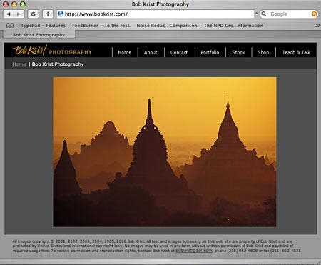
URL: www.bobkrist.com
Photographer: Bob Krist
Why it works: This web site has a good, clean design with important copyright and contact information on the home page. It’s very user-friendly.
The site displays a wide variety of Krist’s stock photography; click on Portfolio (on the navigation bar) and each topic has a lightbox with 15 images per ‘page’–and each page is sized small enough to fit on a 14-inch laptop monitor. Click on a selected image and a new larger window with the image opens quickly; close it and you’re right back on a specific page. You’re not searching from the very beginning again, as some web sites make you. The easy navigation of his site points out all aspects of Krist’s business, including stock representation by Corbis, his online shop with his published books, tearsheets, assignments, and highlights his talks and presentations.
![]()
![]()
In addition to checking cross-platform compatibility for Macs and Windows-based PCs, you definitely want to check your web site’s look in different browsers, such as Safari, Opera, Firefox, Netscape/Mozilla, and Internet Explorer. And clearly note on your site what browsers are supported. Your design with beautifully serifed lettering typefaces and a variety of picture sizes on multi-colored backgrounds may be an unviewable mess when viewed in the wrong browser or if the viewer lacks the font you’re using. This would defeat your plan entirely.
Navigation and visibility
Placing your navigation bar in the same place on every page is a useful design element and makes it easy for the client. Make sure there are shortcuts–direct links—to different sections on your site. And while having thumbnails is another great design element, some creatives have been known to consider moving scrolls a real pain. When you are deciding whether to deploy Flash on your web pages or stick with straight HTML, there are a number of elements you’ll need to consider. While Flash is a good choice for smooth transitions, multimedia presentations, and a commercial look and feel where images can expand to fill the screen, it’s not as good for search engines and screen swipes and will cost you more for an outside designer to update. And while plain HTML is not as fluid, it’s better than a bad Flash site, and makes your site easier for search engines to list. It’s also better for screen grabs and swipes. For ‘creative swap’ (when a creative gathers artwork from magazines, catalogs, etc. to show a client or editor the style, including composition, colors, models, etc., of the photography being considered for a specific project), or ‘comps’ (mock-ups of proposed design layouts to be shown for approval to the client or editor), consider having low-resolution, watermarked images and a registration sign-up for seeing higher resolution images on your web site (registration is an excellent means to follow-up with potential clients through e-mail). Most creatives want to know their options regarding your photographs, including the sizes that are available, the format (TIFF or JPEG), the color space you’re using, and don’t forget the embedded IPTC Core (a new version of an industry standard file labeling technology) metadata and credit information that is for your security. In addition, creatives like the idea of a lightbox where project selected images can be stored, and especially a lightbox that can be shared is a very useful tool.
![]()
![]()
Case Study No. 4
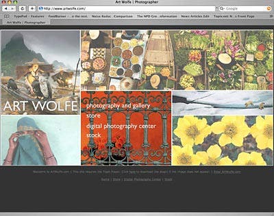
URL: www.artwolfe.com
Photographer: Art Wolfe
Why it works: This and well-thought-out site, with its easy navigation, has something for everybody, whether you’re a potential client or simply an admirer of Wolfe’s memorable images. From the inviting homepage and Flash multimedia shows, you’re immediately aware of Wolfe’s successful, multifaceted business. The site details the ‘Store’ with his fine art prints sales, published books, calendars and videos to his newest venture, the ‘Art Wolfe Digital Photography Center’, which will present onsite classes for the digital darkroom as well as in-the-field workshops and guest speakers. For the researcher or assignment client, Wolfe has provided access to his stock photography through onsite registration. Once registered, the client can use simple or advanced search parameters and utilize lightboxes for specific projects.
![]()
![]()
The all-important search engine readiness or optimization is key to driving traffic to your site. Search engine algorithms will factor in all the meta tag keywords and descriptions, concepts, words and phrases in your content, and “alt” text photo descriptions. Try to get listed for free as many places as possible and numerous quality links can push your site up in rankings. If your work is with a stock agency or gallery, make sure you have a link to all that apply and do check your site often for broken links. Pay for premium listings in journals or other web sites, as high-quality links with good rankings will also increase your site’s visibility. A successful web site will draw people to you and your imaginative photographic work, where by keeping the potential viewer–your client—in mind, you’ve created a user- friendly site that projects you as the focused, organized, easy-to-work-with creative photographer that you are!© Adorama Camera