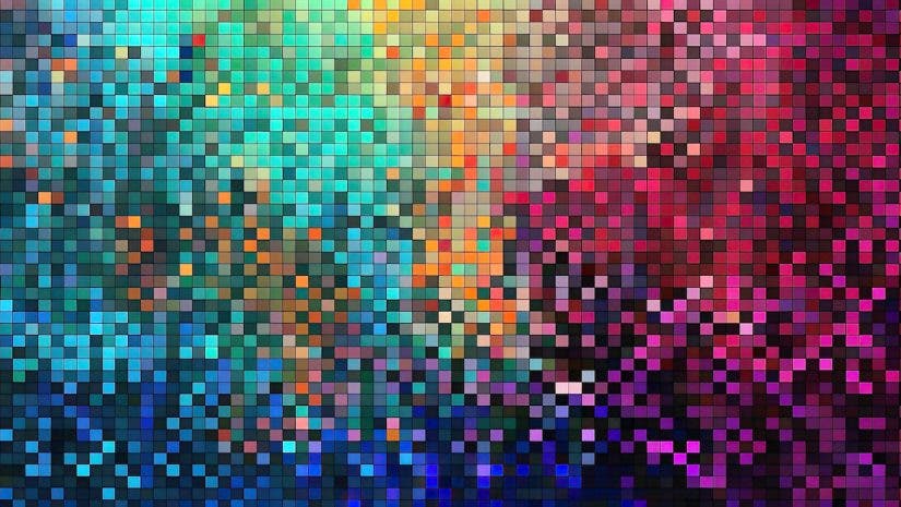

When discussing color space, we’re looking at how the colors shown in your images are made up on the screen. This affects everything about your image— from the hue, shade, and even lightness values in your image. If you want to display the very best (and most accurate) version of your images, you need to know about color space.
What is Color Space?
In photography, this is simply a range of colors shown on any given image. Every file is displayed in a color space, depending on the screen you are viewing, how you view the image (app), and even the embedded color space used in the image export process. Traditionally, the colors on your image came in either CMYK (cyan, magenta, yellow, key) or RGB (red, green, blue).
This means that each pixel is made up of a certain value of their respective colors. Now, more powerful screens allow for wider gamuts of color, and more color spaces are available. When you look at your export options in Photoshop, Lightroom, or any other photo editing software, you’ll see a list of different color spaces to choose from, which we’ll cover in this post.
Different Color Spaces
You don’t need to know about every color space available today, so we’ll just cover the different ones you may want to use. The color spaces are listed in order of its color gamut, meaning the range of colors available to be shown. The larger the color gamut, the more expansive each color’s tones, colors, and shades can be. Ultimately, this results in more realistic images popping off the page or screen.
CMYK
CMYK stands for cyan, magenta, yellow, and key, which comprise the individual colors used to produce a range of colors in your images. It is the most limited color space on this list, but it is still helpful to know when to use CMYK.
Many commercial printers only print in CMYK, so export your image in CMYK for the best color accuracy. The best way to find out the color space of your printer is to ask, which you should always do when printing an image with a company. However, most photo printers print in RGB, which we’ll cover next.

sRGB/RGB
sRGB stands for standard red, green, and blue. Most digital devices use sRGB, which has a wider color gamut than CMYK. In addition, many photo printers use sRGB. For digital uses, such as posting on social media or displaying on your smartphone, sRGB is always going to be a safe bet. For photo printing, sRGB is usually a good choice, but some high-quality print labs use Adobe RGB for printing.
Adobe RGB
At this time of this writing, Adobe RGB offers the widest color gamut possible for printing. Most of the highest-quality print labs print in Adobe RGB, giving you a slight edge over printers using sRGB and a significant advantage over CMYK printers. There may be a few applications where Adobe RGB would be an excellent choice.
Display P3
Apple implemented the Display P3 color space in many of its mobile devices, iPads, and computer screens. It is now used across the industry in many devices. The Display P3 color space has a larger color gamut than Adobe RGB. This means your images should look slightly better when displayed properly in Display P3. Most modern screens can use Display P3, but be sure to check on your particular device to be certain. Additionally, if your goal is to post to social media, ensure the app you use supports Display P3 in addition to your screen.
ProPhoto RGB
When you need the absolute largest color gamut possible on screen, ProPhoto RGB is the go-to. Many photographers prefer to edit in ProPhoto RGB as it gives the most realistic colors. This offers the largest range of tones, shades, and hues. While it seems obvious to use ProPhoto RGB for everything, understand that printers can’t print in this color space. Also, most apps will convert your photos to a different color space when you post. If the stars align and your device can display ProPhoto RGB, it is certainly the best choice for digital uses.
What Happens if I Use the Wrong Color Space?
Most printers and apps will convert the color space on your photos before printing or posting. The success of this process is not always guaranteed, and it is always best to export your image in the right color space to begin with. This ensures you’ll have the most accurate print or social media post compared to what you saw in camera.

What Color Space Should I Edit In?
If you’re a Lightroom user, you edit in ProPhoto RGB by default, which is the best option for colors. In Photoshop, you can choose which one you’ll edit in. It is recommended to edit in the color space you’ll be exporting. But, as photographers, this may not always be possible. When you edit your images, you might not know if you’ll be posting them to social media, printing them out, or just leaving them on your hard drive. For that reason, it is usually recommended to edit in ProPhoto RGB and then convert the color space when you export your images.
Why do the Colors Look Dull in my Social Media Photos?
If you’ve ever posted a photo that came out looking less colorful than it was in your image catalog, one of the most common problems is the color space. Suppose you try to upload a ProPhoto RGB image to many social media apps. In that case, the image will be automatically converted to sRGB, which can unfortunately zap much of the color out of your image. For the best results on social media, always export in the correct color space.
This might seem complicated, but just check on the recommended color space for your final destination for your images. If you want to avoid spending hours shooting, editing, and posting just for your image to look underwhelming, you must use the right color space.