In a color photograph, you capture more than an interesting subject matter. You capture a mix of lines and shapes defined by highlights and shadows and embellished with colors. And even if it seems a given, color is an active element in the composition. In its absence, your photo will have another meaning and deliver a different message.
Therefore, getting the colors right is a big challenge for any photographer. And even when you use high-end cameras and lenses and shoot in RAW, you can still end up with colors that don’t resemble the natural look of the scenery. Because you often can’t go back and retake the photo, you need to edit the photograph and fix the colors. One way to do it is by adjusting photo saturation.
What is Saturation?
A quick look at color theory shows that colors are a combination of the three primary colors. Primary colors are colors you can’t create from other colors. You need to have the pigment for them, such as artists used to start with ultramarine, yellow ochre, and vermilion. In the digital world of colors, primary colors translate into color spaces. The most popular color space is RGB, which creates colors starting with red, green, and blue.
However, you can create many combinations with three primary colors. A JPEG file stores 256 shades per color channel, which means 16,777,216 colors. A RAW file can store between 4096 and 16384 shades per color channel. You do the math.
And here is where saturation comes into the scene. In photography, saturation reflects the purity of a color. Using a JPEG file and the RGB color space as reference, pure red corresponds to RGB (255, 0, 0). Pure green corresponds to RGB (0, 255, 0). And pure blue corresponds to RGB (0, 0, 255). These are the most saturated shades of red, green, and blue you can have. They are the most intense, striking, and pure shades. Whenever in an RGB code you find only 0 and 255 values, you have a fully saturated color.
The saturation decreases when you move down from 255 values or up from 0 values. As a result, the intensity of the color fades. Just imagine adding white or black paint to a red pigment or putting less pigment into the mixture.

Difference Between Saturation, Hue, and Luminosity
The way you reduce the saturation of a color matters. In digital photo editing, a color has hue, saturation, and luminosity (HSL).
Hue represents the way we see color. We give the same names to hues and colors. Red is a hue. So are cyan – RGB (0, 255, 255), yellow – RGB (255, 255, 0), magenta – RGB (255, 0, 255), orange – RGB (255, 165, 0), and purple – RGB (128, 0, 128).
Luminance represents the brightness of the color, how close it is to white – RGB (255, 255, 255) or to black – RGB (0, 0, 0).
If you want to desaturate a fully saturated color and add equal amounts of the missing color(s) (e.g., from cyan RGB (0, 255, 255) to RGB (100, 255, 255)), you reduce the color purity by bringing it closer to white. Therefore, you decrease the saturation but maintain the luminosity of the color. The result will look brighter and less colorful.
On the contrary, if you keep the 0 value(s) but decrease the 255 value(s) (e.g., from cyan RGB (0, 255, 255) to RGB (0, 128, 128)), you reduce the color purity by bringing it closer to black. Therefore, you keep the saturation but decrease the luminosity of the color. The result will look darker and less vivid than the fully saturated color.
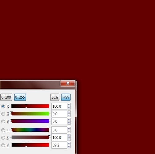
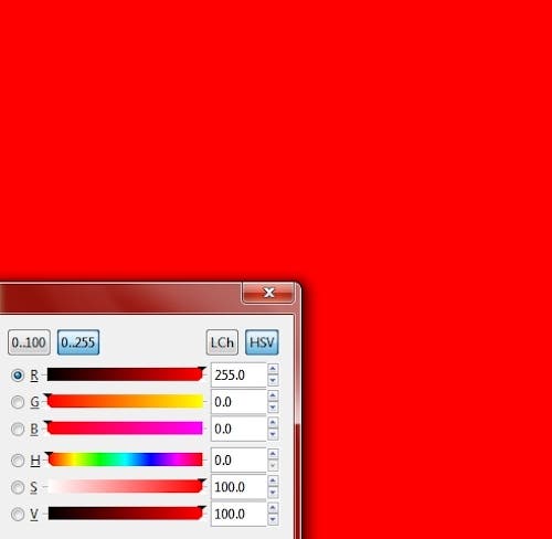
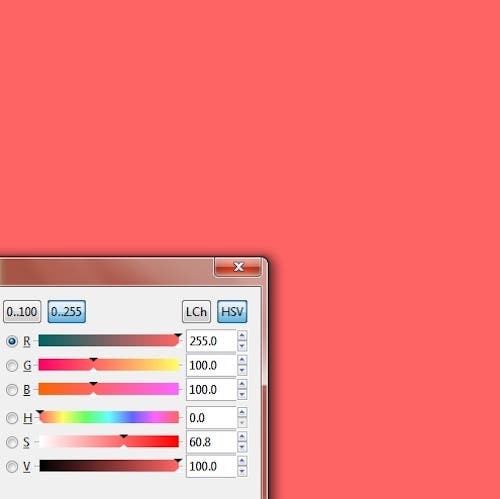
So, fully saturated red RGB (255, 0, 0) has 100 saturation and 100 luminosity, while RGB (255, 100, 100) has just 60.8 saturation and 100 luminosity and RGB (100, 0, 0) has 100 saturation but 39.2% luminosity.
How to Adjust Saturation in Photoshop
Before modifying the saturation in Photoshop (or any other photo editor), you must know that the editor applies color adjustments over the entire image and discards the original information. Therefore, color adjustments are considered destructive and should not be applied to the original image layer.
Also, if you want to increase or decrease the color saturation of an object (e.g., the sky) or area of the image, start by selecting the area you need to modify and isolate it in a layer. Then, apply saturation adjustments only on this layer.
In Photoshop, the saturation adjustment is in the same panel as the hue and lightness adjustments. To open the panel, select the layer on which you want to apply adjustments and do one of the following:
- Select Layer -> New Adjustment Layer -> Hue/Saturation from the menu bar
- Click on the “Create New Fill Or Adjustment Layer” icon in the Layers panel and select ‘Hue/Saturation’ from the options list.
Fix All Colors
The next step is to decide the way you want to adjust saturation. Photoshop allows you to change the saturation of all colors or just one color. To alter all colors, select “Master” from the drop-down menu at the right to the On-image adjustment tool.
Fix One Color
To modify only a color, select it from the same drop-down menu. The default color options are reds, yellows, greens, cyans, blues, and magenta. You can, however, choose a different color than the default ones. You can also change the coverage of the color by operating the adjustment sliders at the bottom of the panel. It gives you more editing freedom as no picture has a single shade of a color — not to mention the purest color. So, for example, if you want to increase the saturation of the blue shades in the sky, you’ll need to increase the saturation of the range of blues you have in the image.
To increase or decrease the saturation, drag the Saturation slider towards the right (higher saturation) or left (lower saturation). You can also introduce the saturation value by hand. The slider goes from -100 (100% desaturation, turns the color to gray) to +100 (100% increase of saturation, turns the color to a fully saturated one).
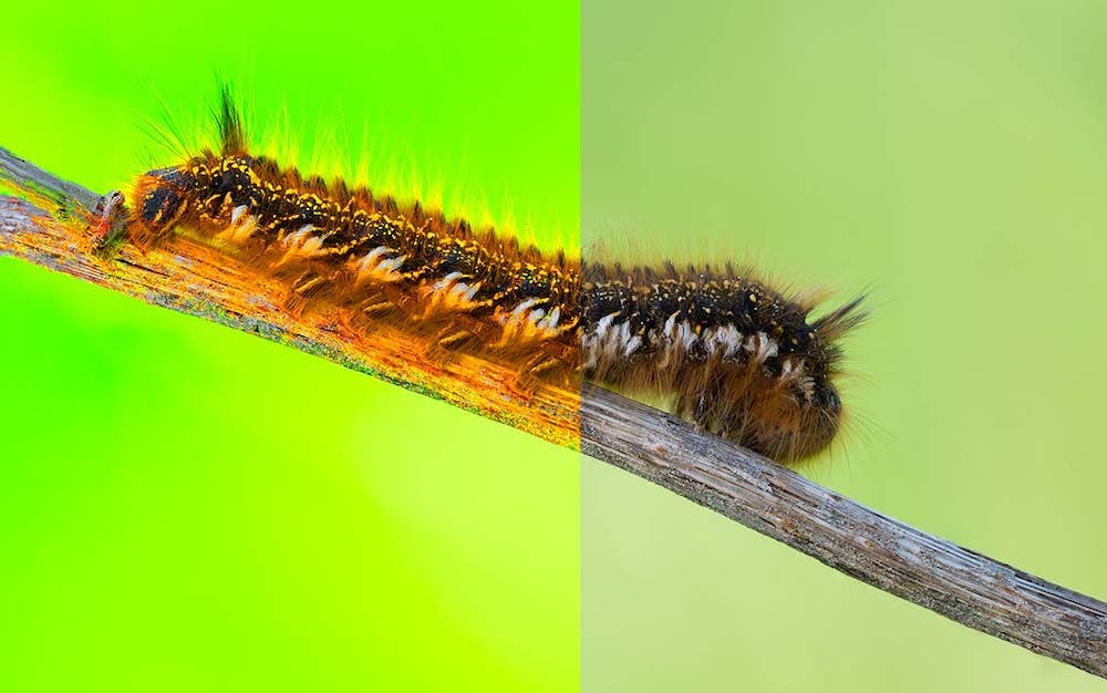
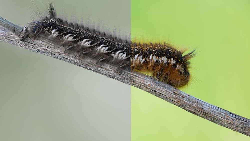
Note: Photoshop also provides a way to adjust saturation locally by brushing over the area you want to change. Choose “Sponge Tool” from the Tools menu, set its working mode to “Saturate or Desaturate,” specify how intense you want the change to be (“Flow”), and brush over the image.
How to Make Sure You Don’t “Overdo It”
Because it’s so easy to increase saturation and create vivid, strong colors, it’s also very easy to exaggerate and create artificial-looking photographs. The most common mistake is increasing the saturation of photographs so much that they seem taken on another planet. While sunset colors are beautiful, fake colors won’t get you too far.
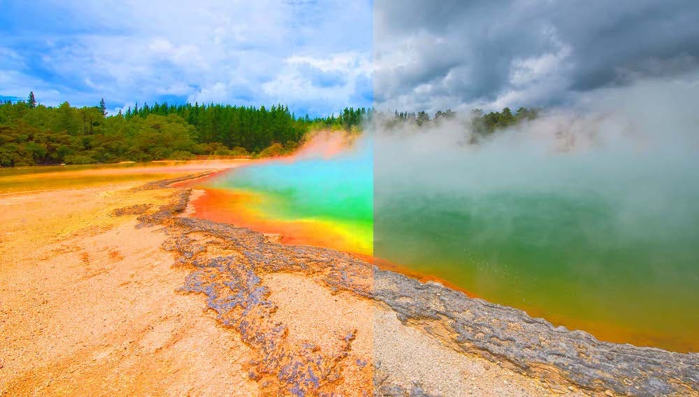
The best thing you can do to avoid increasing saturation too much is to make a purpose of delivering natural-looking images. Forget about what happens on social media and how other photographers’ photos look. Instead, focus on authenticity and create photographs that resemble reality. If you took macro photos of pale pink flowers, keep them like this. If the insects you found happened to be dark green, don’t transform them into phosphorescent specimens. Keep it simple, light, and natural.
So having good intentions is the first step. The next step is to know when to stop processing your photographs. Apply adjustments in small amounts and analyze the result of each adjustment. Most photo editors, Photoshop included, provide real-time previews, split views, and the entire stack of editing actions. You can go back and forth until you are satisfied with the result.
Also, remember you can increase the saturation only in the part of the image that needs it. With Photoshop’s Sponge tool, you can work at pixel level and control the process very well. Alternatively, you can use one of the selection tools to only affect the selected area. Other areas of the image may look fine just the way they are, and increasing saturation when they don’t need it may lead to exaggerated colors. Increasing the saturation of a single color may also help. Precise adjustments of key areas do much more than exhaustive adjustments of the whole image.
Conclusion
Photo editing has two purposes: improving the quality of your photographs by fixing mistakes and creating artwork by applying artistic effects. Adjusting saturation may stand in both categories. The difference is your intention. But regardless of your purpose, to use the tools provided by a photo editor, you need to understand how image information is stored and how to alter it.
From an artistic perspective, saturation is the beauty of a color, its intensity, and its flavor. From a technical perspective, saturation is a number. The mix of aesthetics and technical skills defines your photography style and artistic voice.


