Last year, we made a holiday video stitched from a series of still frames of my wife spelling out “H-A-P-P-Y–H-O-L-I-D-A-Y-S” with a pocket LED flashlight. It was very well received by our friends, and several people asked how we went about the Light Writing bit. So, here, well in time for the holiday season, is a step-by-step guide for making your own Light writing shots to make light writing videos, and even a light-writing font!
Here’s a Lightwriting video we made to illustrate and point to this How-To on Vimeo
We used iMovie, Garage Band, along with Adobe Bridge CS4 for the making of this video, but you should be able to easily translate these steps to whichever video, audio and photo browser you are most comfortable with.
Lightwriting How-To from Adorama Learning Center on Vimeo.
Click the HD is Off button to view this fullscreen over at Vimeo.com!
First things first: Making the Light Writing alphabetThe first thing you need to do is create your alphabet–both capitals, lower case, numbers, symbols, and any other special characters you may want: 5 point stars, 6 point stars, spirals, squiggles, smileys, and whatnot. Download this PDF from FontCapture for a full list of the 128 characters in a standard keyboard font. If you want, you can skip some of the accented letters and rarer special symbols in this list, but be sure to include anything you’re likely to use in your video titles and so on. FontCapture is very cool, and the original intent of this site is to easily turn your personal handwriting into a font, but we’re going to use it to create our light-writing a font in the second half of this tutorial.
You’ll need:
- A small LED flashlight for drawing out each letter.
- A sturdy tripod.
- A wide-angle lens for good depth of field.
- An SLR or EVF camera that can shoot long exposures up to 3 seconds each.
- Either a repeatable self-timer for your camera, such as this one for Canon SLRs, a friend to shoot each frame, or much patience to self-time and reposition yourself from each shot.
- An interesting background for ambient-lighting lightwriting videos, or some animation element such as the fire pit in our above example.
Making your shots:
- A long exposure of about 2.5 to 3 seconds is a good amount of time to allow you to neatly draw each character.
- Shoot at lowest ISO on your camera.
- Once your focus is set, switch to manual focus so the camera does not try to refocus between shots.
- Wait until nightfall is complete so that the ambient lighting levels stay constant, and adjust your aperture down to minimize ambient light, or keep it a bit wide if you want some of the non-lightwriting elements in the frame.
- Shoot medium or large JPG for quick and easy drag-dropping into iMovie.
- Consider black gloves to hide your hands during the shots.
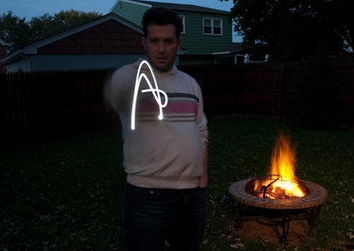
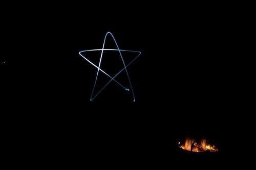
These two frames were shot with virtually identical settings (ISO 50 2 seconds/2.5 sec f/11) just minutes apart as twilight faded, but have completely different background exposures. Decide if you want any ambient light in your lightwriting videos and if so, pick an interesting background such as a decorated tree or lighting display. We chose to make the dancing fire the other focal point in our frame. Set your camera to its lowest ISO and set your shutter speed to 2.5 seconds and experiment with aperture to get the ambient lighting (or lack thereof) level to your liking. Wear dark clothing and gloves to totally “hide” yourself if you want the letters against a clean dark background.
Writing it all on the sensor
If you’ve set a repeat timer to make each shot, as I did, it’s just a matter of paying attention to the shutter click and drawing each letter when the shutter opens. When you’ve got a friend snapping each frame, you’ll know when it’s time to write the next letter. But here’s the thing to remember: Unless you plan on flipping each frame, you’ve got reverse each letter. Imagine that you are “writing” on a piece of glass to make it legible to those on the other side!
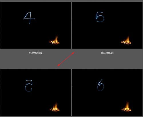
The 4, 5, and 6 that read properly here were drawn backwards. The 5 that is reversed in this screengrab was lightwritten so that it read correctly to me as I was writing it, so here it is wrong. Got that? Good!
If you think you’ve messed up on lightwriting a letter, don’t sweat it! Just repeat it a couple of times. It’s easier to redo now that trying to replicate it later!
Keep going, and make sure you get all the characters you’ll want for your customizable Lightwriting videos. Check with the FontCapture PDF to make sure you don’t miss any. And even more important: Don’t forget to include a couple of slightly different “blank” frames for spaces between words!
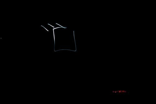
You can also make your own non-standard symbols or logos, or other little light drawings as source frames, if you want.
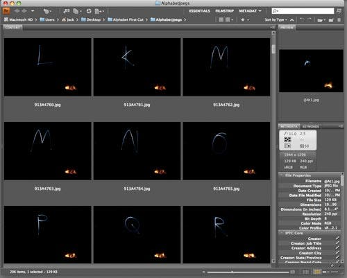
It’ll take some time to capture them all–there’s 52 letters, 10 numbers, and a bunch of symbols you’ll use in animated videos, and a total of 128 characters in a standard font, but eventually you’ll get them all.
I strongly suggest chimping away on your camera’s LCD to make sure you’re satisfied with each letter while you’ve still get the camera set on the tripod, so you can quickly add new frames of any letters or symbols that you’re not pleased with. Once you’re certain you’re happy with each letter and symbol, you’re done with the field capture part!
A musical interlude
I built a quick reggae-tinged wintry jingle in GarageBand using Loops, and if I can do this, I’d reckon just about anyone can, but that’s a story for another day. The point here is that you’ll need an audio track, whether you make something yourself in GarageBand, make a little audio clip of your own singing, or pull something from your iTunes library. Just make sure the audio for your iMovie project has been imported into iTunes before you start with iMovie.
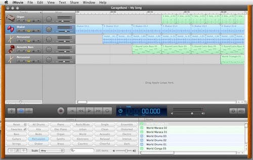
I’ve also been using this jingly tune in our seasonal adverts on our podcasts. Check them out!
iMade this video in iMovie
We used iMovie 8 for this project, but things are pretty much similar in iMovie 9 as well. We’re going to make a new project that matches the iPhone (3:2) aspect ratio of our Canon 1D Mark III SLR source images. If you shot on a 4:3 aspect ratio EVF camera, you’ll want to choose the Standard (4:3) ratio for your new project.
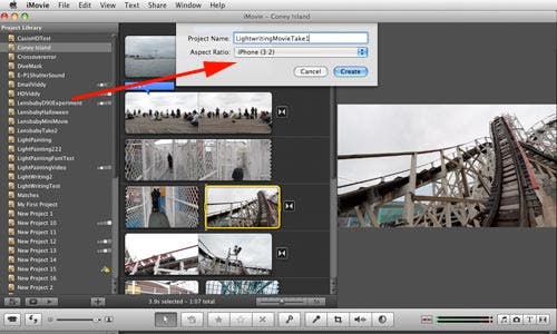
Remember to choose 3:2 for SLR-based shots and 4:3 for most EVF camera source shots for your Lightwriting video.
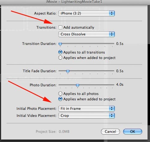
File>Project Properties… brings up this dialogue box. Uncheck Transitions and select Fit in Frame for initial placement.
Now for the fun part. Split your screen between your Bridge folder of source images and iMovie, and simply spell out everything you want to say by dragging and dropping your letter frames from Bridge to iMovie. Don’t forget to include your blank frames between words!
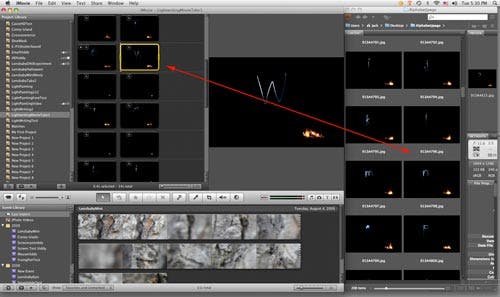
Drag-drop, repeat. Don’t forget your blank spaces between words, too! Notice the yellow border around the one frame? When we click on the clock icon it launches the prompt box below.
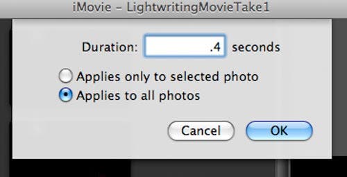
Change the duration from the 4 second default to much, much shorter time per frame. I find that .4 seconds is a good pace for comprehension/readability, but feel free to go faster or slower. But note that the maximum speed is .1 second, or 10 frames per second.
Once you’ve gotten your Light writing message spelled out, go crazy and add lead-in images, subtitles and all those other video sweetening touches to your video.
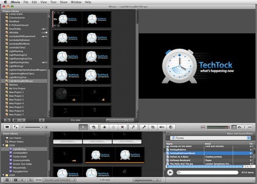
Notice that we’ve added in our TechTock Logo roll-in and roll-outs, and we’ve got iTunes up and ready in the iLife browser window with our HolidayRiddims.mp3 track ready to be dropped onto our video. Check out the green audio track indicator in the background of the next screenshot for our musical accompaniment.
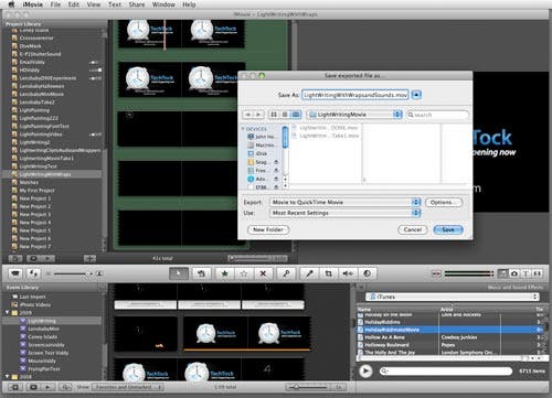
Our video is ready for sharing! We get it ready to send out into the world via the iMovie Share top menu. We select Export using QuickTime because we want to export this in 720pHD for fullscreen display, but you can export it any way you want for iPhones or mobile devices under the Share Menu.
But HD video has a different aspect ratio than our source video, so there’s one more important step for us to go the HD route! Notice the QuickTime Options button in the previous screenshot. We must Letterbox!
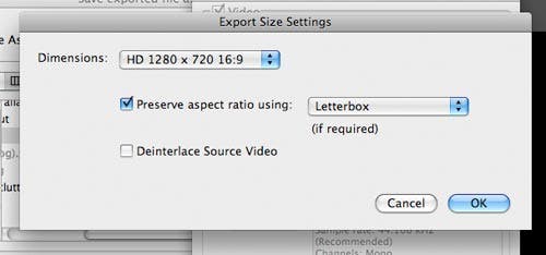
Since our final output size differs than our source video, we select HD 1280×720 16:9 video and check “preserve aspect ratio” and “letterbox” from the dropdown to make sure our images aren’t smooshed or cropped weird during video rendering.
And that’s all there is to making your own Lightwriting Videos. Once you’ve got the flow down, it’s easy enough to make totally customizable and personalized video greeting cards for everyone on your list!
Part II: Converting your Lightwriting still frames into a computer font
As we mentioned earlier, Fontcapture is a very cool way to turn any hard-lined artwork into a font. It was originally meant to convert your handwriting into a font, and that is a lot of fun. But you can also open the FontCapture PDF template into Adobe Photoshop and assign anything you want for each keystroke in your custom font, in this case, our Light writing characters. it takes a little bit of work, and a lot of patience to repeat the process up to 128 times, but I assure you, it’s a lot of fun once you’re done! If you want to do this yourself, you need the light writing to be against a clean, dark background with very little ambient lighting showing in the scene.
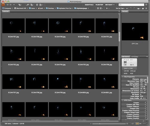
Start with the same folder of JPEG letters in Bridge that we used for the iMovie drag-dropping and open one frame into Adobe Camera RAW by highlighting the image in Bridge and clicking CMD+R or File>Open in Camera Raw…
Here we’ve selected capital “B” but it really doesn’t matter which letter or symbol you choose, so long as it is typical of the exposures of your light writing alphabet.
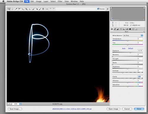
As you can see, we’ve boosted exposure just a bit to make the letter brighter all around and cranked up Clarity to +40 for crisply defined edges. But we all know fonts are supposed to be black-on-white, not white-on-black, so we’ve got to invert this image. And since we are only interested in the letters for copy-pasting for the Fontcapture Template, we’ve zoomed in, and we don’t care what happens with the exposure on the fire.
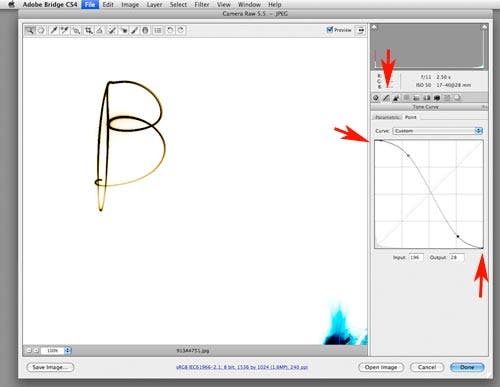
Now, this is cool. Click on the Curves button in ACR, and then the Point Tab. Push your black point to top left and your white point to bottom right to invert the image. Add an S-Curve to futher boost contrast and click Done. We’ve now got a negative of our original image that has a dark letter against a pure white background.
We’ll eventually have to go all-manual, but from here, it is super-easy to automate the inversion of the rest of our alphabet. Select all your alphabet images from the Bridge Folder and click CMD+R or File>Open in Camera Raw…
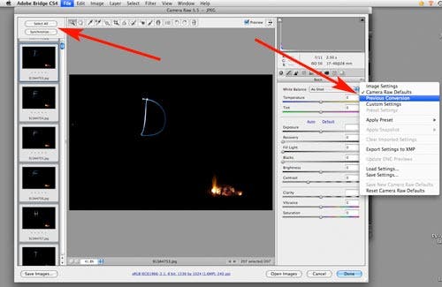
Automation is great! Click Select all in left column, then click Previous Conversions from the flyout box button next to White Balance dropdown, and in just a few minutes, ACR will apply the inversion settings from your first work-through to all the images in your folder!
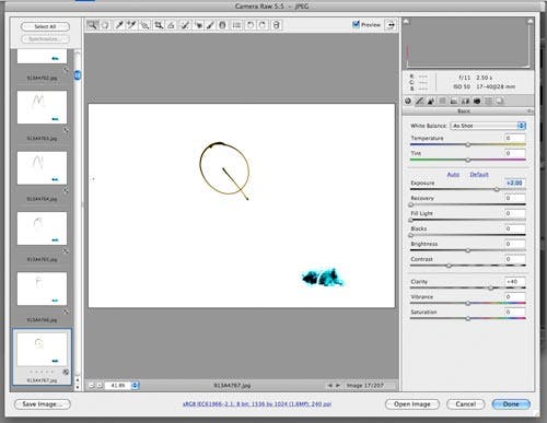
And there you go. All the shots are now inverted. Take the time to pull each one up and check for any minor tweaks you may need to apply to each image. And note well: many of the sliders in ACR will now respond exactly opposite of their normal behavior, since we inverted the curves.
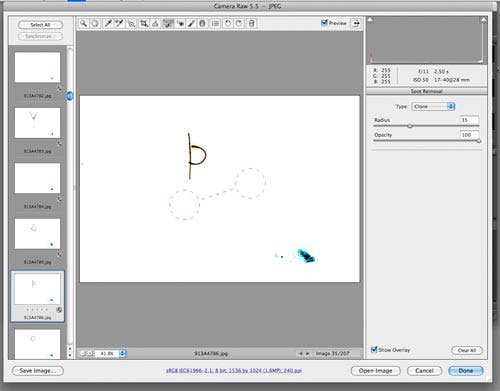
You may want to clean up any stray spots in the vicinity of each letter, or even clean up your “handwriting” a touch.
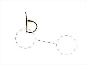
Zooming in, you can see we used the healing tool to get erase the part of the downstroke on our lower-case “b”.
Once you’ve gone through and made sure each letter and character is clean and crisp enough, it’s time to Save these inverted frames. Click the Select all button and then the Save Images button in the left column of ACR to launch the Save Options box:
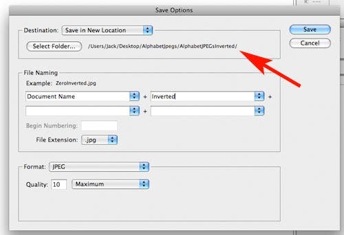
It’s easiest for organization for the next step if you save these inverted images into their own folder, so go ahead and create one as your save destination. I added “inverted” to the filename and we should Save these as maximum quality JPEGs.
After a while, ACR will have churned out all your inverted frames, and you’ll have a folder in Bridge with all your FontCapture source frames like this one below.
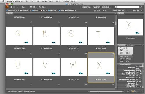
Copy, drag-drop, paste, scale and position. (Repeat approximately 128X)
Now for the drudgery. Remember our blank FontCapture PDF? You’ve got to open that into Adobe Photoshop.
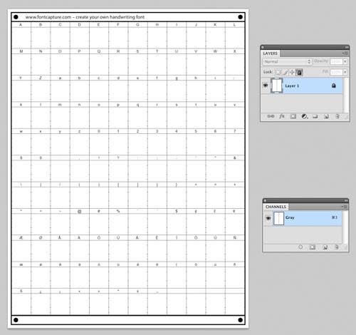
See all those little boxes? We’re going to assign one of our inverted character to each frame.
- Now would be a good time to take a quick look at this article on assigning custom keystrokes in Adobe Photoshop to these two operations: Edit>Transform>Scale and Layer>Flatten Image. We’ll be using these a lot. And also remember that there’s no shame in saving frequently during long operations in any program. Computers and programs do crash from time to time, so go ahead and Save a version of your FontCapture document after every few copy-paste operations.
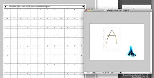
We open our first character, “Capital A” and make a drag out a marque selection. Then Copy the selection and click onto the FontCapture template.
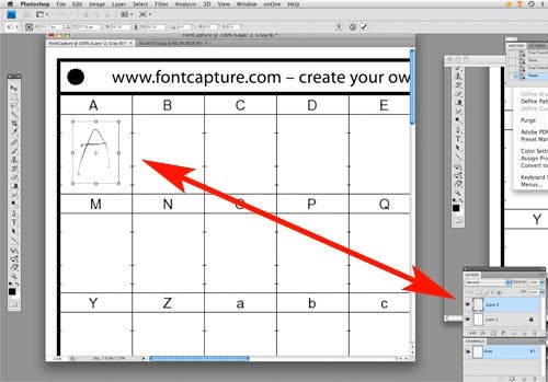
We Paste this into the FontCapture template and use our Edit>Scale>Transform Keystroke shortcut to scale and move the image into its destination box. Hold Shift down while scaling to constrain proportions during the scaling operation. Notice that each time you paste in a letter, you are creating a new layer. This document size will get big really quick if we don’t flatten it down frequently!
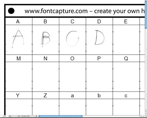
Open, copy, paste, scale and move, flatten and repeat, and repeat, and repeat. Be mindful of the lines in each box for maximum character height and descender depth to not clip off your characters. Remember to Save after every couple of characters, too!
An hour or so later…your template will be completed. Aren’t you glad for those keystroke shortcuts in CS4?
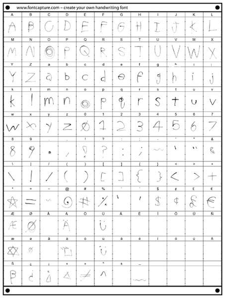
As you can see, we skipped a few of the accented characters and assigned our own designs to some others. But be sure to include both the umlauted “U” keys, which were our upright smileys in the video. Now Save it as a Portable Network Graphic (.PNG) or highest-quality JPEG.
Now for the easy part: uploading to FontCapture
Now that you’ve got your lightwriting font created, head back over to FontCapture.
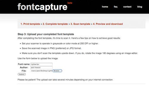
Simply upload your completed template, give it a name, and FontCapture takes it over from here.
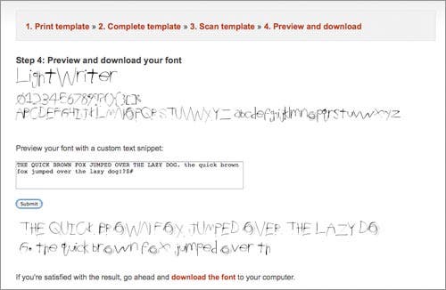
Go ahead and type out “THE QUICK BROWN FOX JUMPED OVER THE LAZY DOG” in both all caps and then again in lower case and numbers/characters to give a quick inspection of all the keystrokes. If satisfied, go ahead and click the download the font link. If any characters are cut off at top or bottom, go back to your template and resize or adjust the position of the character in the template. Then repeat the upload process.
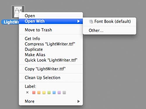
Once the file is downloaded to your MacIntosh, it’s a simple matter of right-clicking on the file, which will be “FONT_NAME_YOU_ASSIGNED_DURING_UPLOAD.ttf” Select Open with FontBook and you’ve installed your lightwriting font! Windows Users: Drag and drop the downloaded font file to your Windows\Fonts folder.
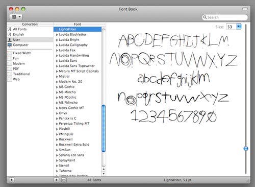
And there you go! We’ve now loaded our LightWriter font onto our computer. You’ll have to quit and restart most of your programs, including Photoshop, for the new font to show up in your list of fonts.
Fun with you new custom font
Right out of the gate, we’ve created a cool hand-written style custom font that has a lot of uses for fun projects. When it is dark-text on light background, it’s got a sharpy-marker feel, and when it’s light text on a dark background, it looks like it was light-written straight away, like the below shot shows.

Trust me, my light-writing is a heck of a lot easier to read than my normal pen-on-paper handwriting!
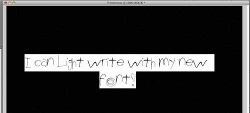
Check this out, we select our text with Adobe Photoshop’s Text Tool.
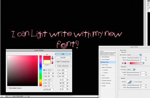
Clicking on the color box on the tool options bar allows us to bring up the color picker and change our green light-writing to a brighter red. And the Layer Style box allows for some different Layer blend effects for different feels, too.
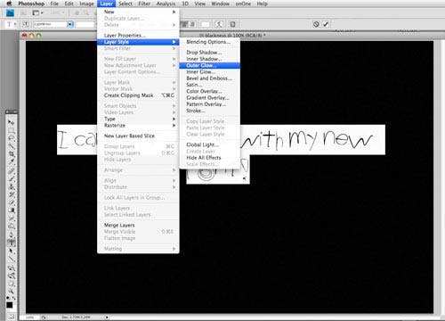
You can also choose Layer>Layer Styles>Inner Glow or Outer Glow for very realistic light-drawn effects with your Light-writing font.
Here, for example, I used my Lightwriter font with an orange tint with the Outer Glow effect to match the colors of Halloween.
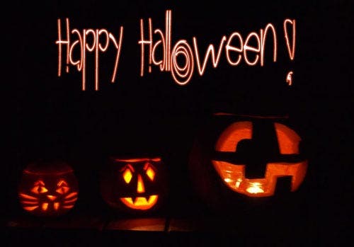
Of course, it’s just as easy to make the Lightwriter font look like holiday colors: bright greens and blues, sparkling whites and reds to add in cool, customized light-written messages your your holiday photos and cards!
Once you make your light-writing alphabet and font, it’s a lot of fun for all sorts of different projects. We’d be interested to see what sort of holiday-themed ideas and images you come up with, so feel free to share your shots over at our Facebook page.
Did you like this How-To piece? Was it easy enough to follow each step? Let us know!


