
There’s so much information out there about upscaling photos “properly.” Most methods concentrate on how the files look on the screen viewed at 100, 200, or 300 percent. In this article, I’m going to examine the effects of upscaling photos on final print output using a few of the most current popular methods. You’ll see a mixture of conventional and machine learning (AI) methods.
In A Beginner’s Guide to Professional Photo Printing, I offered some fundamental tips to get the most detailed and color accurate prints for your images. I brought up the concept of upscaling photos. This time, I want to compare how six different methods of upscaling affects the final print quality. I’ll also compare all those prints to a print made from the original, high-resolution file.
You can also watch the Adorama TV video below which includes a step by step through the downscaling and upscaling process.

Methods for Upscaling Photos
You’ll see in 4K resolution how the files look — first on screen, then in the final print. The six methods I’ll be comparing are:
- Manual upscaling simply by dragging the corner handles of the image in Photoshop
- Photoshop AI’s algorithm
- Lightroom’s algorithm
- Gigapixel AI
- BigJPG
- IMGLarger
Comparison Parameters
Let’s first go over a few basic ground rules and parameters for this showdown.
- The original image is a 9000 x 6000-pixel file (54 MP) RAW with the default sharpening of “20” applied in Lightroom and saved in high quality (level 10 JPEG) from Photoshop.
- The original file was then down sampled by a factor of 4 in the longest dimension to a resolution of 2250 x 1500, resulting in just a 3.375 MP file. The down sampling was done in Photoshop using the default parameters in the image resize dialogue box.
- This down sampled file was then up-sampled back to 9000 x 6000 pixels using the six different methods mentioned above.
- All seven files (the original and the six upscaled versions) were then uploaded to Printique‘s website and printed on metallic paper and then mounted on foam core.
Please note: I highly recommend using a reputable place like Printique to make print comparisons like this because you’ll know the final print quality won’t be because of the method used to make the prints. Printique uses top-notch, archival paper and ink that are extremely color accurate.
My Ranking
Based purely on the on-screen appearance, I ranked the output based on sharpness, contrast, and color accuracy, as follows:
- Original – The original — of course — is the best. The detail is naturally crisp with no appreciable “haloing” around high contrast interfaces. The file could be sharpened even further, depending on taste, with no appreciable adverse effects.
- Gigapixel AI & BigJPG – Both produce similar results with excellent detail and minimal sharpening artifact.
- Imglarger – The file is just as detailed as those from Gigapixel and Bigjpeg, but the colors were not as accurate with somewhat muted tones and a slight cool color cast.
- Lightroom and Photoshop – Both produced similar results, which is not surprising since they are made by Adobe. The micro detail and contrast weren’t quite as pleasing to my eyes as with the other software above.
- Manual upsampling – Not surprisingly, this produced the worst result on screen.
Let’s now consider the actual prints from these files. I asked three photographers and three non-photographers to look at the prints independently from two feet away and rank them.
Viewers Ranking
The results were all over the place! Somewhat surprisingly, the consistent “loser” was Imglarger. This is not because it lacked detail, but because the colors were somewhat muted when compared side-by-side to the others.
The manual upsample was also ranked toward the bottom. Although, two people (both non-photographers) ranked it higher than Lightroom and Photoshop.
What conclusions, if any, can we draw from this? We have to judge the findings in the context of some limitations:
- If I had made the prints even larger, there might have been more consistent results. However, I’m unsure of that. I chose 24” x 36” prints because — in my experience — most people don’t make prints larger than this. Also, this is about as large a print as I can see comfortably from a viewing distance of about two feet.
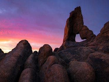
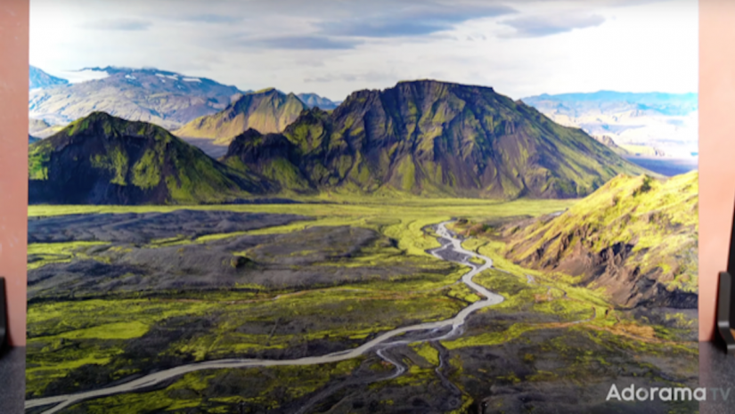
- Subject matter being printed may play a role. I limited my image to a landscape photograph. Perhaps portraits or wildlife images might behave differently.
- I started out with a clean, low-ISO file taken on high-quality equipment so I didn’t feel the need to make too many changes to parameters.
- I used JPEG files rather than TIFF files. Perhaps using TIFF files would have made some difference, but I’m doubtful. Besides, the online software in the free or trial version only allowed for JPEG files less than 5 MB.
Final Thoughts
Given the above limitations, here are my conclusions:
- For prints of landscape scenes, there’s very little difference in what method you use to upscale your images. If you already have Lightroom or Photoshop, I think you can utilize those.
- You should probably avoid resizing using a manual method.
- When comparing prints, colors and contrast seem to matter more — or those elements are more conspicuous than overall sharpness and detail.
- How detailed an image looks on screen at 100 percent (or more) will not necessarily translate to more appreciable detail in prints — at least up to 24” x 36”.
- Viewing distance matters. It matters quite a bit! This is perhaps one of the most over-looked and under-considered elements when people pixel peep on a screen.
- If you’re taking images for social media or to display on a high-resolution monitor, then resolution matters more than for making prints. This is almost counterintuitive because I always hear people argue the need for very high-resolution cameras. This is because they want to be able to make huge prints. I think we need high resolution cameras because we want to be able to crop with abandon and still have enough resolution to post online or display on our screens.