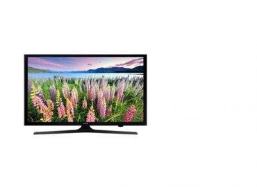
Color accuracy on your monitor is fundamental to working in the digital darkroom because we adjust images by their appearance. If the colors and tonalities in an image are not displayed accurately, you will adjust the image on the basis of false colors. And your prints, which will have the colors and tonalities that are really in the image rather than the ones you see on the monitor, will be somewhere between disappointing and a disaster.
Even though this image doesn’t have a lot of color, if my monitor did not show the tonalities in the light and dark areas and the subtle colors accurately, I couldn’t have made the proper adjustments necessary for a good print.

Getting prints that match what we see on the monitor is the ultimate goal for most of us. There can’t be a perfect match because the monitor is transmitted light and the print is reflected light. The monitor and printer also have different color gamuts, which means each can produce colors the other can’t. But within reason we can achieve a good and, importantly, a consistently repeatable “match.” Actually the goal isn’t to match prints to the monitor but to make both represent the colors in the image as accurately as possible.
The key to this is color management. To achieve it you need to be working with a “color managed” (or “ICC compliant”) digital darkroom application such as Adobe Photoshop. You need to have Photoshop’s Color Settings correct. And you need to have the printer’s auto-adjustment of image colors turned off. Printing was discussed in a previous tutorial: “Advanced Printing: Take Control.”
A profiling primer
The first step in color management is calibrating and profiling the monitor. No matter how new or expensive a monitor, it won’t represent colors accurately unless this is done. A monitor comes in a factory-calibrated state and often there will be a profile on the installation CD. However, the factory calibration settings are aimed at general uses, such as office applications, and are not suited for imaging work.
A profile which may have come with your monitor is not useful for digital darkroom work for several reasons: Any variation of the monitor’s calibration settings from factory standard, by its controls or by the video card settings, renders the profile invalid. (A profile is specific to a given calibration state.)
There is significant variation between individual monitors, even when new. And there are changes in the monitor’s display with age. You should re-profile every few weeks.
Profiles are also needed for printers, as discussed in the tutorial cited above. Digital cameras and scanners can also be profiled, but these are less critical than monitor and printer profiles unless you are processing large volumes of images, because you can correct for their quirks of color representation along with the other color corrections you make to each image.
Monitor calibration and profiling is done by software programs that work with a hardware measurement device. (There are software-only utilities such as Adobe Gamma, but they are not sufficiently precise for digital darkroom work.) The hardware device is hung in front of the monitor while a series of colors are displayed on the screen. The device senses if red is displayed too yellow or too blue, etc. This data is used to tell the video card how to correct the colors, which is handled by the operating system behind the scenes.
It isn’t rocket science
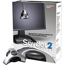
Profiling and calibration programs are easy to install and use, and work for both CRT and LCD monitors and notebook computers, and some will profile digital projectors as well. The most popular packages are from Color Vision, PantoneGretagMacbeth / X-Rite (These last two companies have merged and their products have undergone consolidation.)
I use the ColorVision Spyder 2 Colorimeter suite (right) to produce accurate colors on my Eizo CE210W ColorEdge 21.1″ Widescreen Color TFT LCD Graphic Monitor.
There is a range of products that cover needs from the enthusiast to the pro, and the manufacturer’s web sites contain tutorials and information on the use of their products. Some of the products use spectrophotometers to make the measurements while others use colorimeters. Although spectrophotometers are more sophisticated, colorimeters are quite sufficient for digital darkroom monitor profiling.
If you are already using a profiling application and it is several years old, you may want to consider upgrading as significant improvements have been made with the current line of products. Also, if your monitor is more than 3-4 years old it may be past its prime, as the display declines as CRT phosphors and gun intensity and LCD light bulbs age. A few years ago CRT monitors were better than LCDs for serious color work, but the newest middle- to high-end LCDs are now competitive and their prices have come down recently.
A two-step process
You often see the profiling process referred to simply as calibrating, but there are two steps in correcting a monitor: first calibrating, then profiling. Both are handled by the software. Calibrating gets the display as close as possible to ideal, then the program goes to work making the profile.
In all but the most basic programs you will be asked to make color temperature and gamma (midtone darkness) choices. For digital darkroom applications the recommended color temperature is 6500K. (The printing industry has different needs and standards, and uses 5000K.)
A low color temperature, such as 5000K will give the monitor a warmer (yellowish) appearance, and a high temperature, such as 9500K, will give the monitor a cooler (bluish) appearance. It may seem counter-intuitive that a lower temperature gives a warmer color, but color temperature is based on a black-body radiator, such as an electric heating element. As it begins to warm up it is red, and as it gets hotter it glows orange, then yellow, moving toward the blue end of the spectrum.
Setting the gamma
The monitor gamma value is recommended to be set at 2.2 for Windows applications. In the past it was recommended that Apple monitors be set to a gamma of 1.8, but now there are strong arguments for using 2.2. The 1.8 standard arose from the printing industry, as it more closely matches the response of a printing press. See the links at the end of the article for more information. You need to know that this monitor gamma has nothing to do with the gamma you may set in a printer dialog box. Don’t worry if they are different values.
The monitor profile is used in ICC compliant applications such as Adobe’s Photoshop, Illustrator and InDesign, and Quark XPress. These programs convert an image’s colors to the monitor profile for accurate display. Some other digital darkroom applications are also ICC compliant but I can’t vouch for all of them. Pictures in applications such as word processors, PDF files, e-mail or on the web are displayed using the monitor’s calibration but are not corrected by its profile.
Before you run a calibration and profiling program, there are some things you should check. Since there are so many differences in monitors and video cards, I can only give some generalizations: and
- Clean smudges off the monitor. (If you have an LCD, be careful to use only materials approved by the manufacturer. The surface of an LCD monitor is very delicate.)
- Dim the room lights and make sure there is no glare on the screen.
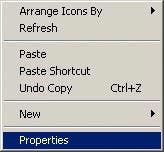 Right-click an empty spot on your desktop and click Properties to open the Display Properties window. (I am showing a Windows system here. On a Mac, open System Preferences and click Displays > Color.) For some users there will be other options in this window that allow you to access the video card settings. That is also possible in one of the tabs shown in the last figure below.
- Click the Settings tab as shown below and make sure the color quality is set to Highest (32 bit.) While you are here, if you have an LCD, check the resolution and make sure it matches the native resolution of your monitor, which will be given in the manual. If you have a CRT you can set it to any resolution you prefer, but you may want to avoid 1280 x 1024, as squares and circles will be slightly distorted at this resolution. (On a Mac, in the Displays dialog box click Display.)
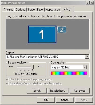
- Click the Screen Saver tab (shown below) and turn off any screensavers, then click the Power button and turn off any energy-saving feature that shuts down the monitor after a certain idle time, so you can let it warm up before calibrating: at least half an hour for CRTs, a few minutes for LCDs. You can reset everything after the profiling is done. (On a Mac, go to System Preferences > Desktop and Screen Saver > Screen Saver.)
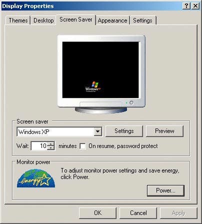
- Go back to the Settings tab and click Advanced.
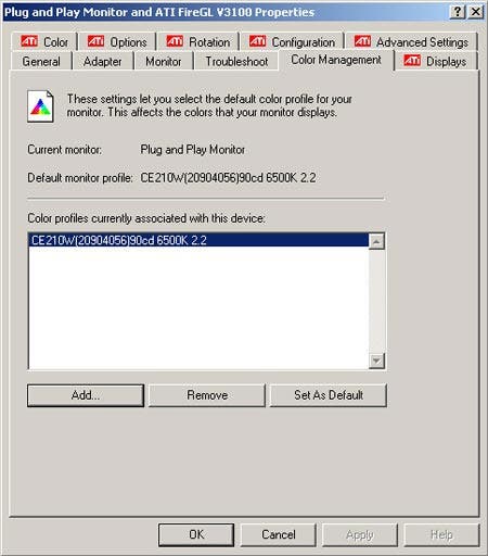
- Click the Color Management tab and if there is a profile associated with the monitor, remove it. Be sure to click Apply if it is not grayed out. (On a Mac, click Preferences > Display > Color.)
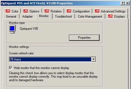
- If you have a CRT, click the Monitor tab and check the refresh rate. It is usually set to 60 Hz by default, which can cause an annoying screen flicker. Setting the rate to 72-75 Hz will get rid of the flicker. (Check the monitor manual; if the refresh rate is set above its maximum tolerable level you can damage the monitor.) For an LCD monitor on a digital output from the video card, this is not an issue.
- Turn off anything else that might pop up on the screen while the calibration is running. It pays to keep an eye on the screen while it is running. It only takes a few minutes.
- Don’t use a front USB port for the calibration device, or a port on a hub or on the monitor. There can be insufficient power on these ports and it can appear that the profiling program has run correctly but a null profile may be generated.
- Check that Adobe Gamma is not in the Startup file. This is a set of utilities that starts when Windows starts and lurks in the background, performing various tasks behind the scenes. If Adobe Gamma is allowed to run it will override the calibration! Go to Start > Programs > Startup. If Adobe Gamma is there, right-click it and choose Delete. If you subsequently install an Adobe image editing product, check to see if Adobe Gamma has been put back in the Startup menu.
- Carefully read and follow the on-screen instructions for the calibration utility. Be careful to follow the directions for attaching the sensor to the screen, which is different for CRTs and LCDs.
- While the program is running make sure the mouse cursor is not in the area where the color patches are displayed.
Double-check the profile
After you have done the calibration, check that the new profile has been properly installed and set as the default. The software attempts to do this for you but sometimes Windows finds a way to interfere with it. As shown above, right-click an empty spot on your desktop and click Properties. Click the Settings tab, then click Advanced. Click the Color Management tab and make sure the profile you made is shown as the default. If it isn’t, click Add and highlight it, and click Set as Default. (On a Mac, click Preferences > Display > Color.)
A few more guidelines
In order to get the best results from your profiled monitor, there are a few things you should be aware of:
- Don’t change any monitor or video card settings after the profile is made. Doing so changes the calibration and renders your profile invalid.
- If you have a dual monitor setup only the primary one will use the profile.
- You should redo the calibration every 2-4 weeks for older CRTs and perhaps every few months for newer LCDs, or if any settings on the monitor or in the video card are changed.
- The appearance of an image on a consumer grade LCD monitor can change drastically as you change your viewing angle, especially the angle at which it is tilted up or down. (This is a major problem with laptops.) If this is a problem with your monitor you might want to consider a better one. Otherwise you will need to find the tilt angle at which you have the best discrimination of dark and light tones and keep that as your viewing angle.
- You can get a rough idea of the success of your calibration and profiling by looking at this gray wedge. It should show all values equally spaced in tone and neutral gray.
![]()
- As you work on images, room lighting should be dim with no reflections on the screen. You should cover windows to keep the light dim in the day and consistent between day and evening. I use “blockout” cellular shades, which are widely available, inexpensive and very effective.
- The colors you perceive on the monitor are influenced by colors in your field of view. Keep the area in your peripheral vision around the monitor dimly lighted and banish bright colors.
- The colors you perceive in an image will be influenced by colors surrounding the image on the screen. Maximize Photoshop so its neutral background hides the computer desktop, or set the desktop to gray on Apple computers. Evaluate an image’s color by using the “F” key to toggle from the normal display to solid gray and black backgrounds for your image, and use the Tab key to hide the palettes.
- In order to accurately compare prints to the monitor you need to view them under light that is neither too bright nor too dim. Its brightness should be such that a white area on the print appears to match a white area on the monitor.
- The color temperature of the ambient light around the monitor should be similar to the monitor’s white point.
- The colors of a print will appear to change with the temperature of the light under which it is viewed.
Find the right white point
You see recommendations for evaluating prints both under D50 and D65 lights. These are the spectral equivalents of 5000K and 6500K monitor white points. Both these temperatures are cooler than tungsten light, and close to daylight. For commercial color work a D50 viewing booth is used, but for most digital darkroom purposes D65 is becoming widely accepted.
For more information see the link below to Alpenglow Imaging. D65 lights are easy to find in office supply stores and on the web. In lieu of using a viewing booth to evaluate your prints, you may find a low-intensity D65 desk lamp with dim ambient light suits your needs.
Whether you are a casual hobbyist or a pro, profiling your monitor is the most important thing you can do to remove frustration from your digital darkroom experience. If your prints still don’t match the screen after following the above guidelines, don’t try to tweak the screen’s appearance. There is a chance the problem is an old monitor that can’t be calibrated properly or a video card that doesn’t support profile usage, but these are highly unlikely with any decent computer less than 3-4 years old. The problem is most likely in your printer settings. See my tutorial, “Advanced Printing: Take Control.”
For a complete guide to a color managed workflow I highly recommend Tim Grey’s recently updated book “Color Confidence 2nd Edition” (www.timgrey.com.)
You can find background information on monitor calibration recommendations for the digital darkroom at Alpenglow Imagingwww.dl-c.com.
Diane Miller is a widely-exhibited freelance photographer who lives north of San Francisco, in the Wine Country, and specializes in fine-art nature photography. Her work, which can be found on her web site, www.DianeDMiller.com, has been published and exhibited throughout the Pacific Northwest. Many of her images are represented for stock by www.MonsoonImages.com.


