Adorama Camera
Adorama Learning Center
Techniques and How-Tos
PhotoZAP: We Critique Your Photos
PhotoZAP 32: The View From Kilimanjaro

PhotoZAP 32: The View From Kilimanjaro

Back to PhotoZAP: We Critique Your Photos page
Average: 5.0 stars
 

Our critics praise and pan your pictures

By

“This is a great shot from a pocketable camera!”  —Jack Howard


Bookmark and Share

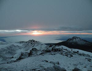
© James Prutilpac, Rochester, NY. Gear: Nikon P80, handheld. Exposure:  f/3.5 at 1/60 sec, ISO 64, metered manual.

Photographer’s Statement: “This picture was taken around 6:30 a.m. at roughly 18,700 feet. I was hiking to the Uhuru Peak, Kilimanjaro. I was about an hour from the summit and was going on an hour of sleep with 10 hours of hiking behind me and another 4 in front of me before I would get sleep for 1 and then wake up and do another 3. I was so exhausted, I had to go through my photos because I didn't know what shots I had even captured. I chose this shot because of the beauty it holds for me and less about quality. This trip sparked my passion for photography and now I'm trying to make all my future shots better.”

Our critics say…   


Mason Resnick: What an amazing experience this photo represents and what a breathtaking view this must have been! However, the light comes across as flat, and the horizon in the center of the image is a compositional no-no. Go back and re-shoot! (I'm kidding!) I’d crop this shot and goose the exposure in Photoshop. In the very rough version below, I increased contrast and color saturation, and tried to lighten the lower part of the image to pull up more detail. I also changed the aspect ratio to 3:2 to emphasize the panoramic nature of the scene and bring the horizon closer to the top third of the frame.


Monica Cipnic: Quite an accomplishment to have climbed this peak, and you have a special memory of all that you went through when you view this photograph. I agree with Mason's crop, increasing the color saturation and contrast, and opening up the foreground--all the better to see your climbing companions, and this awe-inspiring view.

Jack Howard: This is a great shot from a pocketable camera! I agree with a lot of what Mason and Monica say so far, but I want to take this even farther. 3:2 crop? Why? There's so much gray sky, but great cool twilight blues in the foreground that I say we go with just the sunbreak slice of the sky and a 16:9 HD crop on this shot. I'd also agree with boosting the saturation (or preferably Vibrance) a touch in some image editor. Here's a quick tutorial on cropping to fixed aspect ratios in Photoshop CS4, Elements 8, LR 3 Beta and Adobe Camera Raw.


What do you think? Leave a comment!

SHARE THIS ARTICLE

Forward this article to a friend
To use this functionality you should have JS enabled
Bookmark this page

Reader Rating and Comments

9 readers rated this article. Average rating: 5.0 stars
 
  • View
  • 9 comments
1 of 1 people found this comment helpful
 
I agree with the critics

The top gray part of the image is only useful to set the mood, frame the image, and balance the bottom tones. However, if you do not crop out much of the gray sky then the image it is not bottom weighted or balanced. Instead, the original is equalized and detracts from the minds perception of a landscape. Without cropping, the original feels as though you are looking through a tube. The cropping better bottom weights the image and more closely reflects what we would see from being there. Stand outside and look straight and you will notice that the sky is not equal with the ground unless you look up. By cropping the sky, it feels more like your there.

by in Clearwater, Fl on

2 of 3 people found this comment helpful
 
Little of both

I agree to lighten the snow right in front of the photographer, and maybe a tiny bit in the horizon. Maybe crop a small bit from the top of photo....or just let it alone. Unless you're a fanatic, the original photo is pretty good from a p&s camera. Good work.

by in Hill Country, TX on

2 of 2 people found this comment helpful
 
Great Shot!

I like the original shot better. Time of day says it all. The revised version, I think, takes that away. The colors of the sun now look washed out and the whole feeling is gone. It's the contrast of orange/pinks to blue/grays that make this shot. Nice job James.

by in Wilmington, DE on

2 of 2 people found this comment helpful
 
Incredible Image

I have to agree with Gluhwein. The original shot conveys a sense of infinity in the darker gray sky. The rule of thirds is not a steadfast rule that must be followed every time. In this case I think the original photo is more moving than the cropped version. I also wouldn't crop the foreground as it contains the rough rocky area which anchors the photo and keeps your eye moving around the image. Just my thoughts and I'm not a professional by any means.

by in Nacogdoches, TX. on

1 of 1 people found this comment helpful
 
More Real

The first image seems more real to me. A bit darker like maybe thats how it was. Cutting off the sky does not improve the image for me. I think there is more a sense of the forlorn in the full shot. The other crop looks like a travel magazine crop. I like the feeling of the original.

by in Tulary County, CA on

3 of 3 people found this comment helpful
 
This is a very nice shot!

I think the picture would look much better if you cropped it from the top by about 1/4 – eliminating half of the gray area. I would not crop anything from the bottom. I agree here with Jack on more horizontal format, which would emphasize the peaceful and majestic nature of the view. There are some small details in the right lower part which require the viewer to search for them and are almost unnoticeable – other hikers? I think they can add a great deal to the picture if you can expose them. Try to lighten up that area a little bit, but not too much, or else it will look unnatural – experiment is the key. I like the picture with its current neutral tones -IMHO. Mason’s version would probably be more popular.

by in Tampa on

1 of 1 people found this comment helpful
 
Appreciate the Shot

What camera you use has little to do with how the man got there to take it. The original says early light to me while the re-do looks like it's later in the day. Kudos on this event, James.

by in Southeastern PA on

0 of 2 people found this comment helpful
 
Keep the flat light

I agree that the horizon needs to raised but love the dark dead light that conveys cold and a little fear. In fact I would trim some off the bottom to emphasize oppressive negative space at the top.

by in slcbennett@gmail.com on

1 of 1 people found this comment helpful
 
I love it

It's obvious I'm not a photographer because I think it's damn near perfect. I'll agree the tweaks the pros made make it look better, but I think it's awesome in its raw state too.

by in Pocono Mountains, PA on

Items per page
Showing 9 of 9 results

Was this article helpful?

Rate this article

Your rating:

Post a comment

*required fields
Bookmark this page