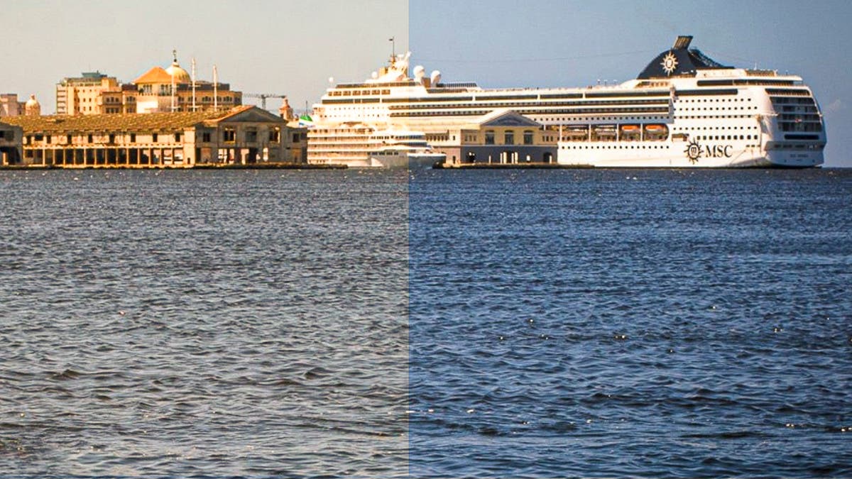
Color accuracy isn’t just about aesthetics — it ensures consistency, crucial for conveying the right mood and message of your work. You rely on a monitor that’s connected to your computer, smartphone, or tablet. You want it to show you an accurate representation of the hues, color saturation, monochrome tonality, contrast, and more. An uncalibrated monitor often skews your color balance. It might wash out specific colors, make others overly intense, or apply an overall color cast to your images, as Figures 1 and 2 demonstrate.
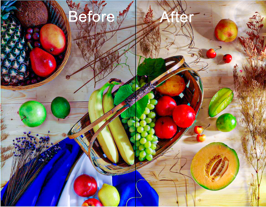
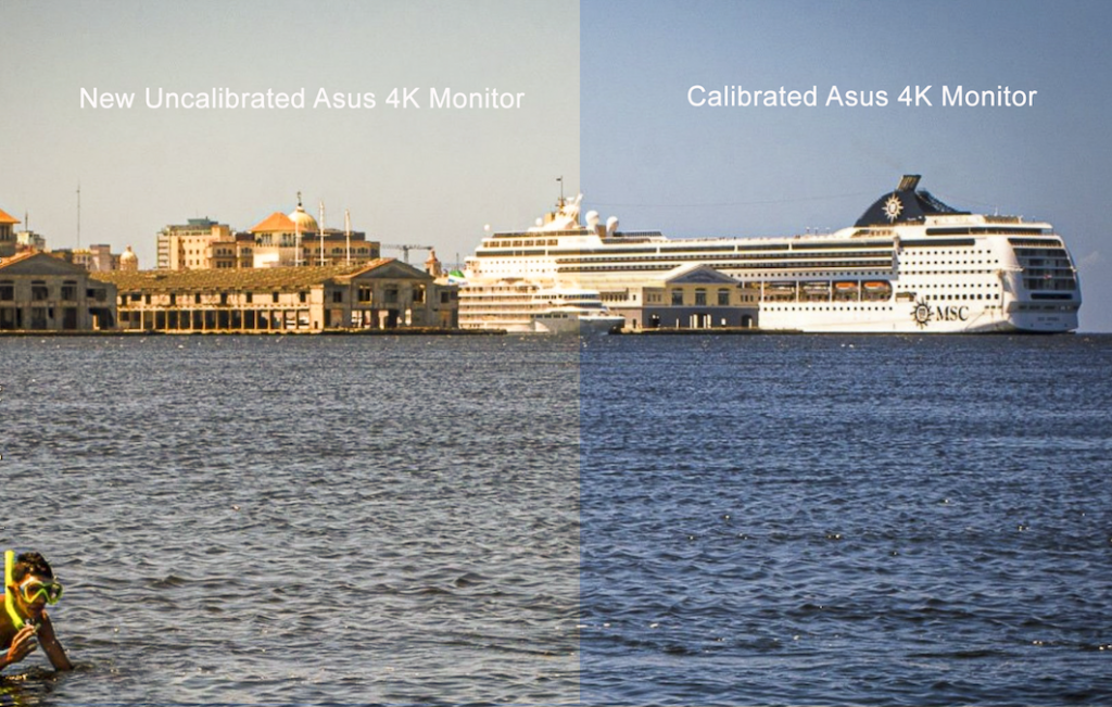
Not long ago I purchased an ASUS 4K TUF Gaming monitor. The first thing I did was load one of my images as the home screen background. Then I made a full screen shot. Afterwards, I calibrated the monitor using a Datacolor SpyderPro. Comparing Figure 1 with Figure 2, it should be apparent that the uncalibrated Acer monitor in Figure1 has a cool tint and the uncalibrated ASUS monitor in Figure 2 has a warm tint. No two monitors are the same. So, don’t count on them to be calibrated out of the box.
I frequently host on-screen reviews and critiques for workshops, camera clubs, and private portfolio sessions, often online. To guarantee that my screen’s hues, tones, and contrast match the student’s display exactly, I maintain a strictly calibrated monitor. In fact, I recalibrate (ReCAL) my display before every single session. It only takes about three minutes, functioning just like a musician tuning an instrument before a show. Since a shared baseline is vital for a good critique, I always ask students if they have calibrated their monitors before we start looking at their work.
Protecting Your Artistic Legacy
If you are reading this article, it means that you are serious about the images you create. It means you are someone who has fallen in love with photography, an art form that allows you to explore and record the world in which you live. It means you harbor the hope that your images will have meaning for those who view them. That you will be remembered for having created them.
It also means that you are likely reviewing and correcting your photos in an editing program before you share them. Considering that down the line a curator, gallerist, or art collector may be viewing your work online, you want your images to appear to them as they do on your screen. Assuming their displays are calibrated as they should be, if yours is not, your images will look as different as the images in Figures 1 and 2.
Now, supposing you send hi rez files to a pro lab to make prints for a show. A Pro Lab always profiles their printer. So, what appears on their screen is as close as possible to what appears on their reproduction. Let’s say you send them something that looks good on your uncalibrated screen. If it looks too warm or cool on their screen, that’s what you’re going to get on your print.
Some online “experts” brag that they never calibrate their screens or printers because they “like the way their prints look,” even if the tint, hue, and saturation are not what’s on their screen. This means they are either not clear about their message, or don’t know how to use the tools at their disposal, justifying their lack of skill by accepting whatever comes back from the lab or their printer spits out.
Considering the above, consider the implications of the warm and cool tints in Figures 1 and 2. A warm tint draws the viewer in; a cool tint creates a distance. Both are valid, but which message is the photographer trying to convey to the viewer? If the photographer doesn’t care, then their message is irrelevant.
Calibrating Your Monitor
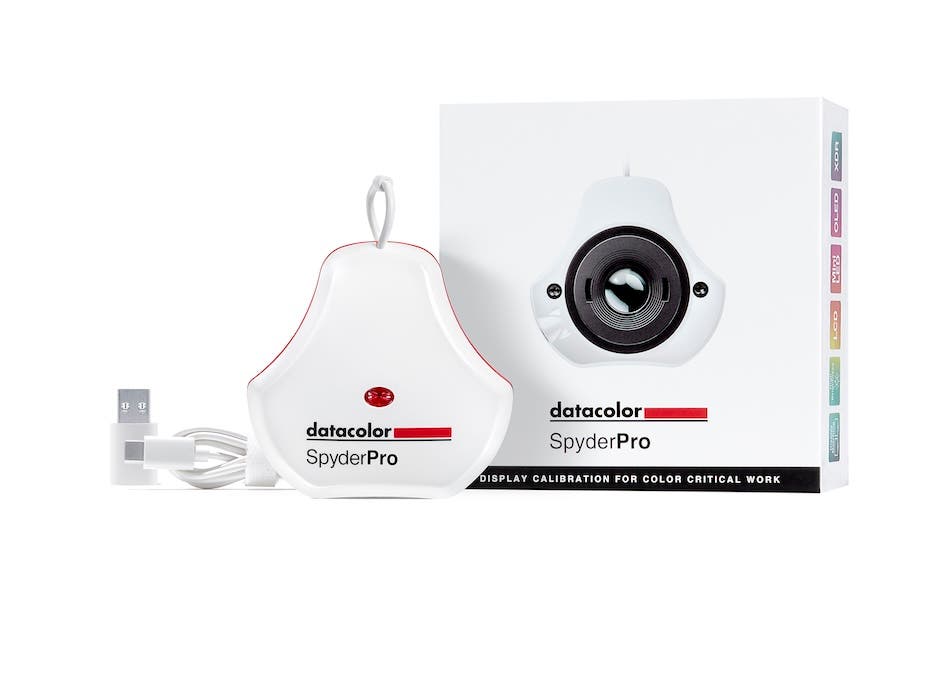
There are several monitor calibration devices available. Among them are the Calibrite Display 123 Colorimeter, Calibrite Display Pro HL Colorimeter, SpyderExpress, and SpyderPro. This article will focus on the SpyderPro, as I have been using the Datacolor system since Spyder 3 was introduced in 2007.
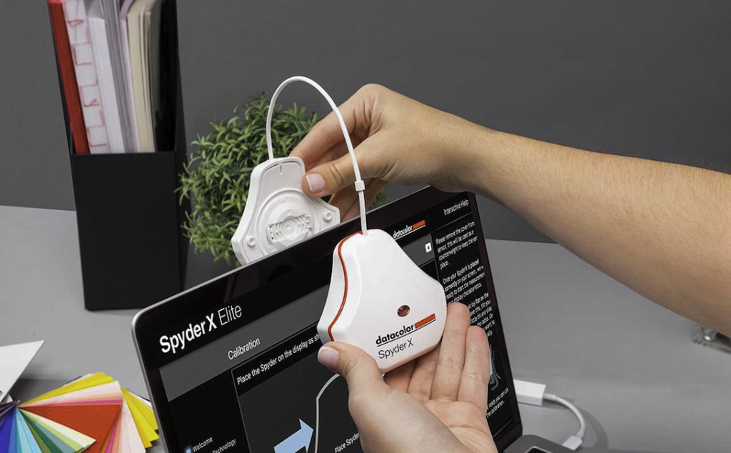
Calibrating using SpyderPro is one of the easiest things you can do in digital photography. There is virtually no learning curve. Once you have gathered a few pieces of information about your display, downloaded and installed your SpyderPro software, and attached the colorimeter to your device, you can open the program and begin. Datacolor will walk you step-by-step through the process with prompts and instructions.
The first time you use the program you will require your serial number. This can be found in the bottom of the box the unit came in.
You will also need to know what type of display you are using. You can usually find this out on the Display Specifications website. As a final resort, Datacolor will read your display and make a recommendation.
Navigating Brightness Controls
During calibration you will be asked to adjust the display brightness based on the ambient light. If you have a detached monitor, before you begin, learn to use the buttons or toggle switches on the front or back.
If you are using a laptop or any display that does not have manual controls, use the following method.
With a Windows laptop open Settings > System > Display. With a MacBook, open Control Panel > Display. Drag the brightness slider to 100%. Leave the window open so you can access it later during calibration.
If you use a laptop or a detached monitor without manual controls, wait until the calibration software prompts you to adjust the brightness. At that point, press Alt+Tab (Windows) or Opt+Tab (Mac) to switch from full screen to the Settings or Control Panel window you opened earlier (see the previous paragraph). Move the display slider to the left to lower the brightness, and then press Alt/Opt + Tab again to return to the Spyder brightness screen. Repeat these steps until you bring the brightness within a point or two of your target.
With my laptop’s slider, I can get as close as one point from the recommended 180 cd^m2 brightness level. Using the Fn keys I can’t get within 26 points.
Ambient Light
In the motion picture film industry, rooms are intentionally kept dark to mimic the way movies are meant to be seen—in a darkened room. Keyboards are illuminated to see in the dark and usually shielded so that the light doesn’t spill over onto the screen. But for general viewing in a lot of different situations that you cannot control, editing in a fully darkened room is not necessary.
Adjusting ambient light in the room will help with display calibration and image editing. If the room is too light, you will tend to make your images too dark. Conversely, if the room is too dark your images will tend to be too light.
If you create images for general viewing, that is, in a variety of lighting situations, then dim the lights in the room where you are calibrating your monitor, but don’t make the room so dark you can’t see the keyboard or mouse. For editing, I turn off all unnecessary lights and close the window shades. I also recommend shielding your monitor from any additional ambient light using a monitor hood.
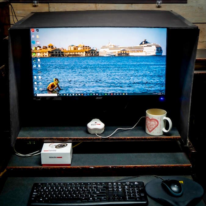
You can purchase a custom hood from PhotoDon or you can make your own out of black Foamcore and duct tape, Figure 5.
Final recommendations
- Allow your monitor to warm up for about 20 minutes before calibrating.
- Reset the monitor’s On-Screen Display (OSD) settings to factory defaults.
- Turn off “Eco Mode,” “Dynamic Contrast,” “Vivid Mode,” and any other auto-brightness features.
- If this is the first time you are calibrating a monitor, use FullCAL. If it has been previously calibrated you can use ReCAL.
- Use Datacolor’s recommended presets for gamma (2.2 for both Mac and Windows), color temperature, and brightness
- Choose a target color space of sRGB (or Adobe RGB if your monitor supports it).
- Recalibrate once a month or prior to any important editing of your images (it only takes about 3 minutes).
Monitor calibration may appear to be one more thing that takes time and money. Time you’d rather spend editing, and money you’d rather put towards a new lens, printer, or camera bag. But if you have something to say with your images, and want to be clear about your message, then consider monitor calibration as an investment in your digital workflow, as much as SSD drives for storage, SD cards for capture, and extra batteries are for your camera.
Steve Anchell is an internationally published writer, award-winning photographer, and teacher with work exhibited in more than 61 exhibits. His next workshop, Delta Blues, October 3 to 10, coincides with the longest running blues festival, The King Biscuit Blues Festival.
Steve has five books on photography published by Focal Press: The Darkroom Cookbook 5th Edition, The Film Developing Cookbook, Mirrorless Interchangeable Lens Camera, The Variable Contrast Printing Manual, and Digital Photo Assignments.