In the early days of my photography journey, I received a phone call from a senior photographer. He constructively critiqued the photos I had just published on social media and offered tips on post-processing. He also emphasised the importance of going through a checklist before publishing my photos online. When sending them to clients or printing them. Though criticism is not always easy to accept, it was my first conscious recognition of the power of post-processing. Thus, the start of a lifelong adventure of learning and creative fun. Let’s explore some of the most important things to do before publishing your photos.
Many beginners tend to underestimate its significance, or feel that they are cheating. This can result in images that aren’t showcased to their fullest potential. Let’s disabuse ourselves of the stigma often attached to post-processing, which is an art form of its own. I will summarise the process I use to enhance my photos before sharing them with others.
Work on Sections, Not the Whole Image
Divide your photo into sections based on interesting elements in your composition. Whether you’re working with a landscape, a photo of a model, a street scene, a portrait, or an object, ask yourself if you have treated every part of it. For instance, the foreground, the background, the subject itself, the corners, and the space around the subject. A well-edited image possesses many qualities, such as contrast, highlights, shadows, colour tones, saturation, etc. Software like Adobe Lightroom provides linear and radial gradients, as well as brushes.
Selection Made Simple
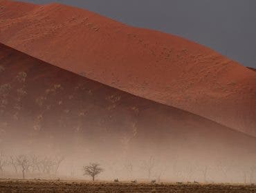
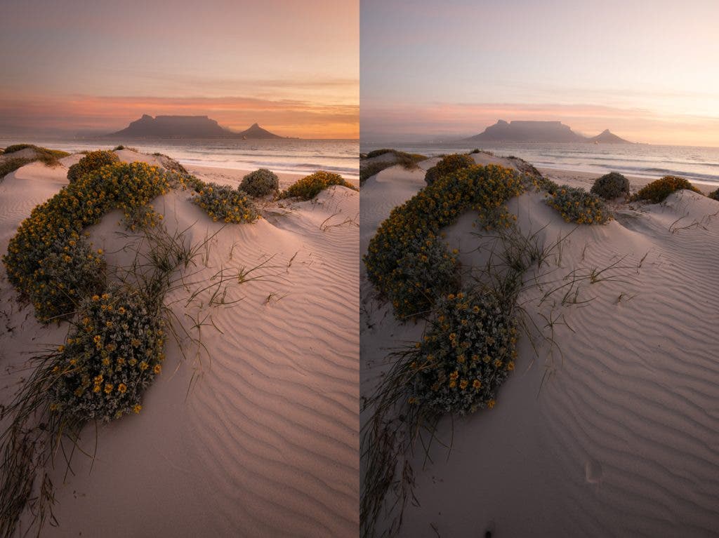
With AI, it is easier now to select the subject, background, sky, people, and different parts of the human body. These tools are there for a reason, i.e., to give you control over all the qualities mentioned above. Check the before and after of the image below: the foreground sand patterns, the middle ground flowers and parts of the ocean, and the background mountain and sky, each of which was edited separately. Certain parts were lightened, certain darkened, certain had an increase in contrast, others were given a temperature change.
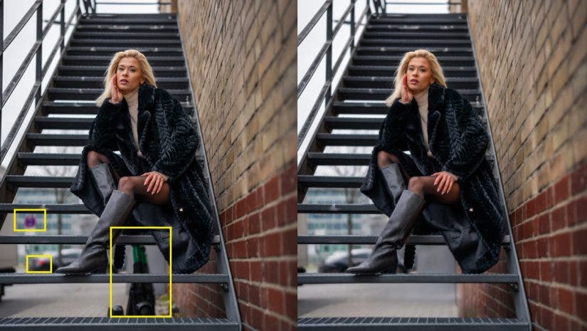
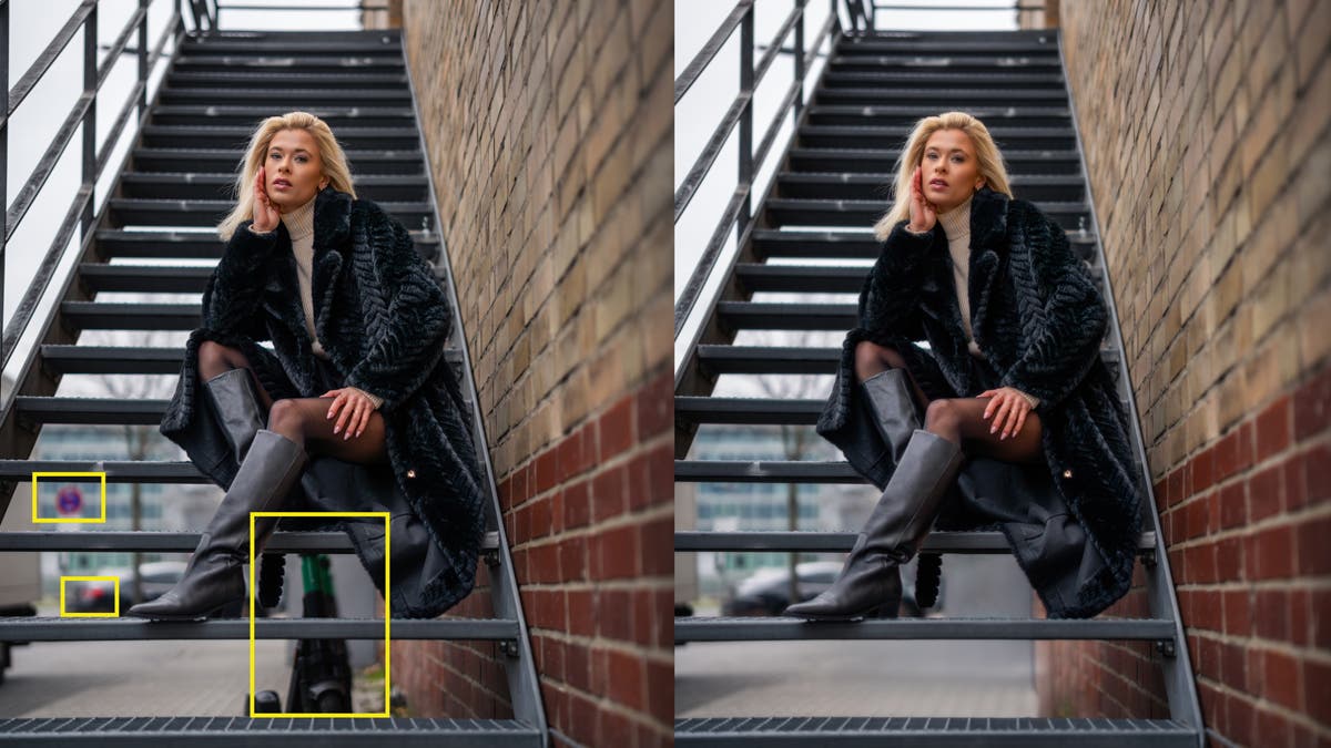
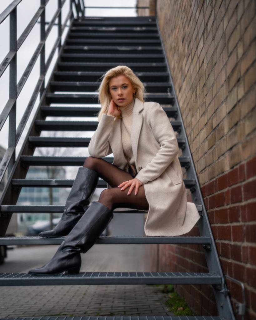
In the example below, I edited the face and hands separately, adding contrast while removing blemishes and softening the skin. I also addressed the clothes independently. To the side wall, I applied a linear gradient to make it darker and less saturated, and the same treatment was applied to the foreground steps of the staircase and the side railing, all utilising gradients and brushes.
While doing all this, ensure you view the image as a whole, too. Your eye should switch from zooming in to zooming out. The aim is to allow the viewer to enjoy and admire the subject without noticing these adjustments. If a typical viewer doesn’t recognise that a linear gradient is being applied in the foreground, you have done a good job.
Check your Histogram
The photographer I mentioned at the beginning of the article phoned me because my images appeared quite dark when viewed on different screens and cellphones. There were two reasons for this: first, my monitor was not calibrated, and second, I was not checking the histogram. It is your job to check the image histogram both while taking the photos and again during editing. Never take your attention away from it, and familiarise yourself with how the image histogram works.
- Utilise the clipping feature of this histogram in your editing software to identify pixels that are completely blown to whites or blacks.
- Identify areas that are underexposed or overexposed and make exposure adjustments to ensure they harmonise with the overall feel of the image.
- Check the histogram to determine if the light distribution is skewed towards the left or right of the entire image. The histogram reveals the truth, so don’t rely on your overly bright monitor, like I did. If the histogram indicates an underexposed image and your eyes do not perceive it, calibrate your monitor.
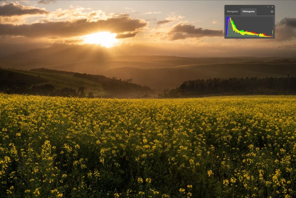
The histogram of a reasonably bright image below indicates that there are more shadows than mid-tones and highlights.
Cropping, Straightening, and Perspective
A photo is not ready until you have checked for the following in your editing software:
- Enable Profile Correction: If you shoot RAW images, which I advise you to do, enable your lens’s profile correction to remove barrel distortion, especially from wide-angle lenses.
- Chromatic Aberration: A fringe of colours usually appears along the edges of objects in images. This looks unnatural and becomes prominent if you zoom in or print your photos large; remove it with just one easy click in software like Adobe Lightroom.
- Straightening the horizon: While it might not be evident in certain images, even an untrained eye quickly recognises even a degree or two of tilt on a seascape horizon or skew of a building. An unstraightened image in your client’s hands or in print is embarrassing. Meticulously, always use the straightening tools in your editing software to automatically or manually adjust your images.
- Cropping: Although you can freely crop an image from either side, remember that many media have their own aspect ratio requirements. For example, if you want to post it on Instagram, edit it according to the platform’s guidelines, such as a square 1×1 or a vertical 4:5 crop.
- Perspective: An image’s perspective can elevate its impact and appeal, especially when the original angle makes the subject look distorted. In Adobe Lightroom, for example, the Transform tools can correct perspective distortions, which is especially useful in architectural photography where vertical lines may appear slanted.
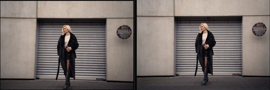
Look at the before and after images below. I not only cropped it and straightened the horizon but also changed the perspective to make it look more natural instead of feeling as if the image is warped.
Dust Spots, Unwanted Objects, and Other Eye Sores
When editing photos, removing unwanted objects, blemishes, and dust spots is crucial to achieve a polished final product. These distractions can detract from the image’s message and aesthetic.
Unwanted items in the background can clutter the scene, but tools like the Clone Stamp, Healing Brush, and now even AI features can help create a cleaner image in Adobe Lightroom and Photoshop. Blemishes on skin or surface imperfections could also be addressed to enhance the subject’s appearance.
Dust spots can easily be corrected in post-processing for a cleaner presentation. Addressing these elements ensures high-quality work that allows your audience to engage with your subject without being distracted by eyesores.

Look and Feel
If you publish a series of images, such as wedding photos, make sure that the look and feel of all your pictures are the same. For example, you don’t want some photos to have warm tones while others have cool tones. Consistency is appealing to the eye. You can also use Lightroom presets to achieve that and have a faster workflow.
Walking Away
It’s helpful to walk away from your work for a few hours or even a day before returning with less tired eyes. I’ve often returned to an image and started editing it from scratch after stepping back. This fresh perspective can lead to moments of insight. For example, during a recent model shoot, I edited one photo with skin tone adjustments multiple times after taking a break, which was a learning curve all on its own. I then applied those techniques far more quickly to the rest of the photos.
In conclusion, refining your photography through thoughtful editing is essential for creating images that truly resonate with viewers. As you continue to develop your skills, embrace the tools and techniques available to you. Always strive for improvement; each photo is an opportunity to convey your unique vision to the world.