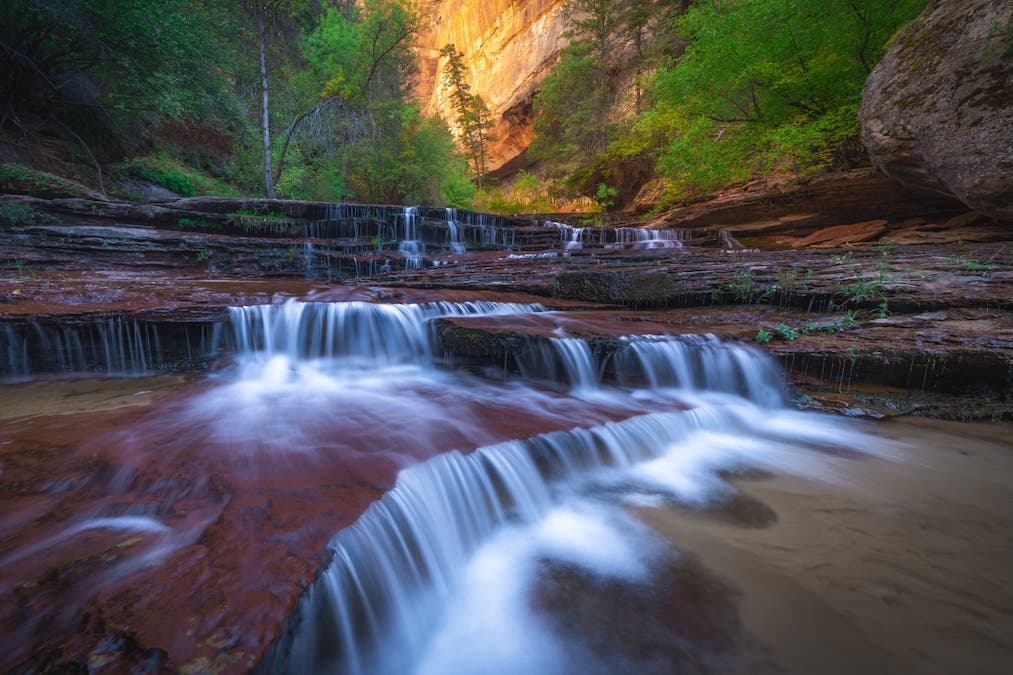
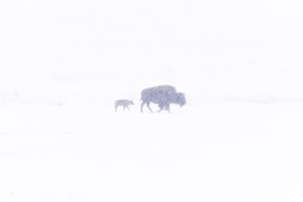
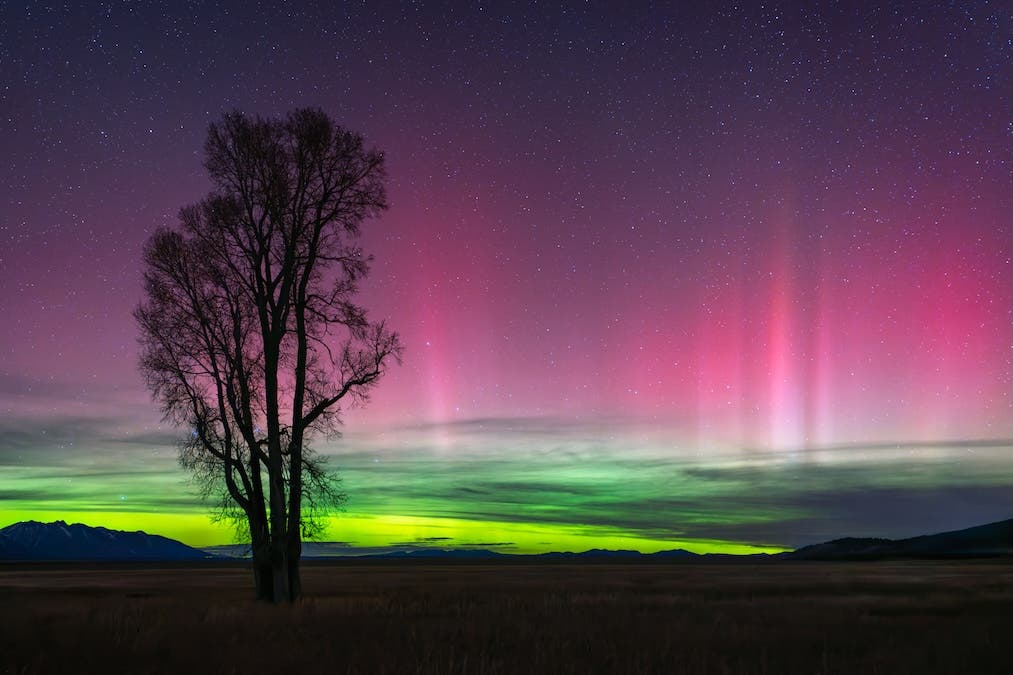
As the photographer, what viewers will end up seeing in the picture is entirely up to you. Aside from choosing your camera, camera settings, and when to click the shutter, you decide where to point your lens. Be careful and deliberate about which camera would be best for your niche like the low light-friendly Sony Alpha a7S III, the blazing fast Nikon D500, or the travel-ready Leica Q2.
Certainly, there are different ways to achieve better photos, but what helps turn your ordinary snapshot into a compelling work of art is by putting a lot of thought into the composition. In this guide, we discuss 11 composition techniques in photography to improve your photos.
What is Composition in Photography?
The main purpose of composition is to influence viewing behavior. This entails understanding the principles of composition in photography and knowing how to lead your viewer’s eye to your subject or whatever focal point you want them to look at. Thus, if you’re looking for tried-and-tested ways to improve your photos even without the need for Photoshop naturally, we’ve compiled a list of some of the most commonly practiced photography composition techniques.
Why is Composition So Important in Photography?
Composition in photography is the equivalent of the skeleton in the human body. It keeps everything together, supports the weights of various visual elements, and makes the frame look dynamic. A chaotic skeleton wouldn’t let your body function properly. Likewise, a chaotic composition wouldn’t allow your photograph to tell a story.
Composition is responsible for the narrative of a photograph. It dictates where everything should stay, the distances between elements, and who is larger, more colorful, or brighter. Its purpose is to create an aesthetically pleasant image but also a roadmap for the viewer. Composition in photography is like the contents of a book: it instructs the viewer to start with chapter 1 and continue reading in the specified order.
Alongside the arrangement of the scene, photo composition is affected by camera settings, lighting decisions, and gear choices. It is a complex process that decides the tone of your visual story and impacts the message you want to convey.
What Makes a Good Composition?
When it comes to composition, photography is fastidious. There are many elements to consider, and all of them have to have the right position, dimension, color, brightness, and shape. A good composition is one in which every visual element has a precise role and adds something to the story.
For a good composition, photography needs a balance between the elements in the frame. It means you have to balance the amount of detail and space, highlights and shadows, etc. But there are also abstract concepts that need balance. How much does the meaning of the focal point or background weigh? The atmosphere created by the quality of light and tones may increase or decrease the weight of other elements.
The profoundness of a role in a movie comes from the interactions it makes with the main character. Similarly, the weight of a visual element affects the weights of the surrounding elements. A leading line has value only in correlation with the elements it makes you look at. A good composition builds strong relationships between elements.
The Top 15 Photography Composition Rules and Techniques
Even after you’ve become a professional photographer, these photography composition “rules” will still come in handy. Check them out down below and bring your photography to the next level.
1. Simplification
The easiest way to have a clear and strong composition is to keep things simple. This can be done by shooting with a narrow depth of field. Additionally, try eliminating distracting elements that may distract viewers from your photo’s main subject. This way, your viewers are able to quickly determine the focal point of your image and decipher the message behind it.
Remember, even in photography, less is more.
2. Filling the Frame
For this technique, move in closer to your subject to strengthen your composition. Doing so allows the focus to fall on your subject, such as a person’s facial expression, and on details that may not be readily noticeable by the naked eye. As a bonus, it will help you get rid of distracting elements in the background and may even give you interesting abstract patterns.
Cropping during post-processing also works to make your photo look like a close-up shot, but keep in mind that you run the risk of significantly lowering the resolution of your image. Also, if you decide to exclude limbs (such as an outstretched arm) from the frame, do not crop at the joints.
Robert Capa is a famous war photographer who said, “If your photos aren’t good enough, you’re not close enough.” Use your feet and physically walk closer to your subject. Try different angles to connect the viewer with a specific subject.
3. Horizontal or Vertical?
One of your first decisions in taking a picture is whether it should be horizontal or vertical. The shape of the camera encourages us to hold it horizontally, but the subject (not convenience) should determine the orientation. A vertical format emphasizes verticals, so vertical subjects usually belong in a vertical frame. Conversely, horizontal ones should be in a horizontal frame.
Verticals are also good for portraits, while horizontals are usually best for landscapes and cityscapes.
However, this is where “breaking the rules” comes in. When doing landscape photography, for example, you may feel inclined to position the camera horizontally. But you don’t have to, especially if you want to control the mood the photo conveys.
4. Rule of Thirds
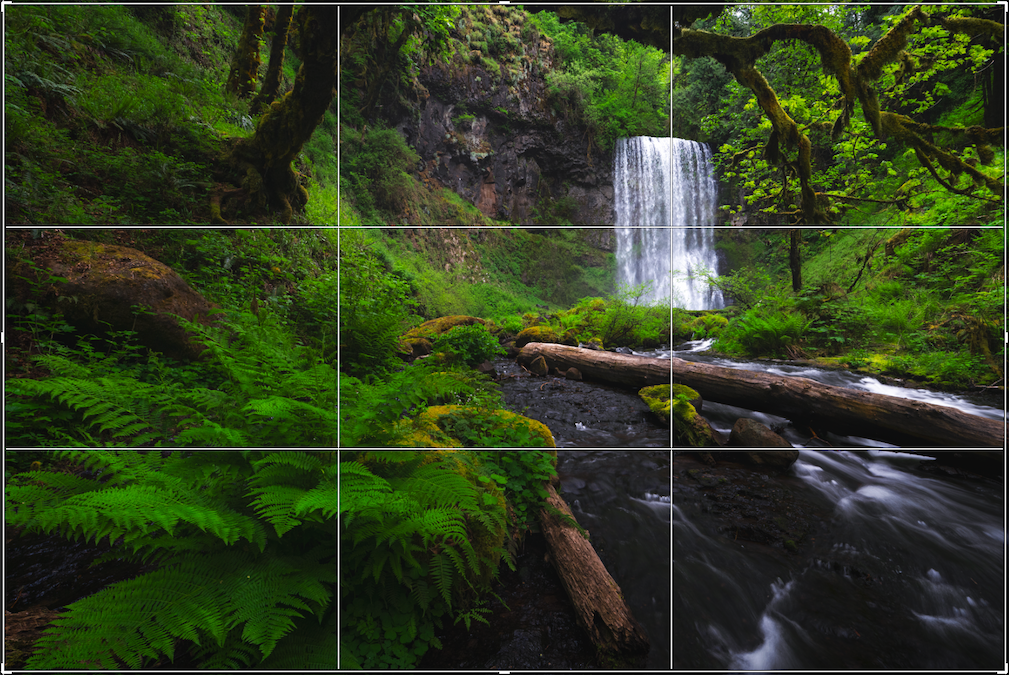
If you’ve attended at least one photography class, it’s highly likely that you’ve learned about the Rule of Thirds. This basic composition technique is based on the idea that placing your subjects off-center yields a stronger, more natural-looking composition and allows you to make creative use of negative space. Following the Rule of Thirds also serves as the perfect opportunity (or excuse) to shoot your subjects from different angles. This will ultimately allow you to capture more unique images.
Whether you’re shooting landscapes or portraits, imagine a 3×3 grid that divides your frame into nine equal sections (by two vertical and two horizontal lines). Then place the horizon, trees, and other focal points like the eyes and lips along the intersections and lines. Most cameras come with a grid to aid you in composing your images this way.
Image via Shutterstock
5. Framing
Also called sub-framing, this type of compositional technique involves using or adding frame elements to emphasize and lead the viewer’s eye toward your subject or to simply add interest to your image. It can be anything from natural frames like rock formations or man-made ones like windows and tunnels. Whatever shape or form, as long as it helps bring focus to your intended subject, it’s bound to create a more aesthetically pleasing image.
6. Color
Another easy photography composition technique is the use of color to create stunning photographs and strengthen the message behind your images. You can choose to include one or several bold and striking colors to make your subjects stand out. Or you can go for pastel shades for light and pretty visuals.
Complementary colors (such as blue and orange sunsets) are also great for creating a stunning and well-balanced image. You may also want to play with color temperatures to produce interesting results. Or you can use certain shades to evoke various emotions, such as happiness with bright yellows and mystery with darker hues.
7. Contrast
As an essential form of color, contrast works similarly in improving your composition, more so for monochromatic images. It can also be used to make your subject stand out—simply surround your subject and fill the frame with lighter colors. Monochromatic images like sepia and black-and-white also rely on contrast to reveal its details and textures.
When going for tonal contrast, it’s important to note that darker areas tend to be “heavier” on the eyes. So balance these out by adding bigger, lighter areas.
8. Leading Lines and Shapes
Other significant elements of art that our eyes are naturally drawn to are lines and shapes. Use leading lines to your advantage by allowing them to change the way your audience views your image. Lines have a natural way of leading the viewer’s eyes, making them the perfect element to help bring attention to your desired focal points.
Roads, bridges, and even hallways are great for showing linear perspective. They have lines that become narrow towards the far end, potentially leading the eyes to where your main subjects (like buildings, the sky, or even a person standing by the door) may be.
As you practice this photography composition technique, you’ll find that shapes are all around you as well. You’ll often find conventional, clearly defined shapes in houses (windows and doors) and other architectural structures. But you can also find compound shapes—especially if you look hard enough—in every multidimensional scene.
Triangles and diamonds tend to add aesthetic appeal to your shots. Don’t hesitate to move around and change the angle of your frame to find—and reveal—those interesting shapes.
9. Symmetrical Balance
Symmetry is a widely taught compositional technique used for creating visual balance in your photos. We unconsciously look for symmetry in all things. A photograph with almost perfectly balanced elements usually makes for a very appealing image.
Just take a photo of the Eiffel Tower below. It may have been incredibly easy for the photographer to position themselves and the camera in a way that would capture the silhouetted French landmark, the dramatic sunset, and the mirror image at the bottom of the frame. However, a viewer would take longer to observe the many details of this photo, thus making it all the more intriguing.
10. Asymmetrical Balance
When executed properly, even a visually imbalanced image can turn out to be an interesting photo. As much as we find pleasure in looking at anything symmetrical, something is unsettling yet intriguing about an image that doesn’t seem to “follow the rules”. This informal balance technique is a lot more difficult to achieve, but it gets better with practice.
To achieve asymmetrical balance, try including two different or contrasting subjects or elements. Then place them off-center (following the Rule of Thirds). They can be anything — two different objects, two of the same object that differ in size or color, uneven yet balanced amounts of light and dark tones, or two different concepts.
11. Foreground Interest, Depth and Layering
Incorporating layering into your composition involves including other elements at varying distances from the camera to add depth to an image. What this does is it allows the viewer’s eye to be led through the image (similar to leading lines) and to bounce from one element to another. The effect becomes more visually compelling when you have at least three dominant layers in your image — your foreground, middle, and background.
In this technique, your subject can be either in the foreground, the middle, or the background. It all depends on where you set your focus. In case the elements are fixed, such as in the photo above, a simple change of perspective can alter the size of your foreground with the layers in the background.
You may choose to do your layering during post-processing by editing your foreground, as naturally as you possibly can. Just be careful about keeping the overall image balanced and make sure that you have a distinguishable subject that your viewers can easily identify.
As important as it is to know how to follow and execute each composition technique, it is also important for you to listen to your creative instincts, which will sometimes tell you to break all the rules.
Again, these are not strict rules. They are guidelines that you can choose to use to improve the overall composition of your images.
12. Unusual Point of View
Bend your knees, get on your belly, stand on a ladder, and hang from the ceiling. Most images look so much better if we can show them from a point of view that’s unusual.
Although we may look funny when we take our unusual point-of-view photos, the photos usually look more appealing, and most people would never guess that you were scraping your knees when you created the photo.
In the example above, we get a focus on the chess pieces. This low point of view helps to strengthen the story, the chess pieces fill the foreground and the low point of view helps to show more of the player in the background.
13. The Golden Ratio
The Golden Ratio is a popular concept in photography. It refers to a spiral, similar in shape to a nautilus shell, overlaid on an image. The parts of the frame the spiral passes through are said to provide greater visual impact than other portions of the frame.
The Golden Ratio exists in countless places in the natural world. It’s based on the mathematical concept called The Fibonacci Sequence, so you may also hear it referred to as the Fibonacci Spiral.
As you shoot, try to imagine a spiral flowing through your frame. Where can you place the subject to best take advantage of the Golden Ratio and the balance it provides? To take your compositions even further, experiment with using grid overlays in your viewfinder to help you consider these ratios as you shoot.
14. Patterns
Patterns are everywhere, we can see them on a brick wall, on a carpet, the stones of a cobblestone road. Once you start to see patterns it’s hard to not see them in almost everything. When you shoot patterns try to emphasize them by filling the entire frame.
Water droplets on glass create a striking visual. Notice that this pattern fills the frame from edge to edge.
You can also make patterns stand out by breaking the pattern. Try to follow the rule of filling the frame with your pattern, but look for things that break the pattern inside that frame.
15. Watch the Horizon
A lot of our snapshots tend to keep the horizon line running through the center of the frame. Though there may be nothing wrong with it, even appearing most natural, you can give your images a more dramatic look by playing with the positioning of the horizon line in your photographs. In some cityscapes, by lowering the horizon line you can better capture the vastness of a skyline or capture the full magnitude of a mountainous scene.
Playing with the horizon line in a portrait can help add a mood to your story – whether it places your subject in a more exciting light or adds melancholy, playing with the horizon line can help you tell a different story by taking advantage of space.
Don’t Forget: Break the Rules
The very idea of composition may seem a little daunting because of all of the “rules”—but don’t worry! They’re not exactly principles that must be strictly followed. They are not etched in stone, and almost each one can be broken if you have good reason to do so.
Nevertheless, several dos and don’ts can contribute to a good composition. When you’re not quite sure what arrangement will make the picture look better, you won’t make a mistake if you compose according to the above principles.
What are the 7 Elements of Photography?
Each of these seven elements of photography is used in visual arts to help make compositions more compelling and accessible. They include:
- Line: Creating a sense of flow for the viewer through leading lines both literal and implied.
- Color: Using a collection of colors, or an absence of color, to create impact and mood.
- Shape: Highlighting objects in a two-dimensional way, such as through the use of silhouette.
- Form: Giving depth to an image by implying dimensionality through light and shadow.
- Texture: Depicting the way a surface may feel through shadow and light.
- Tone: Suggesting an overall feeling through brightness or darkness in an image.
- Space: Selectively filling the frame or leaving empty areas for impact.
Go Out and #CreateNoMatterWhat
Now that you know so many photography composition techniques, look for ways to incorporate them into your photographs. Each rule won’t work in every situation, but learning and being aware of them gives you a good starting point.
Try mixing and matching them or ignoring them altogether, giving yourself the space and freedom to experiment. Remember the best way to improve your photography is to go out there and keep making photographs. As Adorama says, Create No Matter What!
FAQs
Composition in photography is when you arrange visual elements in a certain way to capture a balanced, interesting, and aesthetically pleasing picture.
While most cameras come with standard grid overlays, like the rule-of-thirds, finding cameras with a built-in golden ratio grid is rare. However, for smartphones, it’s a different story: apps like Pro Camera offer a variety of grid patterns such as the rule of thirds, square grid, and golden ratio.
Create depth by using techniques like leading lines, overlapping elements, or varying perspectives to create a sense of three-dimensionality.
Create a lot of negative space and keep the colors in your photos dark, putting a black-and-white filter if need be. Additionally, you can leave a big part of the frame empty. By doing that, negative space emphasizes the subject, creating a clean and minimalist aesthetic that can evoke calmness or isolation.
Centered composition places the subject at the center of the frame, often creating a strong focal point or a sense of symmetry. It’s used effectively in portraits, architecture photography, and symmetrical cinematic scenes.