
As a landscape photographer, I often find myself capturing images under ALMOST perfect conditions. Whether I just missed the perfect sunset or the trees weren’t quite bright yellow in the fall, it can be frustrating to be that close. Luckily, Lightroom Classic has a Color Mixer tool that allows you to make all the color adjustments you need. These tools are far more powerful than the global Saturation and Vibrance sliders. Additionally, these tools aren’t just useful for landscape photography. In fact, just about any photographer can harness the powers of Lightroom’s Color Mixer to enhance the colors in their image. In this guide, we’ll be looking at how to use the Color Mixer to master your color correction in post processing.
What is the Color Mixer Tool?
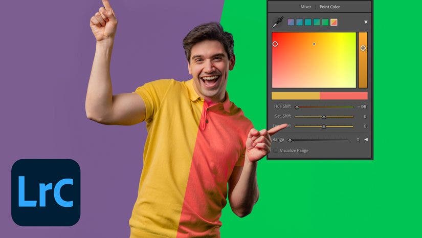
Lightroom’s Color Mixer is your go-to tool for adjusting any color in the image. It can adjust hue, saturation, or luminance by specifically targeting certain colors in the image. As of 2025, the Color Mixer is split into two tools: Mixer and Point Color. While the Mixer may be more straightforward to use, the Point Color Tool is probably the most effective and can do anything the Mixer tool can do. It is also more customizable. Let’s take a look at how each of these tools works.
Mixer
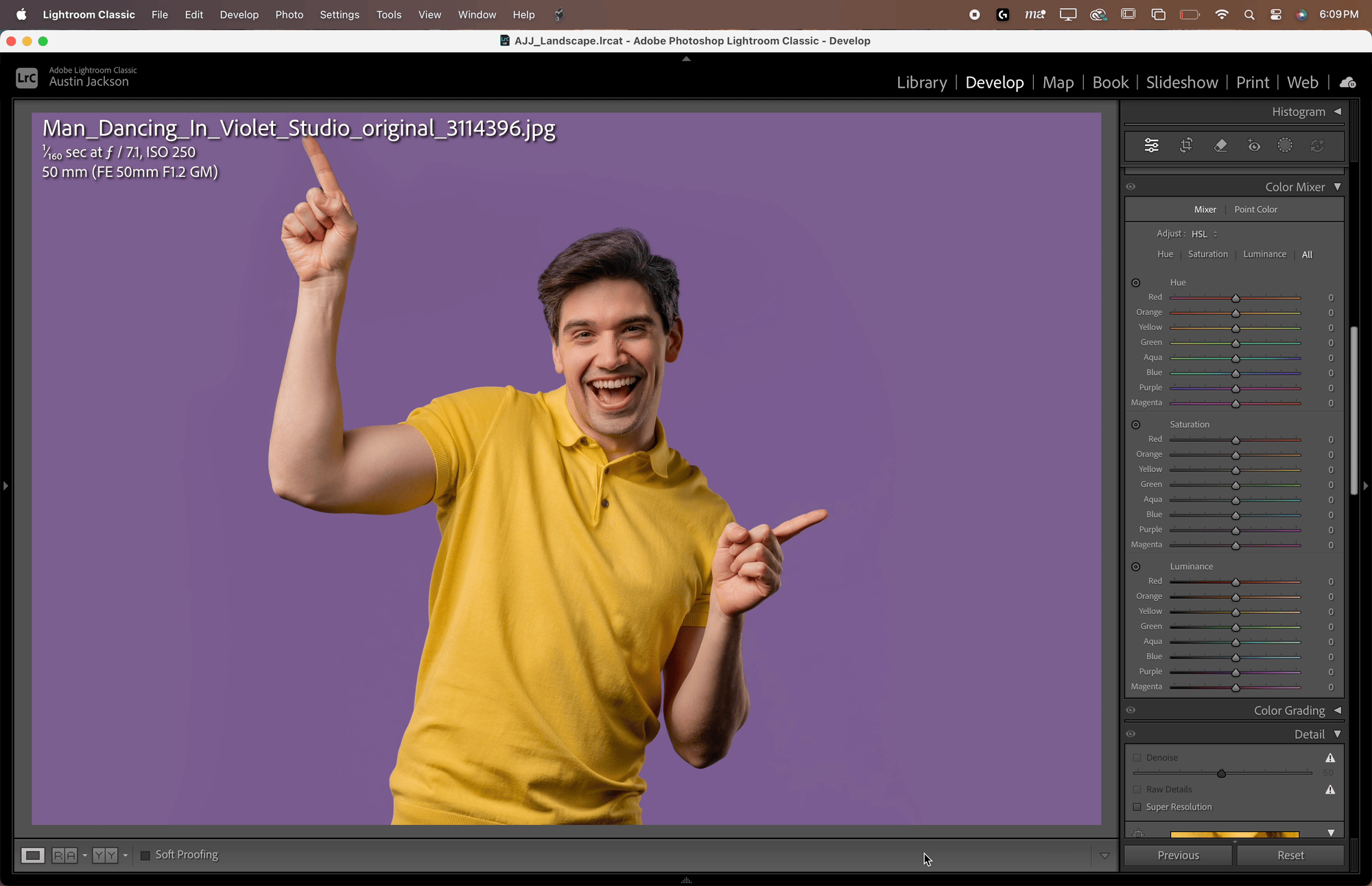
The Mixer allows you to adjust the Hue, Saturation, or Luminance of Red, Orange, Yellow, Green, Aqua, Blue, Purple, or Magenta in your image. The Mixer is a great tool to use when you need to make small, quick adjustments to colors in the image.
Hue controls the basic color of an object. Think of the difference between green, yellow, red, or blue as differences in hue. The hue slider allows you to modify the makeup of the color to change orange to red, blue to purple, or yellow to green. There are numerous other combinations, but these are just a few examples.
Saturation controls the intensity of the color. The more saturated a color is, the bolder it will appear in the image.
Luminance controls the brightness of a color. As you increase the luminance, colors will begin to pop in the image. Decreasing the luminance will make colors darker.
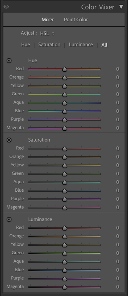
To use the Mixer, click on Mixer and then select either Hue, Saturation, Luminance, or All. I prefer to use All as it allows me to see all of the color options at once. Determine which color you’d like to adjust and which tool will best suit your needs, and then click and drag the sliders. Alternatively, you can select the bullseye to click on the color in the image, allowing you to make adjustments targeted at a specific color. This can be helpful for colors that are in between. Doing it this way, you can adjust numerous sliders at once.
Point Color
The Point Color tool was added to Lightroom Classic in the October 2023 update and gives creators much more flexibility with color adjustments in their images. Rather than selecting a preset color in the Mixer, the Point Color tool allows you to click to select a color in the image and make adjustments to that color from there. As with the Mixer tool, the hue, saturation, and luminance sliders are all available after picking a color.
To use the Point Color tool, select the eyedropper and click a color on the image. A box should appear with your color selected.
From here, you can adjust the color in multiple ways. The easiest way to adjust is by clicking and dragging one of the two circles inside the color box. The larger box on the left controls hue and saturation. Drag up to increase the saturation, or drag left or right to adjust the hue. The skinnier box on the right controls the luminance by dragging either up or down. If you prefer to use the sliders, a Hue Shift, Sat. Shift, and Lum. Shift slider is included below.

Unlike the Mixer tool, where you are limited to just one adjustment per color, the Point Color tool allows you to keep stacking adjustments on top of each other by selecting the eyedropper tool and making additional swatches. Also, the Point Color tool allows for refinement over the colors, unlike the Mixer Tool.
How to Refine Color Selections
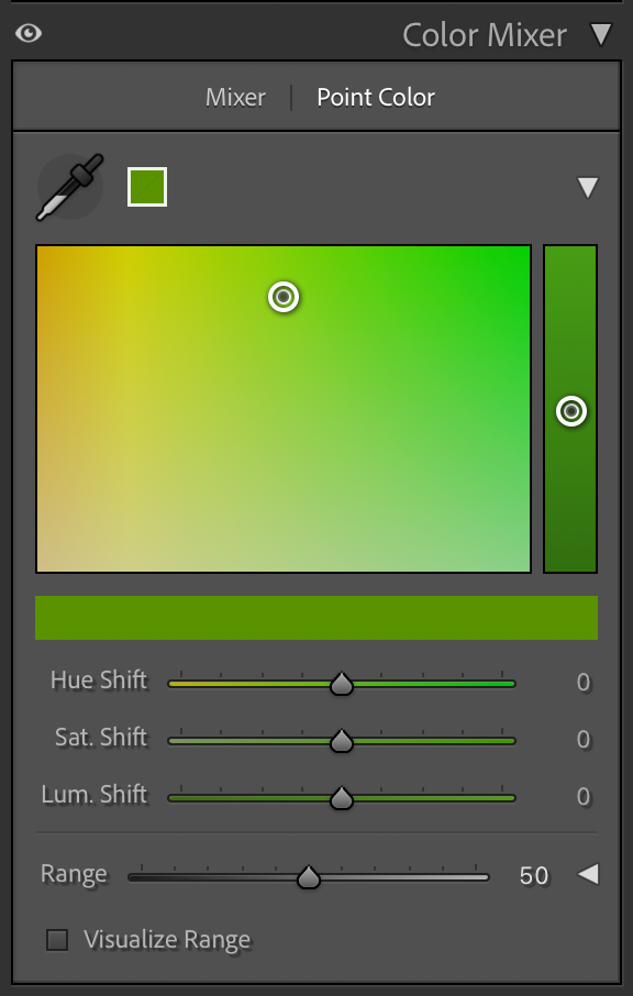
What happens when you want to adjust one color in your image, but another similar color is being selected? If you’re only using the Mixer, you have to take the image into Photoshop to make such an adjustment. But in the Point Color Tool, you can Refine the color selection.

At the bottom of the Point Color tool, there is a dropdown menu that can be expanded next to Range. Range adjusts how different from the original color the selection will go to select other similar colors. The default is 50, but dropping the Range will make the color more selective (meaning it will only pick colors very close to the originally selected color), while increasing the number to 100 would make the selection much broader. For most users, just adjusting the range slider will be enough to target specific colors in the image. For those who need additional refinement, you can make adjustments to the Hue Range, Saturation Range, and Luminance Range sliders. The box between the color bar shows the range of colors that are being selected, while anything between the box and the arrow will be partially selected. You can narrow or widen the selection to select more or fewer colors.

Mastering the Color Mixer tool in Lightroom isn’t difficult with a little practice. Additionally, it’s one of the best ways to take color in your images to the next level. Whether you need to adjust the color of a subject’s shirt by changing the hue, increasing the intensity of a beautiful sunset with the saturation slider, or making a color pop by using luminance, the Color Mixer tool should be your go-to tool for all things color in Lightroom Classic.