The psychology of color in photography is a variable in the artistic equation of photography, one that impacts all others, but also one that strongly impacts the viewer. Color is visually heavy, which means the photographer must pay more attention to balancing a composition when shooting something colorful. There is also the issue of color accuracy, of capturing the world as it is without altering anything, and that of personal style and storytelling.
Ultimately, the photographer determines what to include in the frame, the camera angle and perspective to employ, and how to use colors to enhance the picture’s message. To make an informed decision, one needs to understand the psychology of color. So, continue reading to enhance your composition techniques, camera settings, and storytelling skills simply by grasping the impact colors have on us.
What Is the Psychology of Color?
The psychology of color studies how colors determine and influence human behavior. It’s a very old field of study, with prominent names such as Johann Wolfgang von Goethe (“Theory of Colors” – 1810) and Carl Jung, who believed that “colors are the mother tongue of the subconscious” and introduced colors in psychotherapy.
Part of colors’ meaning is biologically innate in us. For instance, we eat foods of certain colors because we consider them to be edible or tasty. We are calm when surrounded by nature’s colors and become agitated when surrounded by colors we don’t normally see in nature.
Nevertheless, much of colors’ meaning is based on learning or culturally determined. And the way we react to colors has something to do with the context, too. For example, having lived in busy cities filled with artificial lights and colors all our lives may have reduced their negative impact on us. But have not eliminated it. As a photographer, you must be aware of both biological and cultural cues and understand how colors can influence or trigger emotions in any environment.
The Difference Between Color Theory and Color Psychology
Color theory and color psychology are concepts sometimes used interchangeably, but they are not the same thing. Color theory explains how colors interact with each other and create a visual impact. The concept is based on Isaac Newton’s color wheel and is used in visual arts and design to create contrast, harmony, color schemes, color palettes, and so on. You can explore it in detail using Adobe Color.
In other words, color theory affects us at a visual level. For example, complementary colors are visually heavier than analogous colors and more likely to make us look in their direction. Analogous colors draw less attention. But color psychology affects us at an emotional level. It makes us feel a certain way, think about certain things, or react in a certain way. Both concepts are useful for photography and help you create appealing compositions and powerful visual stories. Consider them distinct concepts but use them together.
Colors and Emotions in Photography
Although people may react differently to color stimuli based on their preferences, cultural heritage, context, and personal history, there are a few straightforward connections between colors and emotions that you can benefit from in your photography.
Color Temperature
Colors with low temperatures on the Kelvin scale (around 2700 – 3000K) convey a sense of warmth. They are shades of red, orange, and yellow, and we automatically associate them with the warmth coming from the sun or a fire. In moderate dosage, they may evoke feelings of comfort, the warmth of a home, joy, and love. But the sun and the fire are also full of energy and may be destructive. In large dosages, these warm colors evoke passion, energy, aggression, and even danger.
Colors with high temperatures in the Kelvin scale (over 5000K) convey a sense of cold. They are shades of blue, violet, and green that make us think of winters, ice, and blue hours. At the same time, they are the colors of the sky and the ocean, which may evoke a sense of calmness and tranquility. Again, the dosage matters.

Photo by Jan Kopřiva on Unsplash
Color Saturation
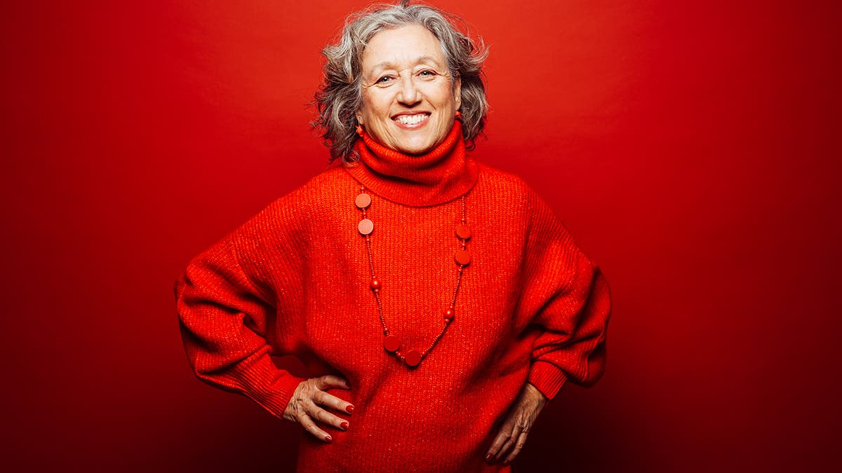
Color saturation determines the viewer’s reaction to an image and may change the regular emotion associated with a particular color. The impact is directly proportional to color saturation, meaning a saturated color is visually heavier. At the same time, saturation enhances the color’s effect. So, if you perceive red as a threat, the more vibrant the shade of red is, the more anxious you’ll get. Just think about Scorsese’s use of bloody red hues to convey distress, danger, and violence. When you turn down the saturation, the effect is diminished.

Color Brightness
We are diurnal animals, hence conditioned to feel energetic, joyful, and positive during the day. As a result, bright colors put us in a good mood, making us feel fresh, energized, and even happy. That’s why pink brings us more joy than red. That’s why we love bright interiors, pastel clothing, and fresh green produce. At the other end of the spectrum, dark colors bring us down, conveying sadness, tiredness, despair, and even grief.
The preference for bright colors comes from the way we interact with nature, too. Spring and summer are sunny seasons with blossoming colorful flowers, green meadows, and light blue sky. Autumn and winter have shorter days, hence less light, less vegetation, and darker colors.
Specific Color Meaning
If we can explain certain preferences and emotions associated with colors, for others, we just have to trust the specialists. If you’ve ever followed Pantone Color Institute’s choice for Color of the Year, you know that each color comes with a story and a list of associated emotions. Here are the most researched and generally approved specific color meanings:
| Red | Love | Excitement | Passion | Anger | Power |
| Yellow | Happiness | Joy | Optimism | Sickness | Excess |
| Green | Health | Freshness | Tranquility | Growth | Harmony |
| Blue | Serenity | Stability | Inspiration | Sadness | Responsibility |
| Purple | Wealth | Extravagance | Creativity | Peace | Pride |
| Orange | Warmth | Excitement | Youthfulness | Arrogance | Impatience |
| Violet | Faith | Modesty | Spirituality | Inspiration | Profoundness |
How to Use Color Psychology in Photography
While the photographer can’t always change the scenery to include or exclude certain colors, being aware of color psychology helps you make better choices in terms of framing, camera settings, and post-processing.
For instance, if you tell the story of a newlywed couple, you may infuse the composition with joy, optimism, and love by finding a camera angle that provides a bright blue sky as background, allows pale yellow sun rays to enter the frame, or includes a patch of fresh green grass or pink flowers. Alternatively, you may adjust camera settings to create a narrow depth of field and blur a dark background or change exposure to make the image look brighter. You may also adjust the color temperature and make the colors slightly warmer.
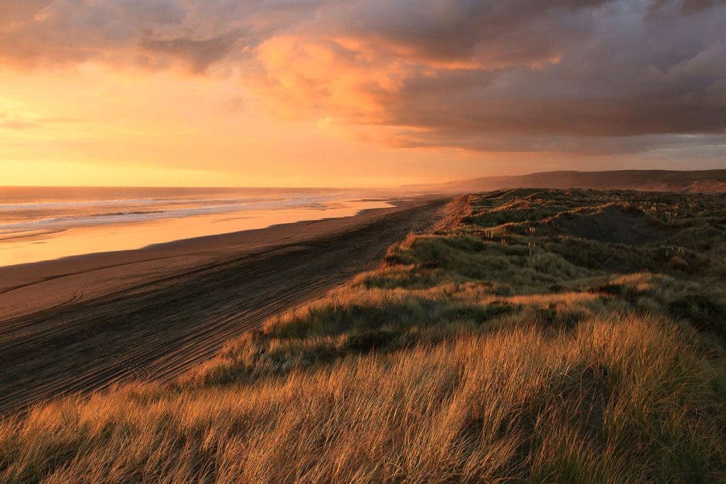
Color psychology also helps you choose the best location and time of the day for a particular photoshoot. For example, shooting during the golden hours emphasizes warm feelings, while shooting during the blue hours provides a certain coldness, sadness, and loneliness.

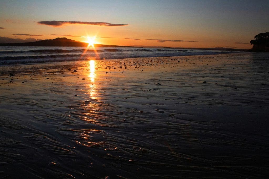
The same beach during blue hour and golden hour – Photos by Jess Davis on Unsplash
Focusing also benefits from a good understanding of colors. For example, you may focus on a dark area and set exposure to bring out its details. The brighter areas will be slightly overexposed and lose their color vibrancy. As a result, the image will have a somber, dramatic look. But if you focus on a bright area instead, the result will be a more colorful, joyful, and even hopeful shot. It’s often the case when photographing an interior space with a window through which sunlight comes in.


Photos by Peter Herrmann on Unsplash
Using color psychology in photography starts with storytelling and intention. It may be something you plan, such as choosing a location and subject matter, but also something you decide when you take the picture. In the end, it comes down to what inspires you and what you want to convey. First, you feel the feeling, and then you infuse it in your photos.
At the same time, color psychology helps you understand how other people will perceive your work. Cultural differences matter. For example, red may be the color of passion for you and the ideal choice for conveying romanticism. But in South Africa, red is the color of mourning. You may think of white as the ultimate bridal color, but in India, brides wear red. In Western countries, green is associated with the environment, sustainability, and progress, while in Indonesia, it is a forbidden color associated with infidelity and exorcism. Knowing this helps you choose décor, backdrops, props, light color temperatures, and more.
Final Thoughts
Color psychology is a useful tool in photography, specifically in storytelling. Combine it with color theory knowledge, composition rules, and technical aspects to create impressive work both for the eye and the heart. The photographer is the first filter between the scenery and the public, so take your emotions as a reference and find a way to convey them to your public.