If you’re just getting started in portrait photography—or even if you’re a seasoned pro—seamless, solid-colored paper backgrounds on rolls are a budget-friendly way to isolate and emphasize your subjects. Here’s some useful background information.
While white seamless paper backgrounds are reasonably priced and very popular studio backdrops, there’s a rainbow of other possibilities that can jazz up your photos and help to emphasize a feeling or concept—and they won’t cost you a fortune. They are most commonly available in 53-inch lengths that cost around $20-30 for a 12-foot roll, but you can get them in 107-inch lengths for bigger setups as well as some other sizes.
A background color not only can play off what someone’s wearing, their eyes, fingernails, or hair color, but it can also imply different ranges of emotions and energies. Let’s look at some commonly-available seamless colors, and how they can affect images:
White
The most popular seamless paper is white. Why? Well, white never goes out of style. It’s open, uplifting, clean, and airy, gives a sense of purity, and serves to isolate people, pets, or objects and draw attention to them. The white material also bounces the light and brightens everything. White is also flexible: you can place color gels over light sources shining on the paper to effectively change the background color. Another advantage of using white? It goes with any other color.
Black
Black implies mystery, danger, foreboding, power, and elegance. It’s also stylish: How many times have you heard (fill in the blank) is the New Black? Low-key portraits tend to have a greater mystique about them because you can lose detail in the shadows. At the same time, black backgrounds can help brighter colors, such as red and orange, stand out more. As with white, Black can go with any other color.
Gray
Gray is a neutral hue that lets you emphasize the subject without distracting the viewer. Gray goes with anything from muted pastels to bright fuschia (as in our example). You can light gray backgrounds broadly, or you can aim a spotlight towards the center of the background behind your subject, which helps to draw the viewer’s eye towards the center of the image.
Brown
Brown (as well as tan, beige, and taupe) is often overlooked as a background. It’s not as prominent as many other colors, but that can be a good thing since its neutrality allows the viewer to focus on the image. It represents simplicity, dependability (why do you think UPS chose it?), and stability. It’s an earthy color, so along with green, it can convey a feeling of wholesomeness and nature. While it’s a neutral tone, it’s less formal than gray or black. Brown goes especially well with yellow, orange or orange-red, deep purple, and green.
Blue
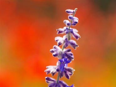
Blue is a versatile, popular color; it infers tranquility, calmness, and calm. It suppresses the appetite, which is why there’s almost no blue in a supermarket; blue in a food photo is a no-no. Look at a solid blue background and it’s hard not to associate it with the sky. Blue is macho—guys (like the construction worker in training shown here) like it. Dark blue is a more serious tone and is the color of choice for corporations, so consider using blue when photographing a head honcho. Blue also infers intellect and technological knowledge. Blue mixes well with warm colors such as yellow, red and orange, although the wrong red/blue combination can cause the two colors to “vibrate” along solid lines.
Red
Red is the most motivating, energetic, nervous of all colors. It makes you hungry, or even raise your blood pressure! It calls attention to itself. It’s a passionate color and, especially as the middle of February approaches, is associated with love. A deep red, such as maroon, can indicate royalty or rage. If you want to send a strong message or show that the portrait sitter is a strong personality, it’s a good one to use. On the other hand, it can also indicate danger and war. There’s simply no in-between when working with red, and wishy-washy concepts need not apply.
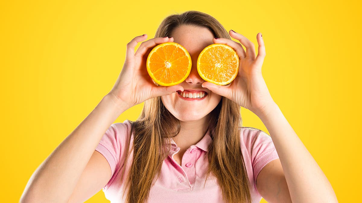
Yellow
Yellow is a happy hue. It implies warmth, joy, intellect, and energy—remember the song “Mellow Yellow”? That’s not just because it rhymes! It gets people in the mood to move around and work out. It’s a child-friendly color when used in small amounts. Be careful when using yellow; too much of it can overwhelm an image. The yellow in the image here might be a bit too much, but it does make it look like that cat is ready to pounce, even if it’s perfectly tranquil. Yellow usually complements darker colors. Blues and browns go well with yellow, but lighter colors may not work as well—it disappears into white, for instance.
Green
In case you’ve been in hibernation since the 70s, you should know that green implies natural and environmentalism. It also is symbolic of growth, hopefulness, harmony, and safety. Like Blue, Green is a calming color. If there’s too much yellow in the green, the feeling might be a bit sickly; on the other hand, a blue-green mix (aqua) can evoke emotional healing. Dark green invokes greediness and ambition and is often used when economic or monetary themes are involved. Throw in some red and you’re good to go for a certain late-December holiday!
Purple
Purple is a risky color (unless you’re photographing kids or anything children might be interested in). It’s associated with royalty, power, and luxury, so it could be used for fashion shoots. It also implies creativity and magic so remember that next time you’re photographing Harry Potter. Too dark a purple can evoke sadness, while lighter purple infers romance or nostalgia.
Pink
Pink is typically associated with femininity, love, friendship, and passiveness. It tends to have a relaxing, calming effect—and yet, it can also be a bright, edgy, active color that, like red, can call attention to itself. Pastel pinks are popular in Easter-related images. Bright pinks more playful, and are especially popular with young girls. Men in pink? Depends on whether or not it’s in style or what it’s combined with. When combined with black, gray or blue, pink takes on a more sophisticated attitude.
Ready to go seamless? Browse Adorama’s Seamless backgrounds department to see what colors are available.