I didn’t even realize I shoot with green tones so much until I was tasked to write about it. Then, I asked myself: why do I tend to lean into green so often? I usually use color to lend narration to an image. It’s a way to clue the viewer into what that light source is (or trying) to mimic. When I think of the color green, I think of grime but not filth. I think of sleek but off-putting, toxic but intriguing, cartoony but not over-the-top. But what is it about the color green in photography that makes it so versatile to use?
Green as a Symbol
Different hues of green can represent different things. For example, mint green can make a viewer feel much different than the color of moss, or even neon green. You can use many different shades of green to create different kinds of images. For example, green can often be used to represent:
- Nature
- Health/Disease
- Sci-Fi
- Envy
- Growth
- Money
- Luck (St. Patrick’s Day)
Pairing Green with Other Colors
Monochromatic
A monochromatic look is achieved when green is the primary color in the frame. For example, this can mean using a green background with green clothing or props.
Complementary Colors
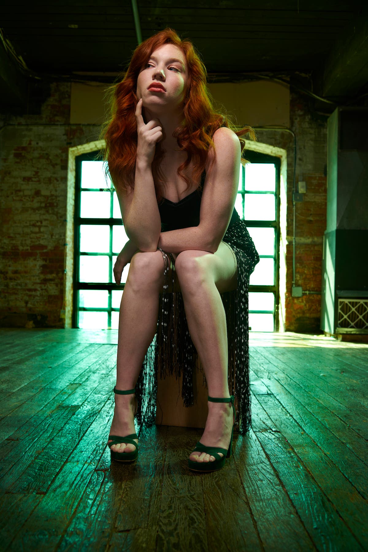
Green and red are complementary colors. It might be cliché to mix green with a redheaded model, but sometimes it just works. When used correctly, it can grab your attention and turn a portrait into something else worth a second (or third) look. The use of complementary colors gives the viewer something to unravel once you grab their eye.

Analogous Colors
Green has a way of walking between worlds of cool and warm. You can sway more towards a yellower green or a bluer green to achieve your desired “vibe.” This is because green sits between blue and yellow on the color wheel.
Triadic Colors
Green, orange, and purple are triadic colors. This means they are equally spaced (and opposite of each other) on the color wheel. Funny enough, these are also the three colors most often used in Halloween decorations. If you’re like to introduce color into a photo but still want to maintain a dark or moody vibe, green, purple, and orange together is a great option.
How to Use Green in Photography

Green Subjects or Props
Green also has a strong tie to Sci-Fi, which helps when you’re shooting SFX like I do. Oftentimes, I will be working with a subject who has been painted green to be some sort of species out of an artist’s imagination. While green can easily be cartoony, it can also balance out quite well when you build context around it. Whether it’s a Matrix-type concept or just some kind of “alien,” a greenish hue can provide an other-worldly feeling.
Green Background
If you don’t have access to amazing SFX, you can incorporate green elements in other parts of your image. For example, adding a green background is an easy way to introduce the color. Even choosing between an olive green, mint green, or tech green background can create totally different environments.
Green Lighting
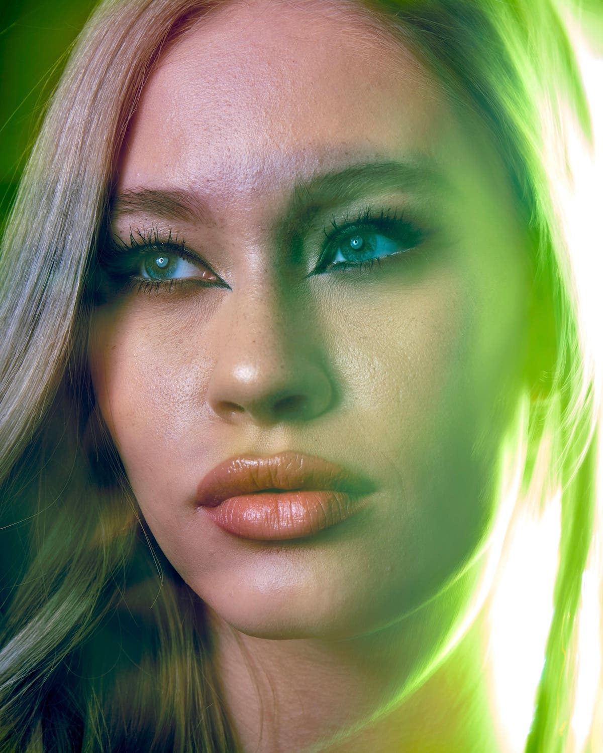
The use of green lighting doesn’t need to appear overbearing or uninviting. Sometimes balancing ambient light towards green can just add some surrealism to the environment and play off colors with your subject.
Adding Nature
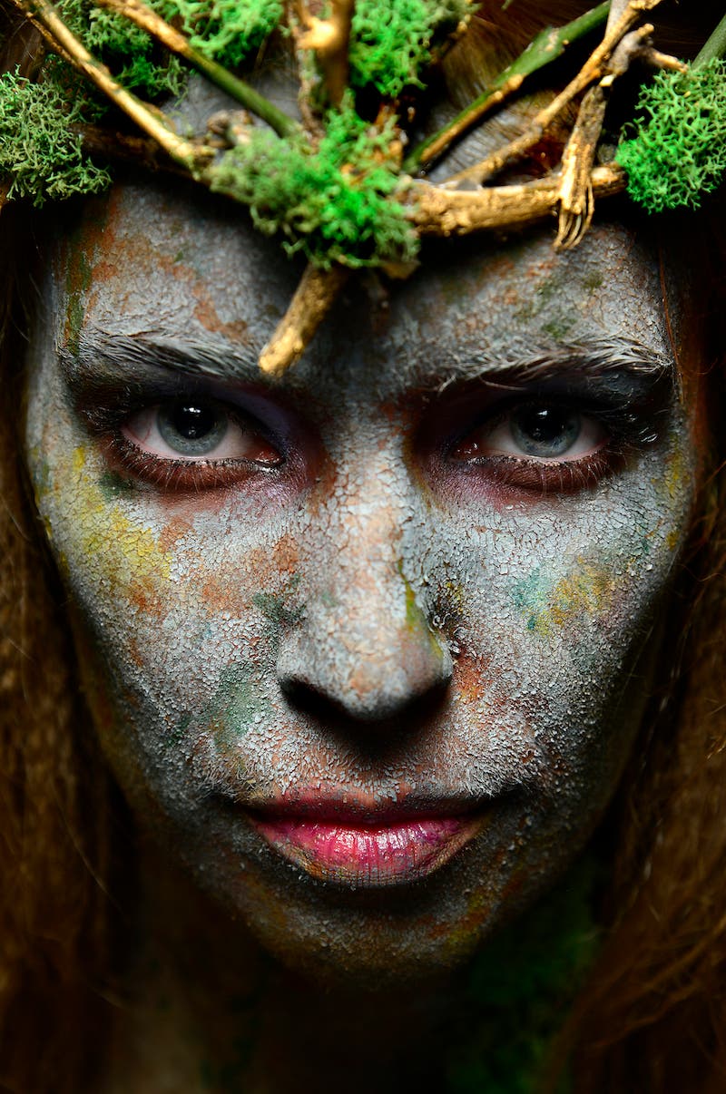
Since the color green is most often found in nature, you can use flowers, plants, or even moss to invoke an ethereal feeling.
The Subtle Use of Green
It’s easy to lean into rusty, filthy tones of green in photography. Although, you can use green in more subtle ways to slowly creep into the viewer’s comfort zone. I have always liked the tone you get from traditional fluorescent light bulbs — like what you would find in commercial buildings. When you don’t adjust your white balance, you get achieve a cold, uneasy mood.

Green can set a vibe without over taking the scene. Setting a vibe can be all you need to provide context, instead of a sterile studio space or bland location.
Color in our images hold a lot of weight. They speak a lot of words without saying anything. They set the stage for what we hope to tell in our stories from frame to frame. We all tend to have a demeanor about ourselves — so too does our photography. Of course, none of us use just one color all the time. Although, you can see trends in certain creators’ work and color can be a common denominator in our toolset.
To learn more about color wheel, read How to Use the Color Red in Photography by fashion photographer Lindsay Adler.
