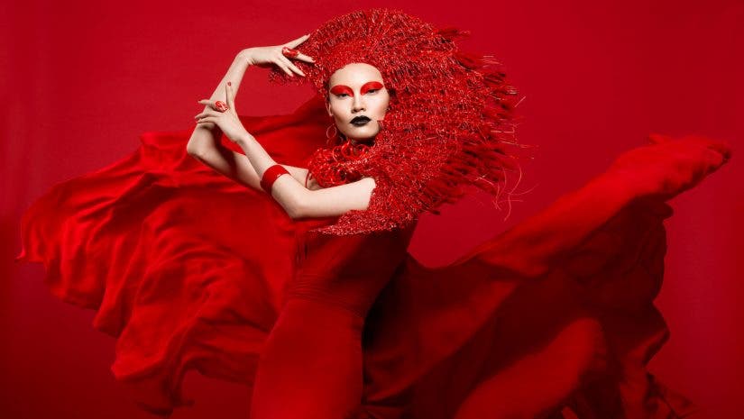
,Color is one of the most powerful tools available to photographers. It helps to direct the viewer’s eye, catch their attention, create emotion, move the eye through the composition and much more. Since the beginnings of my creative explorations in photography, I have been attracted to the color red. When I started to experiment with red in photography, I started to discover my own artistic voice — bold, graphic, colorful, and attention-grabbing.
In fact, a decade ago, I photographed a personal project exploring this color in all its facets, emotions, and visual representations. Red is powerful and fabulous color to integrate into your photography for more emotive and scroll-stopping imagery. Let’s take a deeper look.
Red as a Symbol
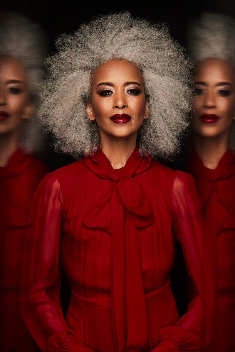
Red is an incredibly versatile and emotional color. It can represent the extremes of emotion — from romance to anger. It is powerful, hot, and celebratory, or can represent both passion and danger.
For example, in the movie “The Matrix,” the Woman in Red is alluring and irresistible, but also dangerous. The duality and versatility of this color makes it a useful tool to express a range of emotions in our work. Historically, red has also used in religious ceremonies as a color worn by Cardinals, and representing sacrifice.
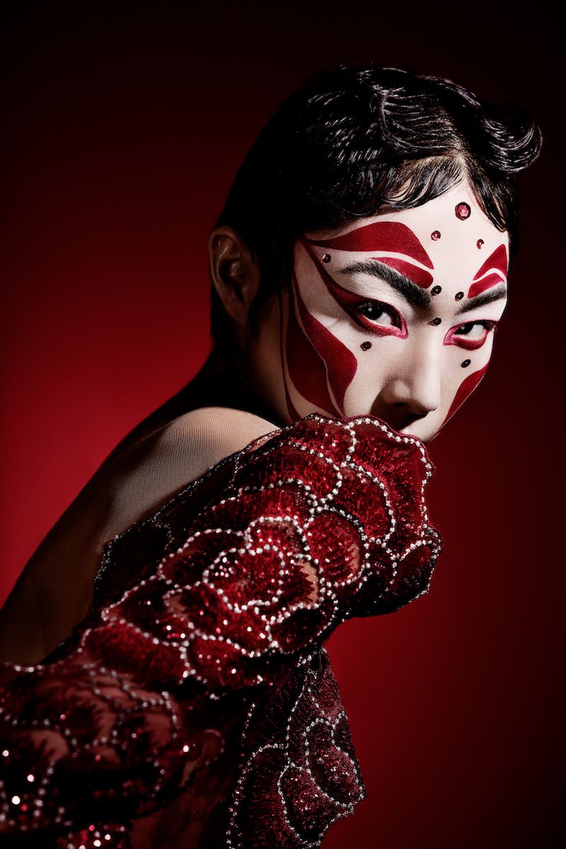
Color, however, is not uniform from society to society. Over time, a country or culture’s history imbues certain symbolism to different colors. For example, in Chinese culture, red represents luck and happiness and is a tradition color worn by Chinese brides. Within the U.S. stock market, red represents a loss while, in Chinese markets, it means the opposite.
These contradictions and societal representations aside, below are common international meanings for the color red that you can utilize in your photography.
Red can represent:
- Romance/Passion
- Anger
- Danger/Warning
- Power
- Heat
- Celebration/Holiday
Ask yourself: What is the purpose of this photograph? How is the viewer meant to feel? Does adding red help to reinforce my photographic goals?
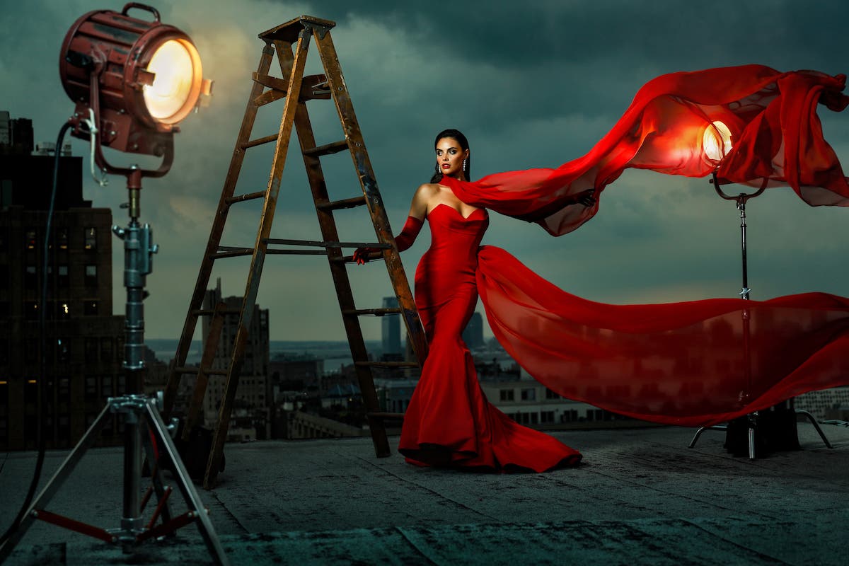
Red Beyond Emotion
Red isn’t just about creating emotion. It is incredibly attention-grabbing color that can help a viewer pause to look at your work. When we are all constantly bombarded with images all day long, it is important to use color to its full advantage to catch the viewer’s attention.
Because it is so bold, red can also help to direct the viewer in your composition and give them a focal point in an otherwise busy scene. In other words, you can use it compositionally and emotionally to create visual balance.
Pairing with Red with Other Colors
Although my favorite way to photograph red is to create an entire image about this color (red on red), it can certainly pair with other colors for dramatic effect. Let’s take a look at a couple examples of color harmonies for how to use red.
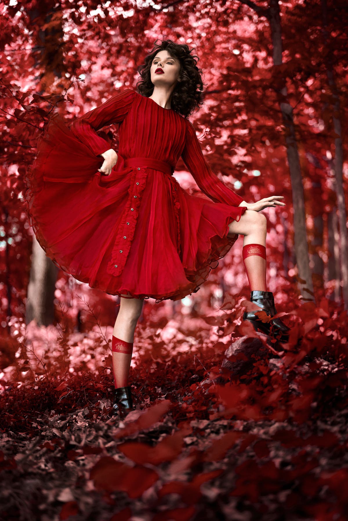
Monochromatic
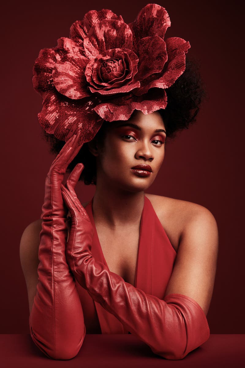
When red is the predominant color in the frame, this is a monochromatic color scheme. Red clothing on a red background is a perfect example of this.
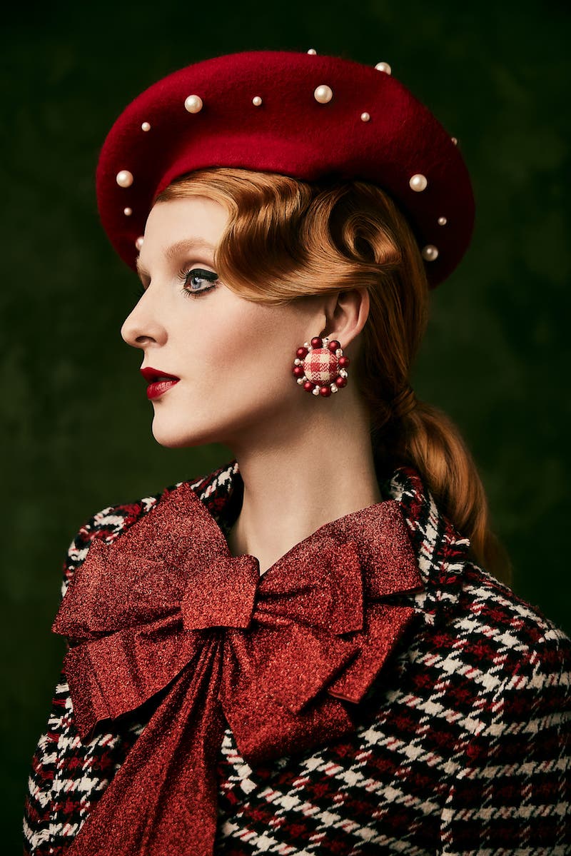
Complementary
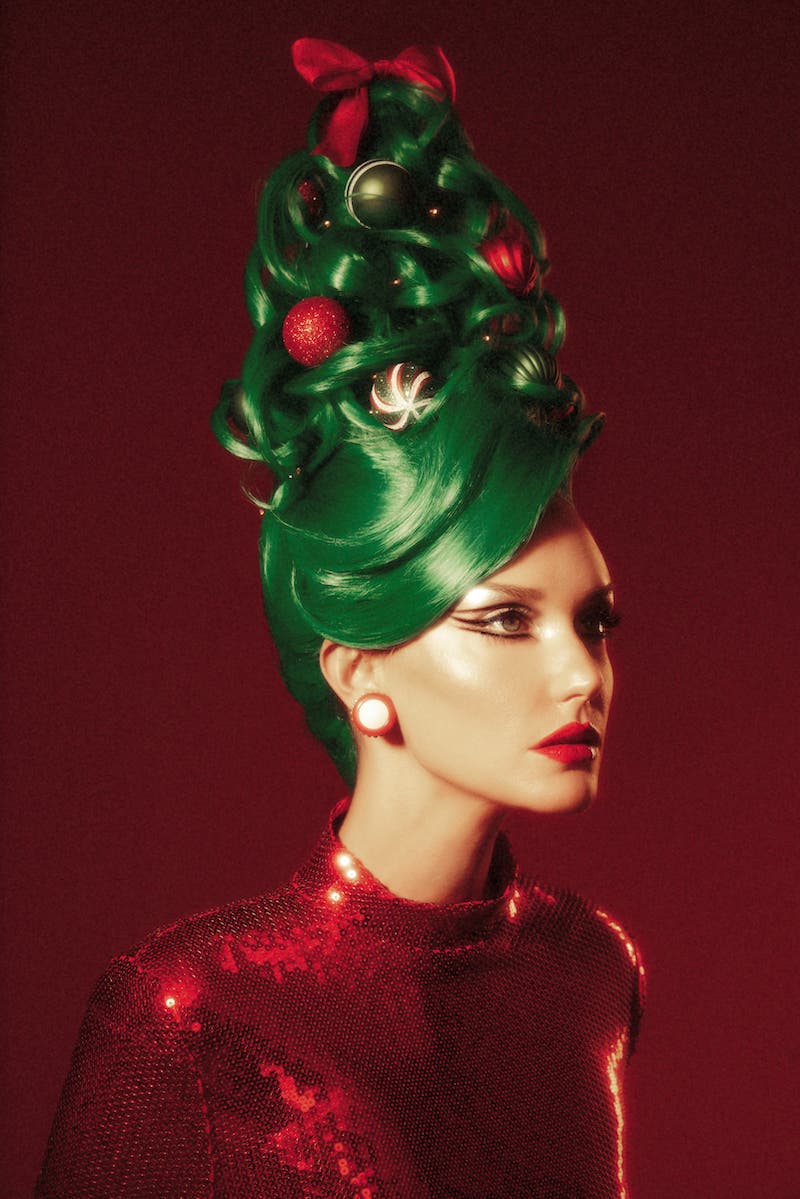
Red and green are complementary colors that instantly brings the holiday spirit to mind. You can, of course, use this combo for “Christmas colors.” Although, more desaturated or subtle hues help you achieve painterly results without instantly bringing up Christmas vibes.
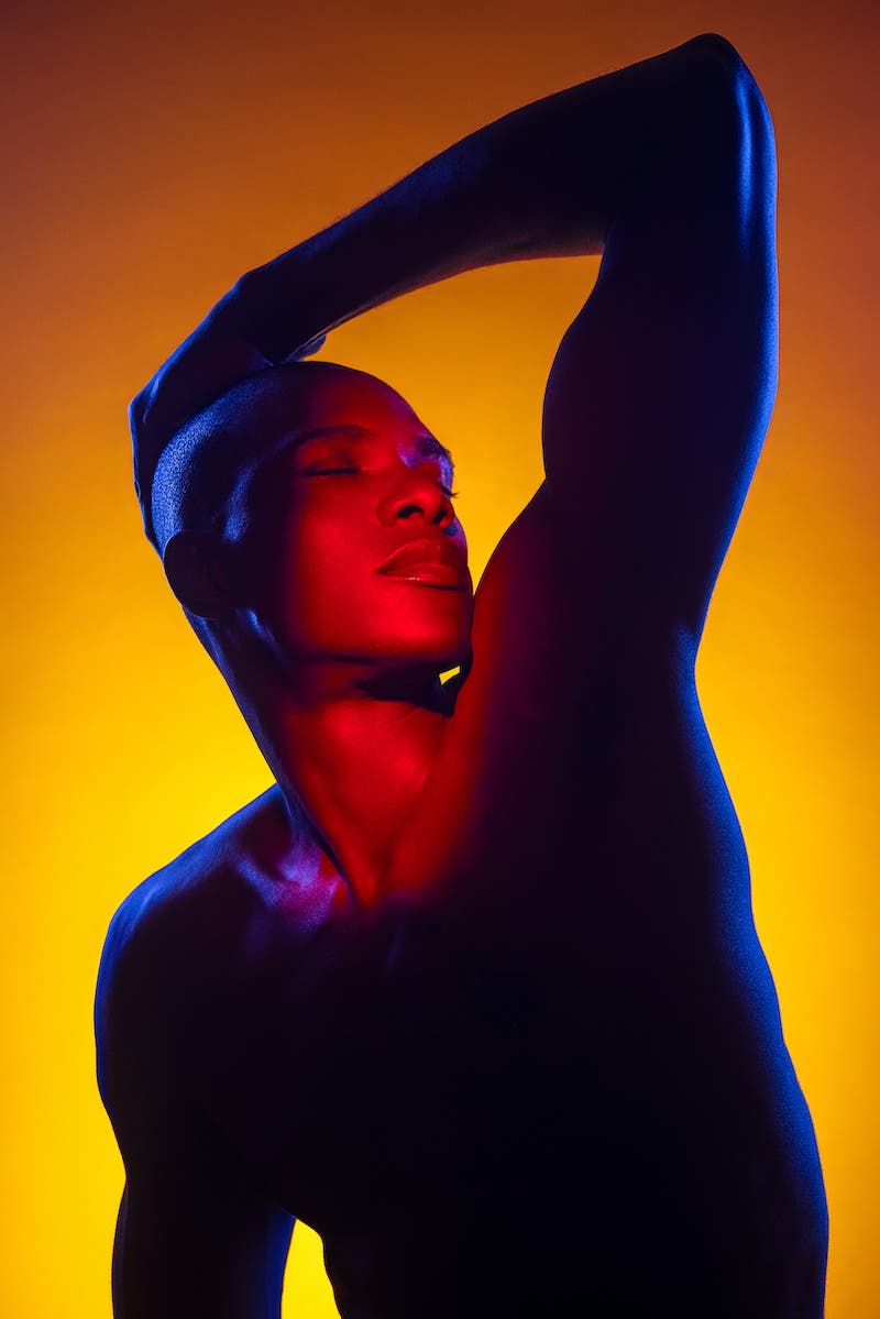
Analogous
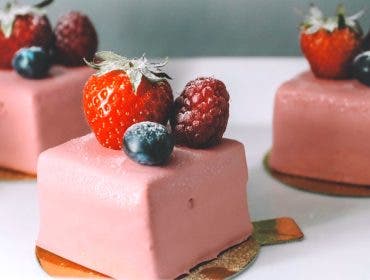
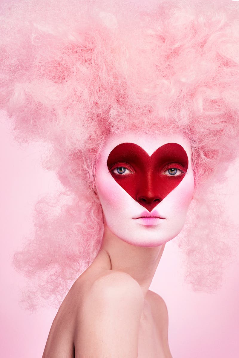
Colors next to each other on the color wheel create an analogous color harmony. These harmonies are more peaceful and unified. When it comes to red, this can include red, yellows and oranges (a common warm palette), or perhaps red and pink hues together.
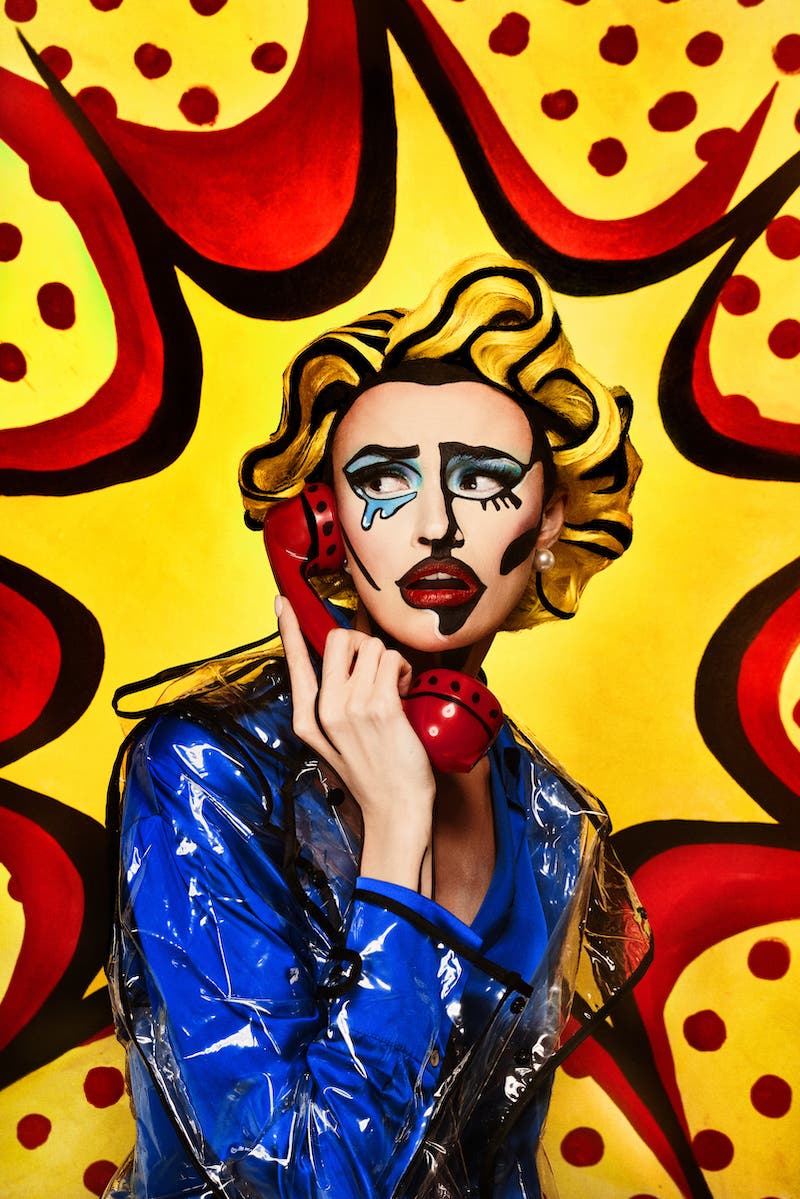
Triadic
Three colors equally spaced on the color wheel create a triadic color scheme. Red, yellow, and blue are a common pairing to create bold contrast in an image that is energetic and youthful.
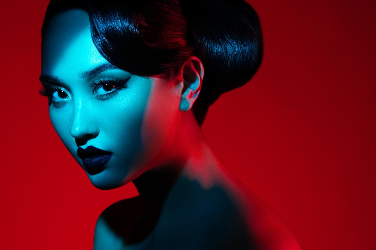
Warm-Cool Contrast
Another great way to create contrast is to pair a warm color against a cooler color. In my gel photography, I often use a red/cyan pairing for dynamic results.
Where to Add Red in Your Photos
When you introduce red into your imagery, you can do so in a subtle way or go more heavy-handed by creating a monochromatic image where red is prominent throughout. I find that I add red to my photos with these three main approaches:
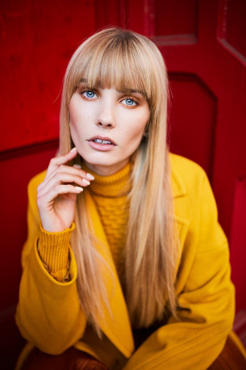
Background
A red background is a great place to create a bold and attention-grabbing image. I recommend the scarlet red backdrop, which you can see used throughout my portfolio.
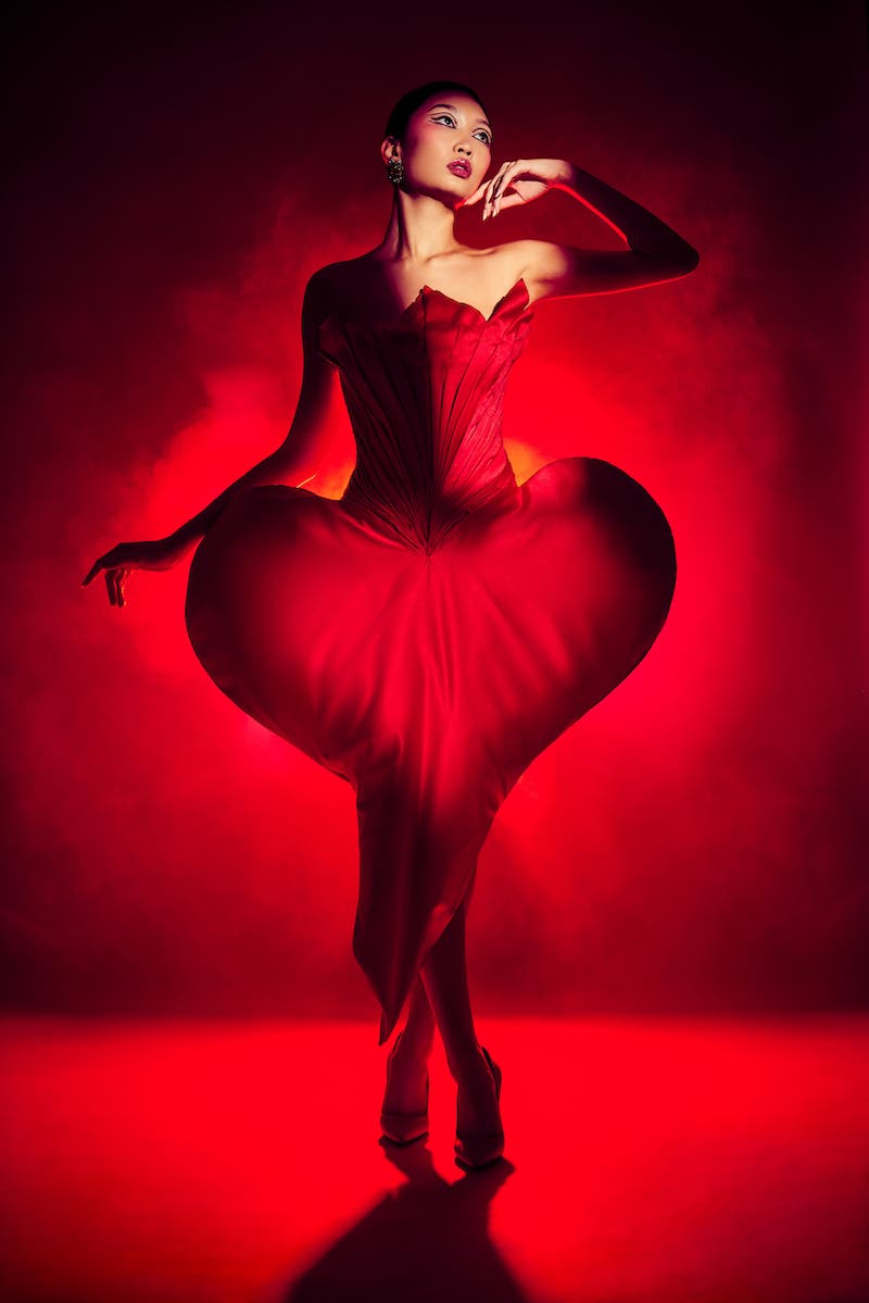
Red Light
I find that red light as a lighting gel, or RGB LED lights, is a fantastic way to fuse red into your image. Red light allows you to create dynamic results by adding a kiss of red into the shadows or to illuminate the environment with a red backlight for moodier, cinematic results. I usually grab a red light source when there is already red in the scene. This helps to unify the elements, particularly when I want a monochromatic red look (red light, red makeup, red background, etc).
Styling
You can introduce red into your image by how you style your subject. A red hat, a bold red lip, or a dramatic red dress are all great ways to introduce this powerful color into your work. You can also consider adding some red props. Each year, I make a trip to the dollar store to grab Valentine’s Day or Christmas decorations to add a dash of red into my upcoming holiday shoots.
Tips for Capturing Red
It can be a challenge to capture rich, saturated red in your images because there are a few common mistakes that can throw you off! Here are just a few tips to get your reds looking fabulous.
Watch Your White Balance
Never use auto white balance when photographing a lot of red. Our camera sensors read this warmth and instantly cool down the image, making skin tones look off. Use the appropriate white balance preset (flash, daylight, etc) or get a photo of a grey card.
Don’t Over-Light a Red Background
I’ve found that if you add too much light to a red background, you can run into problems. Sometimes too much light (from a strobe or continuous light) can cause the red to look washed out and desaturated. It can lose its richness. Furthermore, if a red is hit by direct sunlight or overexposed, it can begin to go out of gamut. In other words, the sensor can no longer accurately represent the color. I find that I tend to underexpose reds just a bit to help keep their richness.
Adjust HSL
In post-production, you can independently adjust the hue, saturation and luminance (brightness/lightness) of each color. Shoot RAW and then take the time to mess around with these sliders in Lightroom (or other RAW processor). I’ve found that if I darken the reds or saturate them, they look much more striking.
Conclusion
I aim to create images that are powerful, eye-catching, and emotive. To do this, I use the full range of my creative toolkit from styling, lighting, posing, and color. The color red in photography has become an important element of my style. It is a tool that you, too, can integrate into your work for impact.
