The early months of 2012 brought forth a photo contest, sponsored by Adorama and Ken Rockwell,offering a free newiPad 2as a prize and incentive to enter, and me offering to set out the rules and judge the winner. Well, we now have our winners!
Photo blogger Ken Rockwell, chose the winning photos (see below) and set a distinctive tone for the competition, which saw nearly 10,000 entries.
Ken picks up the narrative:
The point of this contest was fun (it was all free to enter), and to see who could create the strongest image.
The rules were simple: no rules! Just make an image that catches my eye and keeps me glued to it. Make an image that says “Pick me!!!” and doesn’t let go. Easy.
We had almost 10,000 entries, and to keep things manageable, we let you folks vote for the best images. After the votes were counted, the top 25 were delivered to me from which to pick the winner.
As I explained, to catch someone’s attention, the image needs to be bold and strong. Image strength usually comes from simplicity: saying just one thing, and saning that one thing as strongly as you can.
I don’t care what kind of camera was used, or even if a “digital” camera or any kind of camera at all was used. Paint with oils on canvas, use “Photoshop,” and do anything you want to craft a bold image. I never said photo, I said image, so anything you can show on a computer was fair game.
I asked for strong and simple — something that jumps out at me as a thumbnail image. This is a modern-day contest; people spend more time looking at things on their iPhones than they do in real galleries. The most difficult thing for a photographer to grasp is to think like an artist and pay more attention to thebasicsthan the distracting details the camera records for itself. This is a contest about getting the basics right —and getting rid of distractions that are in every photo unless the photographer goes out of his way to remove them.
The key to winning this contest was to craft an image with such strong basics that everyone will be attracted to your image as a thumbnail. That’s 90% of life in photography.
Related: Five Things I’ve Learned About Photography
90% of making a great image is getting thebasicsright. Few photographers pay any attention to basics since, unlike painters, the camera always captures something, even if you pay no attention to the basics. Most photographers ignore the basics, and thus make boring, bland images that say nothing thumbnail-sized. This is why 9,999 images didn’t win: too many distractions. It’s sad that photographers worry about meaningless things like “high ISO noise,” while many completely ignore all the real noise (distracting elements) in their images that they fail to crop-out.
Like most things in life, there is no second place, just a free iPad 2 for the winner, and a good time had by all.
Obviously I’m judging this by my own personal preferences; we all would have picked a different image, so here’s why I chose what I did:
First Place
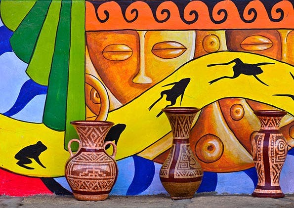
Photo © Sergio Armando Forero
The winner won easily: it’s the only image of the top 25 that instantly grabbed my eye. None of the other top 25 images made its point anywhere near as clearly. Every other image had too much noise in it: too many distracting elements that weakened whatever the image might have been trying to say.
This image is all about a strong yellow band flowing from left to right. I don’t know or care what are the details or how it was made; it’s the only image of the top 25 that had a strong design element: the yellow band.
Once the yellow band caught my eye, which is 90% of everything, there were plenty of other things to keep my eye exploring. The image is very carefully balanced and very properly squared-off. Too many photos are made by lazy photographers who fail to keep level lines level, and more importantly, to keep parallel lines parallel.
This work didn’t have the frame edges cutting through any details. The exiting frog on the left is questionable, but tough; no other image in the top 25 came anywhere near as close to getting its point across.
What’s the point of this image? A yellow band flowing smoothly from left to right. That’s it; bright, bold and fun.
I have no idea how this image was created, and don’t care. It looks like the artist painted it on a wall, placed some pots in front, and then photographed it. Painting, be it acrylic, oils or in software, was perfectly legal and encouraged in this image contest.
Second Place
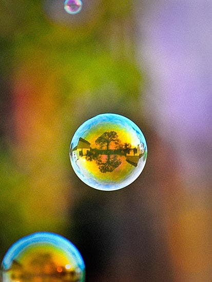
Photo © David Rekowski
This image would have won, except:
There’s too much noise. The bubble at the bottom is a distraction, and sliced by the frame edge. Ditto for the smaller bubble at the top.
Less is always more in art. If this image was submitted cropped-down to only the center bubble centered in a square frame, it would have won.
Runner-Up #1
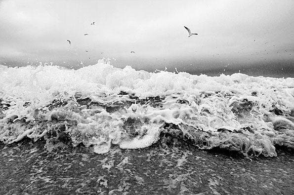
Photo © Titus
This image would have won, except:
The birds lost it.
1.) If the birds were painted-out and the image was cropped a bit into a balanced, dynamic section of the bursting wave and dodged and burned carefully, it could have won.
2.) The bird could have been flying out of the top right, closer to us. That would have added motion and dynamics, and probably would have won the contest.
If the bird had flown a few feet forward, closer to the camera and the wave had held still, this would have won. As-is, the birds are just noise, not stong parts of the image.
Barring the bird flying on cue (fast frame rates in cameras like theNikon D4are a huge help here), I would have selected and copied the bird to a new layer inPhotoshop, painted over the original bird on the base layer, and then enlarged and moved my copied bird to make it much bigger and closer to the top right.
That, and a little clever cropping, burning and dodging, and it would have won, but as-is, the birds are noise; they aren’t strong enough to help the image, so they weaken it.
Runner-Up #2
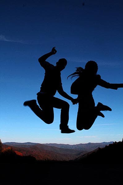
Photo © Jaliza Lasala
This image would have won, except:
It’s all about lighting. There is no background.
If the sun was directly behind them, beaming out brilliant golden beams all around them with rim-light, this would have slammed into first place like a race car.
We can’t always make the light we want as we shoot, but we often can add to it later.
If the artist had gone intoPhotoshopand replaced the dull, dark blue sky with a brilliant golden sunstar from another shot, or just drew a glowing background in Illustrator and dropped it in, we would have had our winner.
The subject is cut-off on the right. I would have painted-over the arm at the sleeve, and cropped the couple to be in the center, too.
Summary
As I said when starting the contest on February 1, 2012, this was about creating a simple, strong image, regardless of the media or tools used to create it. It was all about catching my eye (the hard part), and then keeping me interested once my attention’s been caught (the easy part). There were no rules; just like life, this was an open-class competition.
I wish I could impress upon everyone thatsimplicity is everything.9,999 images lost because they weren’t simple enough: too many distractions, too much in the image, too many details in the background, and not enough concentration on the image.
Thecamera means nothing.Your own vision means everything. The top image could have (or for all I know, may have) been snapped with an iPhone or aQuicksnap; itjust doesn’t matter.
What does matter is paying attention to your subject. Your camera will take care of itself; set it on auto and pay attention to your pictures. Only take it off auto if for some reason it’s not doing what you need it to.
Note that the only reasons any of the images didn’t win was because of huge, basic things there were or were not in the image. Megapixels and high ISOs had nothing to do with any of these, but the critical fundamentals that make up each image do.
So until next time, a hundred-thousand thanks to each of you ten-thousand folks who entered. I hope you all had a great time!
-Ken
Runners-up
Quick critiques by photo blogger Scott Eccelston. Visit Scott’s blog.

Photo © Joseph Stanek
A Different World
A great example of how focusing on the eyes can make a powerful image.

Photo © Matthew Brubaker
Waffles The Corgi
It’s hard to go wrong with a Corgi wrapped in a towel.
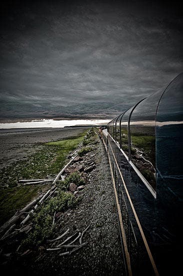
Photo © Nick R. Gibson
Perpetual Penetrance
Powerful clouds, great leading lines, nice evocative use of HDR and vignetting.
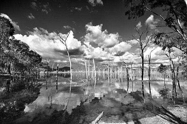
Photo © Michael Nimtz
My Submission
Lots working for this image—lines, reflection, clouds. It’s the perfect kind of image for black and white. Has an “Ansel Adams” feel.

Photo © Liviu Lazar
Fun Fun Fun
The title says it all: A fun day at the beach. The expression on the child’s face is priceless and the composition is well-balanced.
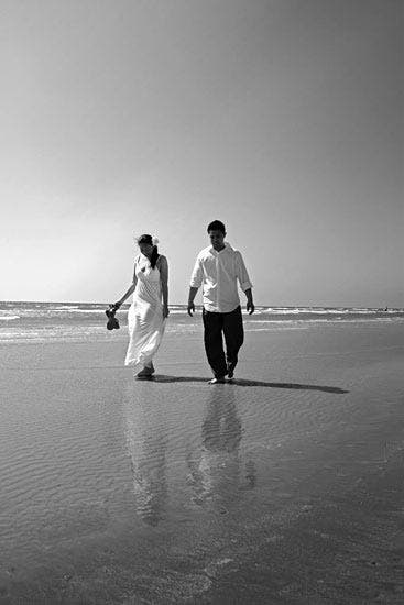
Photo © Leo L.
Love Reflects
The reflections in the water make all the difference here.
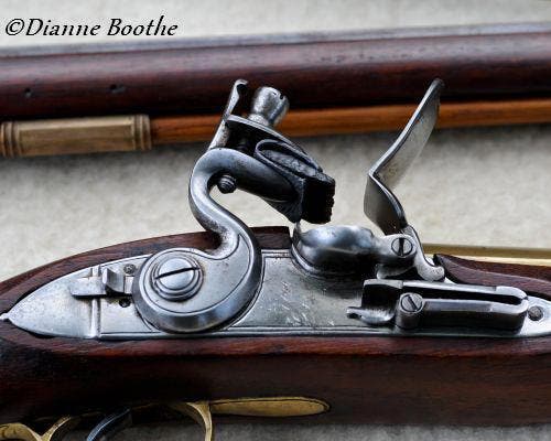
Photo © Dianne Boothe
Gun from the mid 1700’s
A nice close-up showing intricate detail.

Photo © Kailash Naik
It’s a deal!
A good “slice of life” candid shot.
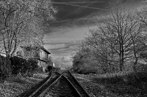
Photo © Florian Engelhard
Old Rails
This is a good example of using vanishing point perspective to convey depth, while the detail in the clouds add an important element of interest .
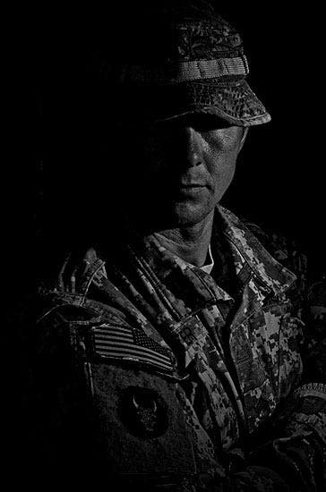
Photo © Cory Lessard
Strength
Great use of black and white and light and shadow, to convey a sense of mystery and danger.
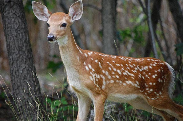
Photo © Adam Zakrzewski
Wild Fawn
The stillness of the fawn is well represented, as is the sense that it was ready to bolt at any moment. The detail of its coat is well done.

Photo © Devin Toner
Devin Toner
This kind of photograph is really hard to expose correctly, and is done well in this shot.
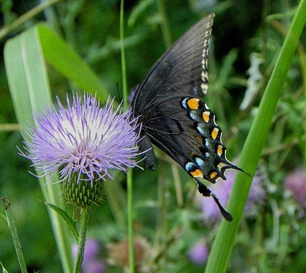
Photo © STEVE SOLOMON
PURPLE THISTLES AND BUTTERFLY
The kind of photograph that has the ability to draw you in, although the background is slightly distracting.
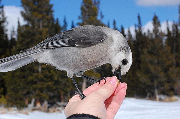
Photo © LW
Whiskey jack and a Clif bar
The detail captured in the feathers and overall sharpness of the image is very good.

Photo © Inna Malostovker
Looking up
Nice use of lines and an unusual perspective.

Photo © DeeAnn Eller Wiggins
Human Impact
Nice atmospheric photo. The lack of detail leaves a lot to the imagination of the viewer.
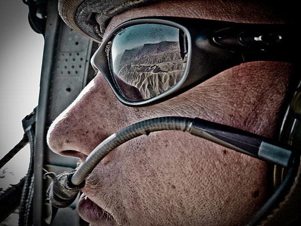
Photo © Nick R. Gibson
The Perspective of War
I liked everything about this shot, the texture of his skin, the reflection, right down to the sand dunes caught in the sunglasses.
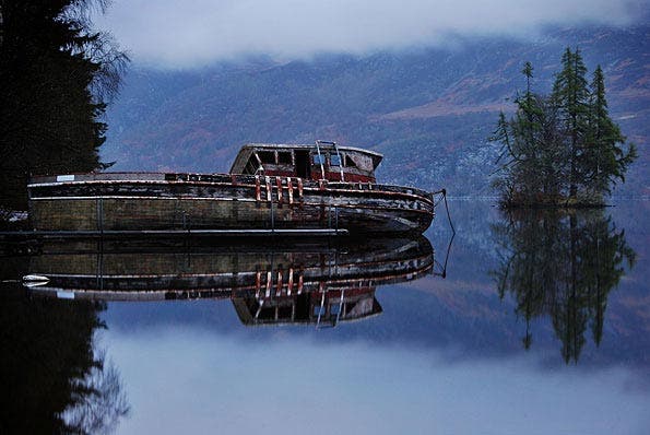
Photo © Colin Fitz-Gibbon
Docks of Loch Ness
The conception and processing of this image was well done. But where’s Nessie?

Photo © Gary Patton
Gary Patton and His Mushroom
Gary got down low to the ground to get a compelling angle and capture the delicacy of the subject.
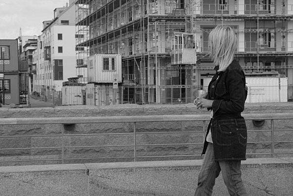
Photo © Thomas Kiss
Black & White
Good cityscape, and the addition of a person in the foreground adds a human element and breaks up the patterns.
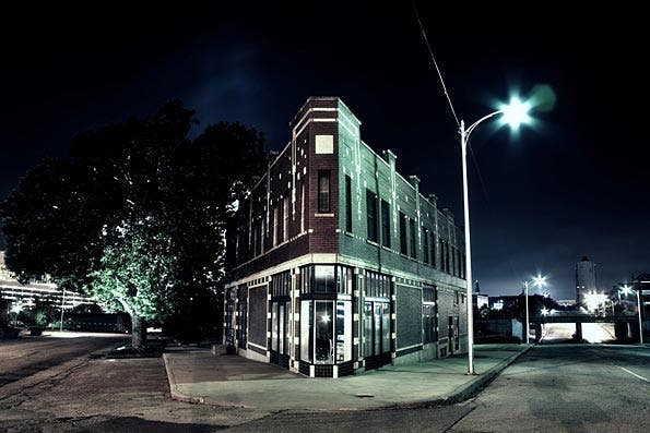
Photo © Michael Mehrhoff
Flat Iron building
Very good example of night photography and use of lines.

Photo © Kellie Tatem
Two Days
Great color, use of flair, and the hint of the sun. I like everything about this image.