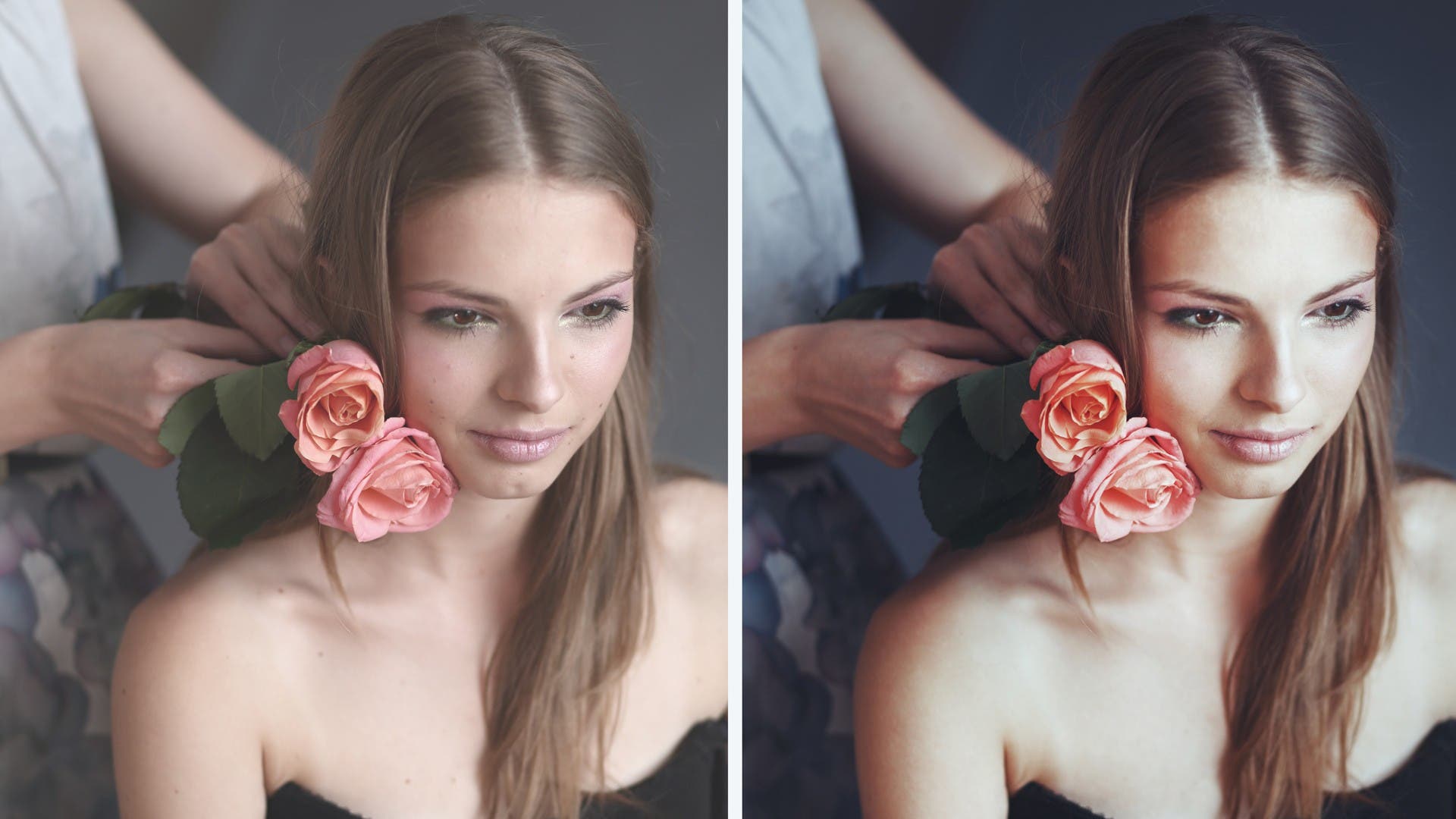
Congratulations on making the jump into photo editing. This will be an exciting journey that will allow you to get your pictures to their absolute best. I will guide you through the first steps of navigating Lightroom and into some basic photo editing. As this is an introductory lesson, I won’t get too far into the weeds with all the available features as that would be a book’s worth of information. My goal is to get you up and running with enough knowledge to handle some basic edits as well as some advice to help you make good choices. I will also explain the terminology and the reasoning behind my methods.
Just Breathe!
So perhaps you have had struggles with Photoshop. I remember when I was first learning to use Photoshop I was befuddled by the icons, how layers worked, and basically everything in the menu. Even after learning every icon and many of the features, I still found it cumbersome to edit all my photos. When Lightroom was released I was amazed at how fast I could edit all my photos and how powerful a photo editor it was. While it will not do all the things Photoshop can do, it has a ton of features: exposure, white balance, color adjustments, cropping, and way more. I now find myself using Lightroom way more than Photoshop. So, just how complex is Lightroom? On a scale of 1-10, if you have never worked with any photo editing software, I would say it is a 4.
Importing
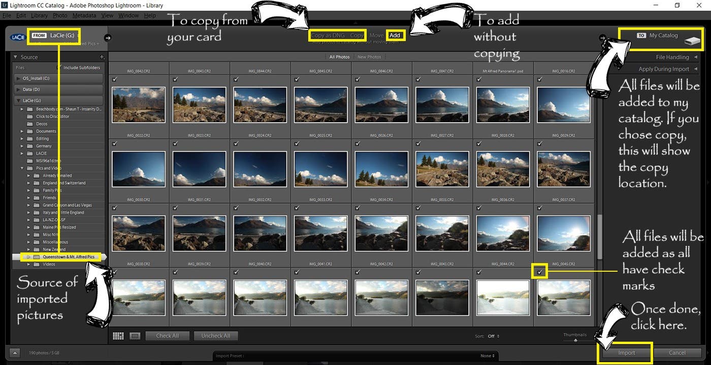
You have taken your photos, copied your photos from your SD card to a hard drive and opened up Lightroom, so how do you import your photos? The first step is to select your source on the
The first step is to select your source on the left-hand side. I have chosen the Queenstown & Mt Alfred Pics from the LaCie (G:) drive. I copy my files onto two drives, one to work off and one as a backup. From this screen, you can also choose to import your photos directly from your card by using the Copy function. This gives you file handling and file renaming options, but I prefer to leave my files with their original names so that if I need to work off of a backup, the file names will be the same. I rename my files upon export with a custom title and sequence number to keep better track of them.
In order to select the files you want, start by clicking the “Check All” or “Check None” button and then adding or removing individual images as you see fit. To select multiple files use the shift or Ctrl key (Cmd key on a Mac) and select the photos you wish to import. When you are finished selecting the files click on the import button.
Keep Organized and back up
When importing and organizing photos, make sure to follow a system that will make sense to you when you need to find photos from years ago. I keep a piece of paper listing what is included in my drive in the same case as the hard drive. This allows me to more easily find what I am looking for without plugging in every drive until I find it. And ALWAYS backup, preferably to a place that is not in the same location as your working drive because in the unfortunate event of a fire, flood, or other catastrophe, you will lose all your work. It is a good practice to upload to an online server.
Library Module
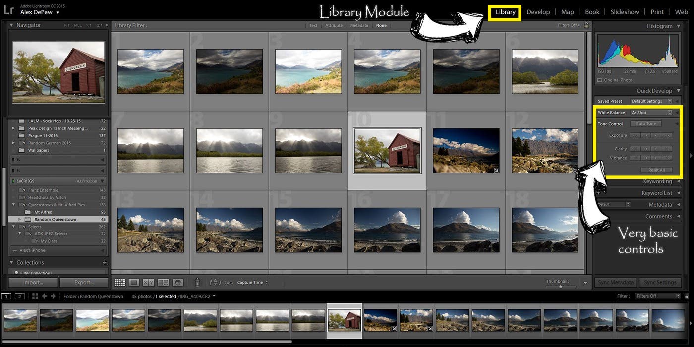
I generally don’t edit or spend too much time in the Library Module, preferring to skip directly to the Develop module. The Develop Module gives you full control and a much greater tool set to edit your photos. I use the Library Module when I want to make global changes or see the thumbnail view of the pictures I am working with.
Develop Module – Before
Non-destructive editing – Don’t worry, be happy!
Before I go any further let me explain how photos are edited in Lightroom. In Lightroom all the changes you make to your photos are reversible. The changes don’t do anything to your original photo files, the instructions for edits you are making are saved in Lightroom, so feel free to mess with any setting and play with all the sliders to see what they do.
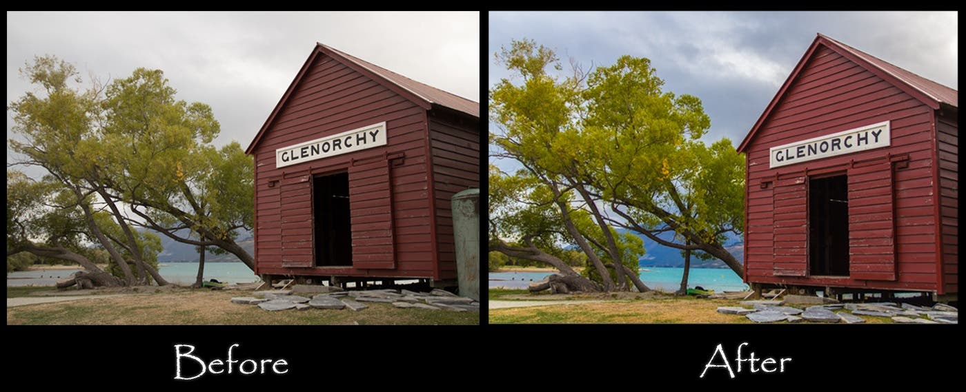
I’m going to use a picture I took in New Zealand as an example to show you what can be accomplished with a bit of photo editing. This picture was shot quite a few years ago with a Canon T3i in Canon’s CR2 RAW format. I almost always shoot RAW as it allows me the greatest flexibility to edit my photos. While getting the image right as much as possible in camera is ideal, I still suggest that if your camera can shoot RAW to make use of the feature as it will allow you a lot more latitude when you are trying to pull back highlights, change the color temperature, raise the black levels and way more.
Editing is not cheating
There are a lot of people who think that editing pictures is cheating or fake. In my opinion this is nonsense. While you do have a lot of control over how the camera records your image through picture profiles and manipulations of those settings, the color space, contrast, sharpening and distribution of exposure from the darkest part of the image to the brightest is something that the camera largely handles through its software. This may not be exactly what you want, so editing your photos is overriding these decisions to make your own choices. Of course, you can go crazy and make everything look way overdone, but then you are proving the naysayers right, so don’t do that!
Histogram as a guide
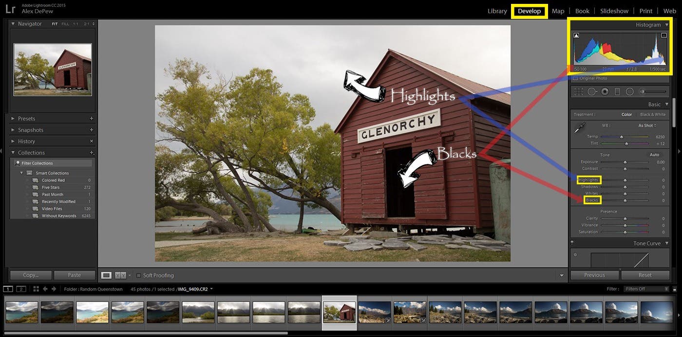
Looking at the picture below, I know what I would like to modify right away. The colors look flat and the sky is just a blob of grey. The first thing I look at when editing my picture is the histogram, which you will find on the upper right hand side of the screen. The histogram is a visual representation of the light hitting the scene displayed from darkest, at far left on the graph, to brightest, far right. In between you have your midtones. When you have a solid line on the far left of the graph you have parts of the frame that are underexposed and when you have the same on the right side you have parts that are overexposed. Generally you don’t want to have images where the blacks are clipped, meaning there are parts of the image that are so dark the information is not there. You also don’t want to have your highlights blown out, which means that the information on the brightest part of the image is lost. You can check to see if this is the case by selecting the box with the triangles on the upper left and right of the Histogram box. These highlight the sections of the image that are either clipping or blowing out respectively.
While clipping and blowing out are definitely areas you should look out for, there is a lot of incorrect information out there in the digital world that says that there is an ideal histogram shape that you need to achieve. There is no one shape or distribution that you should be looking for. The light distribution in photos can vary wildly. A dark noir shot of a cop sitting at his desk, holding a bottle of whisky in a dark room illuminated by a desk lamp will have a heavily left leaning histogram with midtones being almost nonexistent and a bit on the right side where the lamp shows up. A white rabbit in a snow covered field on a cloudy day will likely have no darks, very little midtones and will heavily lean to the right towards the whites. In the example I am using there is a decent spread from blacks through the highlights. I exposed my shot so that I would make sure that the sky didn’t get overexposed, a technique called exposing to the right. Under many circumstances (but definitely not all!), this allows you the most latitude when editing your images, as it is easier to push the blacker part of the images down than to push underexposed or very dark parts up, which may lead to a unwanted pixilation of the image. It also retains information from the part of the scene that might have been overexposed, in this case the sky.
Develop Module – After
Cropping and Straighten
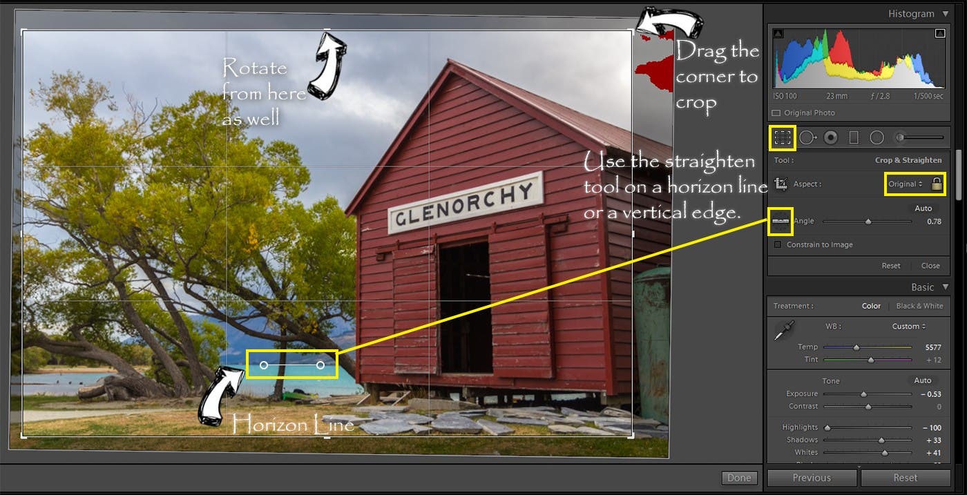
The first step I take whenever editing is to make any rotation adjustment and crop the image until I am happy. By cropping and rotating first, you are seeing the effects applied only to the already cropped image. Let’s say you wanted to crop the sun out of a shot. Doing so alters the histogram and when you move the highlight slider, you will see the only the cropped part of the image being adjusted.
You have several ways to crop and straighten. If you want to maintain the ratio of the height to width of the picture when cropping, leave the icon of the lock closed and when you drag a corner in it will maintain the ratio. If you want to crop without regard to the aspect, unlock it. There are also common aspect ratios that you can select from the drop down menu if you click on the word “Original” just to the left of the lock symbol. Once you have cropped your image you can drag the image around by holding down the left mouse button and letting it go when you are happy with the final crop.
In order to straighten your photo, you can rotate using the slider right next to the “Angle” setting. You can also rotate if you hold your cursor over the middle dash line pointed out below, simply wait for it to display the rotation icon. If there is a horizon in your picture you can also straighten the image with the Straighten Tool by dragging it over a horizon line as I have below. You can also do so with a horizontal edge such as the side of a building, but I find this generally less accurate.
Presence Panel
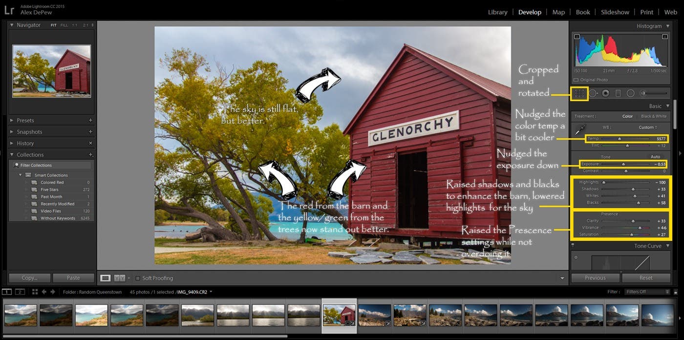
The next step I take is to head to the Presence Panel and adjust the Clarity, Vibrance and Saturation sliders. The reason I adjust these settings next is because the Clarity slider is responsible for midtones contrast. This means that as you increase the clarity you will get a separation in the darks and lights of the middle light range of your picture. If you were to adjust this after all your other settings the colors and light of your image will be very different and you will need to go back and adjust them. While this isn’t sharpening it has a similar effect as it sharpens the details around the edges and adds definition to the objects in the midtones. This is basically a midtone contrast slider. It adds punch to your picture. I rarely use the contrast slider as it applies contrast to the entire image. I much prefer the clarity slider as it has a lot of impact where it is needed and doesn’t affect the parts of the image where it isn’t. However, I will advise caution when using clarity. It is very often pushed too far by beginners to image editing. The punch is very effective, but you don’t want your viewer thinking they just got punched in the face with contrast!
Vibrance works with an Adobe proprietary formula to add saturation to colors in your image that are not already saturated. In the After image below I have added both Saturation and Vibrance to the image as the before image was quite flat. I first adjusted the Saturation then the Vibrance. As the Saturation setting is global and affects all colors I adjusted this until I felt happy with the overall look of the colors, then I adjusted the vibrance to bring out the reds and sky a bit more.
Exposure
After that I adjust the exposure slider to the left a bit to lower the overall brightness of the image as I wanted to take it down a touch to enhance the mood of the photo.
Color Temperature
Color temperature is a value of light using the Kelvin scale (K) with warmer colors being in the 2700 – 3200K range and cooler colors being in the 5000K+ range. For an intro to photo editing article it doesn’t make sense to delve into the science behind color temperatures, it is much more useful to use real world examples which will help you determine your White Balance, both when taking the picture and when editing it. The chart below shows you lighting situations that generally correspond to their respective Kelvin color temperature. If you would like to learn more, you can check out a previous article I wrote for ALC on Color Temperature Basics.
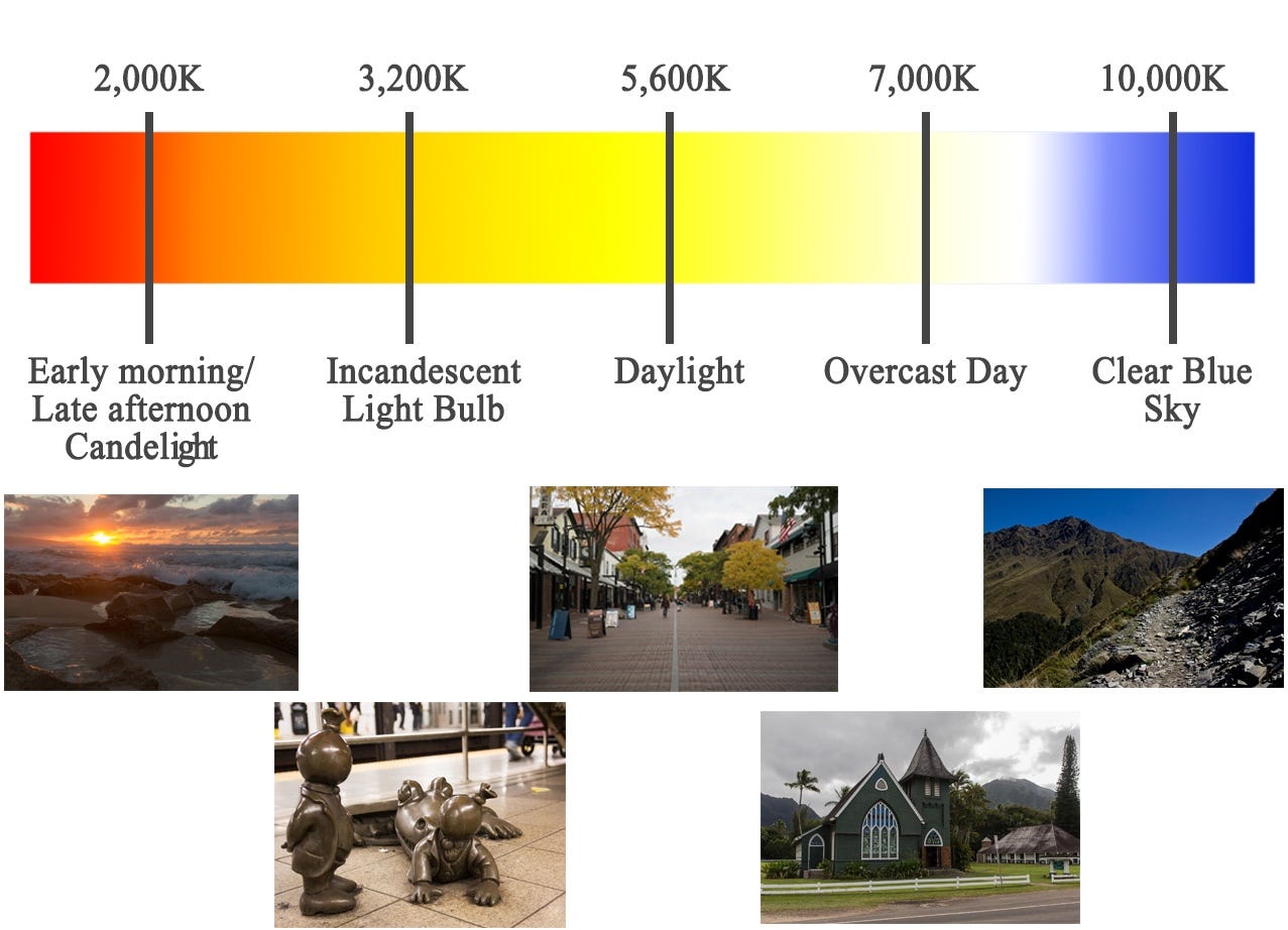
Color temperature can be controlled in two ways. You can choose from the Custom dropdown Auto, Daylight, Cloudy, Shade, Tungsten, etc. or you can be more specific using the Temperature and Tint slider. In my picture I warmed the temperature a bit from 6250 to 5577. Now you may be saying to yourself ‘Hey! Isn’t that backwards, you just said that lower numbers are warmer!’ And you would be right, except that Lightroom isn’t warming the picture when you move the slider the right, it is adjusting the compensation for the lighting of a cooler temperature, which is in effect backwards to what you would expect. Confusing I know, but once you get used to sliding the Temperature, it will become second nature.
Highlights, Shadows, Whites and Blacks
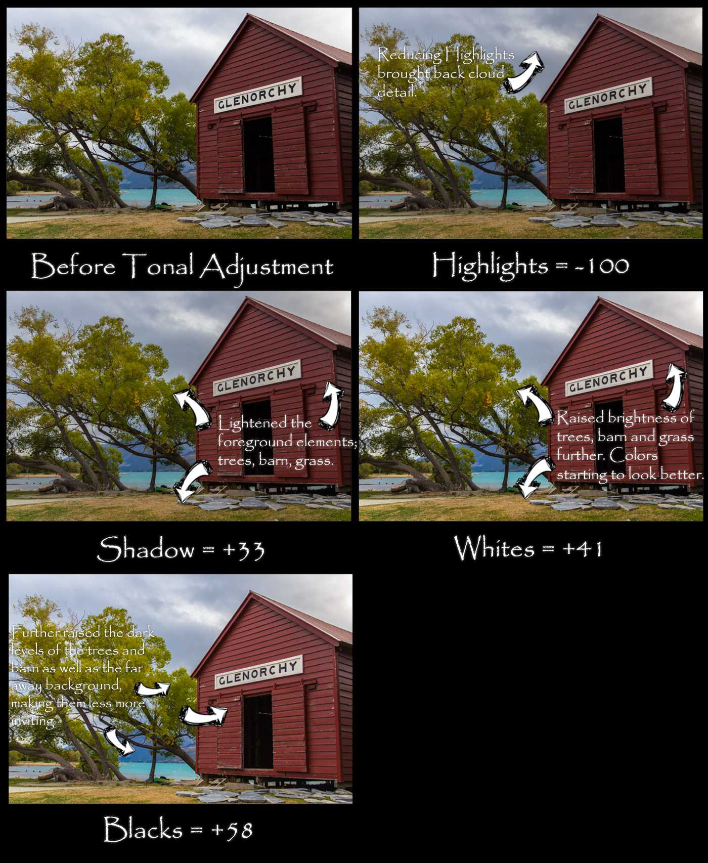
In this panel you work on tonal ranges of different light values from the darkest parts of your image to the brightest. Starting with the Highlights and working down works well for me. In situations where the sky is a big mess of blobby clouds like in my picture, I lower the highlights value considerably, in this case all the way to -100. This helps to bring back a lot of the detail in the sky that your eye may have seen, but the camera couldn’t record and sometimes even brings out details you may not have been able to see.
I raised the Shadows to bring up the slightly darker parts of the image, namely the tree and the barn, which I want to be not so moody. Raising the Whites brought the light levels up in those areas further as well as giving the white of the Glenorchy sign a big bump so it would stand out. I also raised the black levels to take the very darkest parts of the image and boost them a bit so that the look would be more welcoming. The background and the opening into the barn are getting affected the most.
All these are personal choices I made to get to what I felt was the best representation of my picture. If you gave this photo to 10 people, you would get 10 different interpretations. Some would be not so far off from what I have done, while others would be wildly different. For this post we will only go through the options up to the Tonal Curve panel, but definitely play around with all the settings, spend some time moving the sliders around and you will start to understand how these sliders all work.
Final Output
As you can see, the difference between the original and finished is very pronounced and the final looks way better to my eye. If I were to continue editing this photo I would make minor changes to the red and green color channels and perhaps make adjustments to the sky using the Adjustment Brush, but overall this is very close to what my final would look like. So, go get your hands dirty and start editing your photos. Just remember not to overdo it and make your photos surrealistic, unless of course that is the exact goal you are trying to achieve. Happy editing!
Questions? Leave me a comment below, or tweet me at @adorama. Check out ALC next week for Part 2 of Lightroom 101.
Also, to learn more about photo editing using Adobe Lightroom and Photoshop, check out these full courses on creativeLIVE: