“We are drawn into the moment by that great pocket of light toward the center but, when we get there, we realize there really isn’t a moment.” —Jena Ardell

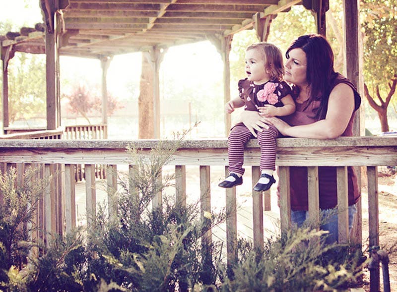
© Michelle Herman, Wheatland, CA. Gear: Canon Rebel XSI with Tamron 28-75mm 2.8 zoom taken at 28mm, f/2.8, handheld. Spot metered exposure: 1/125, 100 ISO. Edited in Photoshop Elements.
Photographer’s statement:
“This was in the AM at our local Pumpkin farm (Bishop’s) in Wheatland, California Us. They have a small pond there that she was looking at with her daughter. I liked the “lines” of the railing and thought it would add a visually appeasing element to the picture. I tried to keep the focus on mom and baby though by using the rule of thirds. My biggest challenge was to keep other people out of the photo since Bishops is a pretty crowded place. This was taken with my old Rebel XSI – Edited in Photoshop Elements.”
Our critics say…
Jena Ardell: I like the colors tones you’ve created here because it gives the image a whimsical appearance. The way you framed the veranda creates interesting lines and shapes, but the shrubbery in the foreground is overpowering and steals the show. These cosmetic details pale in comparison to the real issue: we are drawn into the moment by that great pocket of light toward the center but, when we get there, we realize there really isn’t a moment. I’m a bit more interested in what the mother and daughter could be looking at than their relationship. The mother looks uncertain or concerned, which makes this seemingly-whimsical shot seem a little dark and mysterious. If you aren’t going to show us what your subjects are reacting to, have them react to each other, so we can become emotional invested in the photograph.
Mason Resnick: While I agree with Jena that the shrub is distracting, it’s fighting with the bright light in the background to draw my eyes away from the mom and her daughter. Perhaps that’s for the best, since wooden posts appear to be growing out of each of their heads! This is a careless compositional flaw (and a perfect example of an unintentional use of the Gestalt concept of Proximity) that could have easily been avoided if the photographer had shifted over a small step to her right. I agree the lines of the railing and the form of the “roof” guide the eye back to the mom and daughter, so compositionally this comes very close to working well—but its the little details that derail the photo.
Russell Hart: I differ with Jena on the “moment”—I think it’s here, but it’s one of mystery and (in the little girl’s case) of open-mouthed wonder. And I think the sort of faded-Ektachrome color scheme and background glow add to that. I don’t want to know what’s holding their attention; I’d rather wonder about it. The asymmetry of the picture (I hate to reduce to it to the Rule of Thirds, which drives me crazy!) is very effective too, I think, letting their gazes shoot across the frame. At first I thought the shrubbery was distracting, but even it has grown on me. So take that, Jena! Overall a very good combination of original capture and post-production work, without the latter being overpowering.
What do you think? Leave a comment!
Want to get Zapped? Learn how here!


