ByMark Wallace
Creating a compelling composition in a photograph is similar to building a house. When you build a house you have to make some basic decisions: Which way should the house face? Will it be one story or two? How many windows will it have? And so forth…
However, no matter what kind of house you build, it will always use the same basic elements: a foundation with a structure built on it. The same is true for images; they need a foundation and a structure. The foundation of every image is our subject. We build on that foundation using the elements of composition to create a story.
The subject of our photo can be anything: a flower, a cactus in the desert, or a chess player in New York. Subjects can also be abstract like colors or shapes.
Think of the elements of composition as the structure we use to create our story. Sometimes the story requires one or two elements and other times it requires many more. The objective is to compose our photo in a way that creates the most compelling story possible.
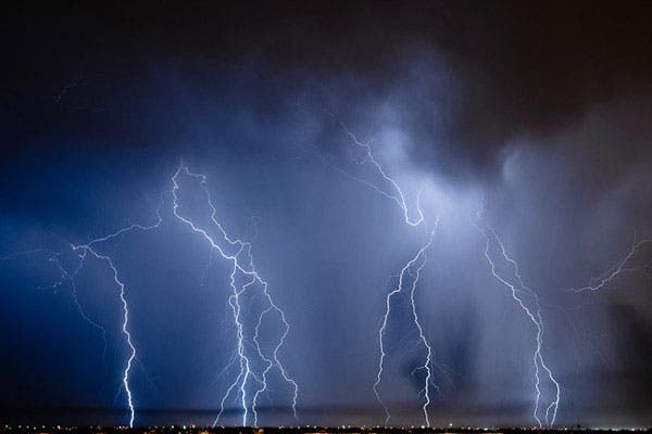
Take a look at the two photos below. The first has a very simple story: Lightning storms are awesome. The second photo has a more complex story: A chess player in the park takes a moment to think.

When we compose our images we have to ask ourselves: What’s the best way to tell this story? Do we tell a complete story, or leave some of it to the imagination of the viewer? Is it a story of action or peace? Should we fill the frame with the subject or give it some space to show motion? Do we need to direct the viewer’s attention to something? Does the subject need context or can it stand on its own?
Once we’ve made some decisions we use the elements of composition to create our story. In this article we’re going to examine eight of the basic elements of composition.
The Rule of Thirds
This is one of the most widely used elements of composition. It’s simple to understand and apply to your images, and it has to power to dramatically improve the quality of your photos.
Simply divide your image into thirds, both vertically and horizontally, to create an imaginary “tick-tac-toe” pattern.
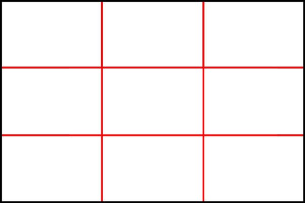
Use this imaginary guide to help you position your subject in the frame. Although it’s called the rule of thirds I think a more appropriate name should be the guideline of thirds because this simple grid can be used in several ways and it doesn’t always need to be exact.
The most common use of the rule of thirds is to place things of interest at one of the intersections of the grid. You can also use this grid to distribute the items in your frame. Let’s take a look at a few images to get a better understanding of how this works.
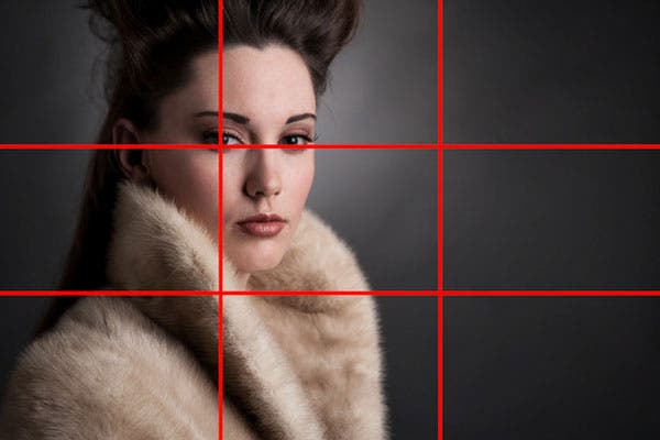
In this portrait the model is place on the left two thirds of the frame. Notice that the eyes are placed exactly at the top third line and the dominant eye is on the intersection of the top-left intersection. It’s rare that an image aligns so perfectly with the rule of thirds, things don’t have to be this exact, close is usually good enough.
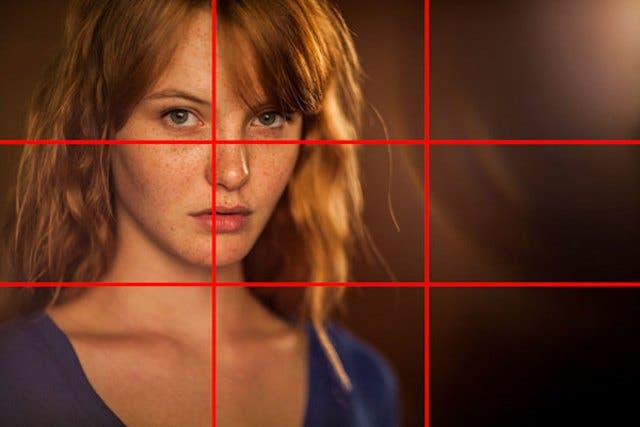
Here’s similar example, things aren’t lined up exactly, and that’s OK.

In this portrait we can see that the model’s face is lined up with the right third gridline. Her head takes up the top two thirds of the image and her shoulder is placed in the lower third. Notice the microphone and the lens flare are each placed in one of the other two thirds of the image. The lens flare in the top left balances the shoulder in the bottom right.

In this image the rule of thirds is used as a guide for placing the sky and city. The horizon is placed at the top third of the image.
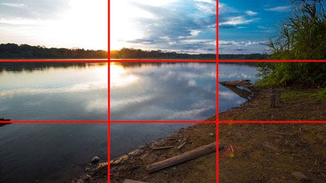
Again, the horizon is placed at the top third of the image, we also have the majority of the beach placed in the right third.
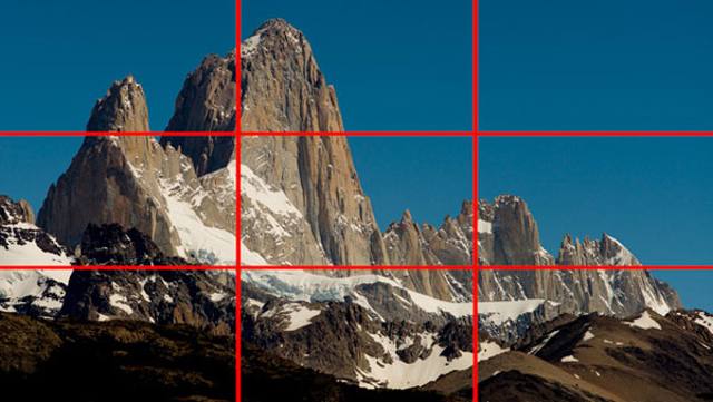
This image of Mount Fitz Roy also uses the rule of thirds. Notice how the largest peak, our subject, is placed on the top-left intersection.
Leading lines
Using leading lines you can draw the viewers attention to something specific in your photo. Think of the way railroad track lead our eyes to the distance. Those tracks are leading lines. They pull our eyes to the horizon.
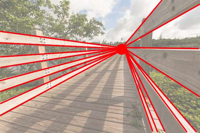

In this image you can clearly see how the handrails on the boardwalk lead our eyes into the image.

The strong leading lines from the floor and the architecture pull our eyes into the center of the frame.
Unusual Point of View
Bend your knees, get on your belly, stand on a ladder, hang from the ceiling. Most images look so much better if we can show them from a point of view that’s unusual.
Although we may look funny when we take our unusual point of view photos, the photos usually look more appealing, and most people would never guess that you were scraping your knees when you created the photo.
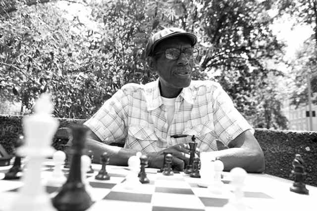
In this image of our chess player the camera was placed just above the table. This is not where our eyes would normally be (unless you happened to fall asleep while playing chess). This low point of view helps to strengthen the story, the chess pieces fill the foreground and the low point of view helps to show more of the park in the background.

This image of burning incense was shot with the camera almost touching the ground.
Patterns
Patterns are everywhere, we can see them in a brick wall, in a carpet, the stones of a cobblestone road. Once you start to see patterns it’s hard to not see them in almost everything. When you shoot patterns try to emphasize them by filling the entire frame.

Water droplets on glass create a striking visual. Notice that this pattern fills the frame from edge to edge.
You can also make patterns stand out by breaking the pattern. Try to follow the rule of filling the frame with your pattern, but look for things that break the pattern inside that frame.

This pattern of stones is broken by the cracks in the concrete. Breaking up a strong pattern gives our eyes places to explore and draws the viewer deeper into the image.
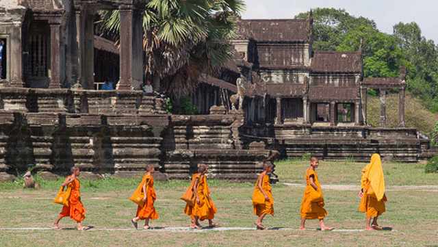
Pattern doesn’t have to be as obvious as bricks or rocks, it can be anything in the frame that repeats, like a group of young monks taking a walk.
Texture
Textures make photos look like we can reach out and feel them. Texture is more visible when light hits the subject from the side. Texture is easier to find when you shoot just after sunrise or just before sunset, when the sun is low on the horizon creating strong directional light.

The shadows and highlights on this peeling paint create strong texture.
Color
Images with strong color combinations will always stand out. To better understand this let’s take a look at the color wheel.

A simplified color wheel is on the left. The primary colors are shown on the right. When we have colors in our image that are opposite sides of the color wheel we get high color contrast. These are colors that really pop. The colors don’t have to be direct opposites; they just have to be from different areas of the color wheel. Let’s examine a few colorful photos for a better understanding of how this works.
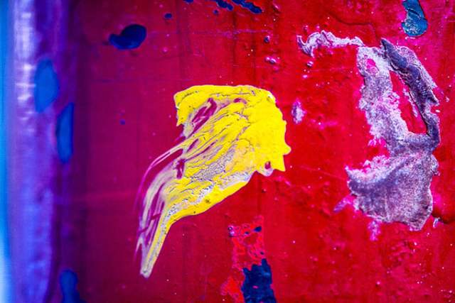
In this image we have strong red, yellow, and blue tones. Red and blue are primary colors, choosing primary colors always makes a strong statement. Notice that yellow is totally opposite of blue on the color wheel, that’s what makes it really stand out.

Notice the strong relationship between the blue and yellow tones of this image. From left to right we have blue on yellow or yellow on blue. These colors compliment each other very well.
Take a closer look at the incense photo from earlier. Notice how the colors also follow this rule?
Get Closer
Robert Capa is a famous war photographer who said, “If your photos aren’t good enough, you’re not close enough.” Use your feet and physically walk closer to your subject. Try different angles to connect the viewer with a specific subject. Getting closer usually means using an unusual point of view.

In this image of exhausted subway riders the camera was just a few inches from the subject. We get the feeling that we’re sitting right next to the tired woman.

I got as close as possible and filled the frame when shooting this tiny lizard.
Fill the frame
I tell many of my students that I have a simple rule of thumb for good photos. If I can cover your subject with my thumb then you aren’t close enough! We’ve all seen photos with the subject tiny and all alone in the middle of the frame surrounded by things that only detract from the subject.

What’s the subject of this photo? There is too much in the image that doesn’t contribute to the story. We need to get closer and fill the frame.

This is a much nicer image. Now the dog fills the frame and we’ve eliminated the excess.

In this portrait I’ve filled the entire frame with just the girl’s face. We don’t need anything else in this image to tell the story. Also note that this image follows the rule of thirds and the colors of the girl’s head covering are primary colors.
Leave Space
There are times when leaving space around your subject is more important than filling the frame completely. Space can give us context or show implied motion.
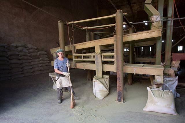
The bags of tea, the warehouse, and machinery give us context for our subject. He’s not just a worker, he’s a worker cleaning up from a long day of bagging tea.

When you have movement in your photos make sure you leave a bit of room to show the implied motion. In this image we can see the motorcycle zooming away as the passenger looks back. Generally you should place the open space where your subject is looking. If both the passenger and driver were looking ahead I would have placed the empty space on the opposite side of the motorcycle.

This photo was composed so that the bird has been placed on the left, flying into the open space. If you don’t leave enough space for the implied motion viewers will get a sense that your subject is about to hit the edge of the frame.
Using these basic elements of composition will help you to improve your photography skills dramatically. Try practicing each of them over the next five weeks. Here are some activities to help you get started:
Week 1: Create an image using the Rule of Thirds for composition.
Week 2: Photograph a scene that features strong leading lines.
Week 3: Share a photo that features strong patterns, textures or colors in the composition.
Week 4: Share an image that the composition of the subject fills the frame of the camera.
Week 5: Share a photo that the composition leaves space around the subject for implied movement and story.